Sixty Search Dropdown Menu

Hidden Midwest: Detroit

In part one of the three part series Hidden Midwest, writer Elizabeth Upenieks investigates the legacy of Modernist architecture in Detroit. While in Detroit, Upenieks critically illuminates the city’s history through an interview and studio visit with local artist Melissa Webb.

Image: Nighttime installation view of local authorities in the spirit world shape shift through time (we call it evolution) by Melissa Webb. Interior shot of Frank Loyd Wright designed home shows a sitting area bathed in psychadelic light. The many colored lights come from an artist's projection out of frame and cast green and yellow shadows upon the wooden walls. Textile pieces, made from crocheted fabric hang from the ceiling and the couch. Photo by P.D. Rearick.
Image: Nighttime installation view of local authorities in the spirit world shape shift through time (we call it evolution) by Melissa Webb. Interior shot of Frank Loyd Wright designed home shows a sitting area bathed in psychadelic light. The many colored lights come from an artist’s projection out of frame and cast green and yellow shadows upon the wooden walls. Textile pieces, made from crocheted fabric hang from the ceiling and the couch. Photo by P.D. Rearick.

Hidden Midwest is a series that weaves together the complicated legacy of modern architecture in the Midwest and the work of Midwestern artists who respond to and converse with these sites. I focus on three artists and cities: Melissa Webb in Detroit, Carole Wantz in Columbus, Indiana, and Juan William Chávez in St. Louis. Hidden Midwest questions the histories of modern architecture in these cities through a contemporary perspective.


It takes one person, book, or YouTube video to spark a lifelong interest. My appreciation and obsession for modern architecture traces back to a graduate class I enrolled in on a whim. I couldn’t get enough of modern architecture’s approach to domestic space and the modern architect’s attention to detail in the home. In contrast to the suburban houses of my childhood, a house made with thoughtfulness was a revelation. When I moved to Chicago in 2021, I was so excited to see the places I studied in real life, like Mies van der Rohe’s Edith Farnsworth House (1951) in Plano or Frank Lloyd Wright’s Frederick C. Robie House (1910) in Hyde Park. This passion is how and why, armed with a travel grant from my previous employer (Northwestern University), my fiancé-slash-photographer, and meticulous itineraries, I headed out this summer to Detroit, Columbus, IN, and St. Louis to see these projects in real life.

The sweltering hot August drive to Detroit gave me a chance to contemplate. Photographs and texts distance these locations, buildings, and cities from the lived experience of the people who call these places home. I am removed from their reality. Can the beauty of these spaces transcend injustice, or are these projects inseparable from injustice?

Detroit, before, during, and after the rise and fall of the American automobile industry, was, is, and continues to be a city of stark division. The city’s poverty rate is just over 30% and as of 2021, Detroit ranks as one of the most racially segregated cities in the United States. Detroit’s economic and racial disparities are intimately intertwined with Henry Ford’s impact on the manufacturing industries. When Ford invented the moving assembly line in 1913 he changed the way cars were mass-produced. Ford’s assembly line has crept into all aspects of modern American life; everything is standardized, mechanized, and deviations are unacceptable. The “one size fits all” approach of the assembly line fails to consider workers as individuals. This suggestion of equality is deceptive as it bolsters those already ahead and hinders those behind due to racial and class inequality. For instance, even if Black workers in Ford’s factories were making the same amount of money as white colleagues, they were systematically barred from banks and neighborhoods and unable to purchase land or houses due to racial discrimination. Before the Federal Fair Housing Act in 1968, neighborhoods and banks explicitly banned residents from buying land or borrowing money based on a multitude of reasons, including race. This willful blindness to the realities of American life, for everyone, is a sentiment echoed by modernist city planners, designers, and in particular, the modern architect Le Corbusier. In his 1923 book Toward an Architecture, Le Corbusier declared, “A house is a machine for living in.”

This swift statement portrays homes as sterile environments where an inhabitant can push through the actions of living and streamline the minute movements of day-to-day life. Le Corbusier’s motto encourages inhabitants to live within the grooves of the social machine and never deviate from its pre-scripted structures. Such obedience in turn makes them the ideal worker: someone who never questions their place on the assembly line. Top down hierarchies are indicative of modernist architecture’s vision of the future. Where do architects and creatives hoping to inspire and stimulate fit in?
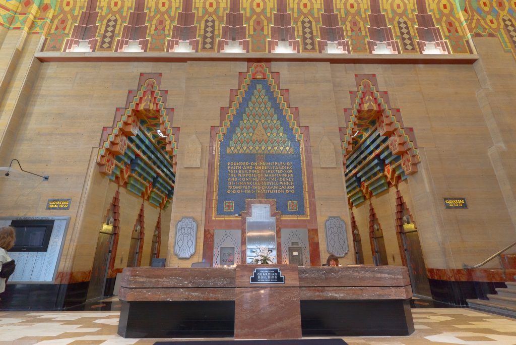
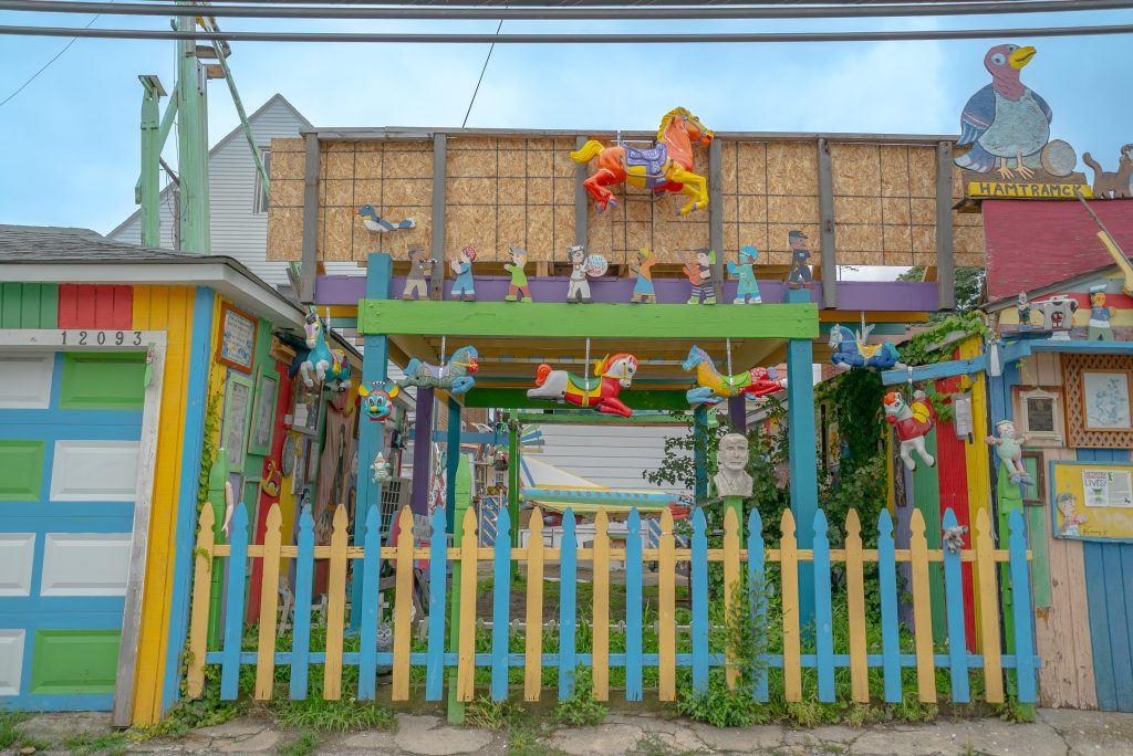
Image: Lobby of the Guardian Building in Detroit, MI. Art Deco tiles in greens, blues, ochres, and dark corals, rise upwards on high walls. A large stone lobby security desk site in the middle of the photograph, behind the desk are six elevators; three in each alcove separated by the large stone support that sites behind the desk. A staircase ascends out of frame. A person sits behind the desk as another person stands left of center and looks up. Photo by Mikey Mosher.
Image: A view of Hamtramck Disneyland (Detroit, MI) taken from alley. A blue and yellow picket fence stands in front of vibrantly colored awnings and wooden beams. Wild grasses grow up the fence pickets and wind their way around the two garages that stand between a small parcel of unbuilt land. Painted rocking horses hang from porticos that rise up from the grass and in the distance there is a glimpse of a bright yellow and blue plane, built to resemble a spacecraft. Photo by Mikey Mosher.

A way to better understand these questions of Detroit’s past and present are through the city’s art and architecture. The contrasts of the city are replicated within the differences between the Guardian Building lobby and Hamtramck Disneyland. Though both sites are fantastically colorful and visually playful, they represent two diametrically opposed types of art making and community in Detroit. The Guardian is a bastion of commerce, government activity, and capitalism. Hamtramck, an off-the-grid project located in an enclave of Detroit, relies on community support to maintain its existence.

The issues Hamtramck Disneyland faces in its effort to exist are echoed throughout other Detroit art installations like the Heidelberg Project. Responding to Detroit’s financial hardships, residents have sought help from one another by building community networks. These community networks allow Detroiters to forgo cash and instead trade time and knowledge, or willingly share resources they no longer need. This is a city where people rely on one another and share a sense of trust across communities. They often work outside the confines of a capitalist financial system. 

This sense of connection is shared by the artist Melissa Webb. For Webb, community is not only “the community that’s right there with you,” but also those who support you through love and encouragement. She also considers the craftspeople who make the tools and objects present in her work, “as everything is from somewhere and someone.” Her focus on the collective as a living network stands in opposition to the streamlined uniformity championed by Ford and Le Corbusier.
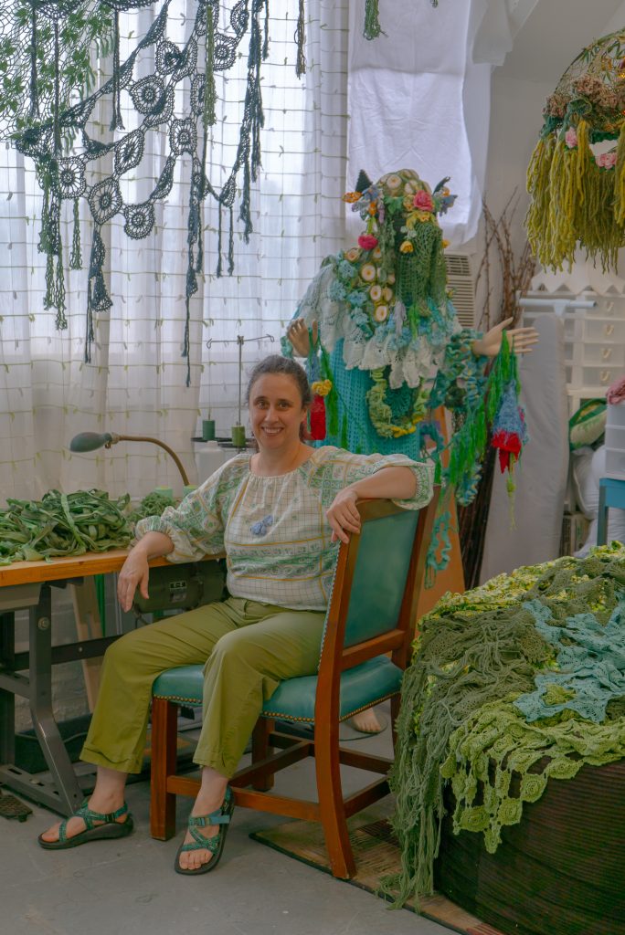
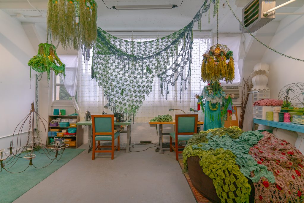
Image: Melissa Webb in her studio. The artist wears sandals, lime green pants, and a patterned blouse in a large bottle green and wooden hard back chair. She sits by a desk covered in crocheted green fabric. A mannequin covered in colorful crocheted fabric, stands behind the artist. A gauzy curtain obscures the window behind the desk. Against the studio's white walls ringlets of crocheted fabric rain down to the floor and a large pile of fabric in various shades of greens sits to the right of the artist. Photo by Mikey Mosher
Image: Melissa Webb in her studio. The artist wears sandals, lime green pants, and a patterned blouse in a large bottle green and wooden hard back chair. She sits by a desk covered in crocheted green fabric. A mannequin covered in colorful crocheted fabric, stands behind the artist. A gauzy curtain obscures the window behind the desk. Against the studio’s white walls ringlets of crocheted fabric rain down to the floor and a large pile of fabric in various shades of greens sits to the right of the artist. Photo by Mikey Mosher
Image: Melissa Webb's artist's studio. A wire candelabra sits on top of a green rug. Above the light fixture hangs a curving, naturalistic lamp covered in crocheted green fabric. Windows covered by a gauzy curtain line the studio's back wall. Two desks are pushed against the back wall, each with a similar green and wooden chair. A bookshelf of Tupperware cases stands to the left of the desk, and to the right is a mannequin draped with fabrics of various hues and weaves. In front of the mannequin is a large cushion covered with woven pink, blue, and green fabrics. Above the draped cushion, various threads are stacked on a blue shelf. Photo by Mikey Mosher.
Image: Melissa Webb’s artist’s studio. A wire candelabra sits on top of a green rug. Above the light fixture hangs a curving, naturalistic lamp covered in crocheted green fabric. Windows covered by a gauzy curtain line the studio’s back wall. Two desks are pushed against the back wall, each with a similar green and wooden chair. A bookshelf of Tupperware cases stands to the left of the desk, and to the right is a mannequin draped with fabrics of various hues and weaves. In front of the mannequin is a large cushion covered with woven pink, blue, and green fabrics. Above the draped cushion, various threads are stacked on a blue shelf. Photo by Mikey Mosher.
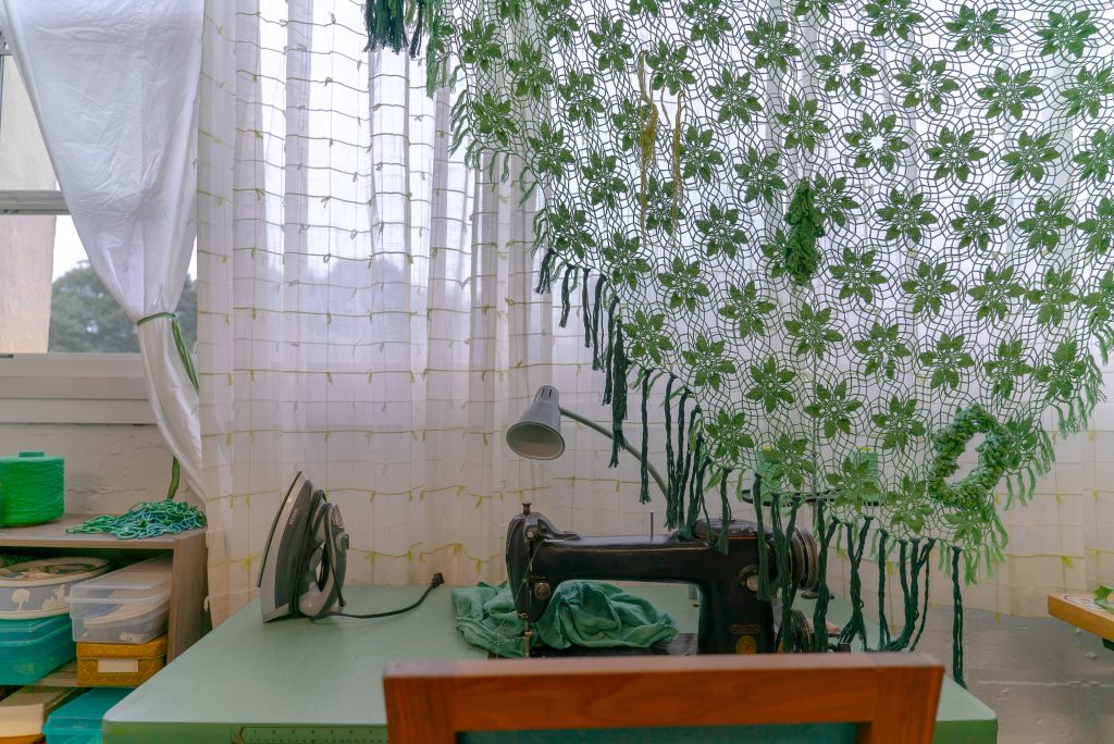
Image: Detail shot of Webb’s studio tools and materials. On a green desk sits a black sewing machine, mid-work, an iron, and a desk lamp. Crocheted green flowers hang in front of a white gauze curtain which obscures a window. To the left of the desk, studio supplies sit stacked in various boxes on a small bookshelf. Photo by Mikey Mosher.

Webb invited me to her studio just 15 minutes from the Michigan suburb, Bloomfield Hills, and spoke with me about utilizing “machines for living” in her art. Melissa came to the Detroit area for her Masters in Fine Arts from the Cranbrook Academy’s Fiber Program (MFA 2021). She has always been interested in how cities navigate their pasts: “there’s something about Detroit, its living history that’s constantly dealing with itself.” Her own work shares this reflective quality, as she is drawn to built spaces charged with history. This interest in history and space drew Webb to the Architecture Department during her time at Cranbrook, which she describes as “spatial studies,” because “their discipline of architecture is very driven by artistic concerns.” The department’s ethos resonated with her own practice, as Webb states, “you have people who are thinking about space in different types of ways.”

Webb’s artistic interventions have occurred in churches, historic houses, and even her own home. “The installation in my home was the ultimate site specific work I think because I’m living in it, and it’s in the context of my personal environment.” Webb invigorates these sites through work that acts alongside and with these spaces’ histories. At the same time as she worked on her home installation, she also started on local authorities in the spirit world shape shift through time (we call it evolution) at the Smith House (1950) by Frank Lloyd Wright.
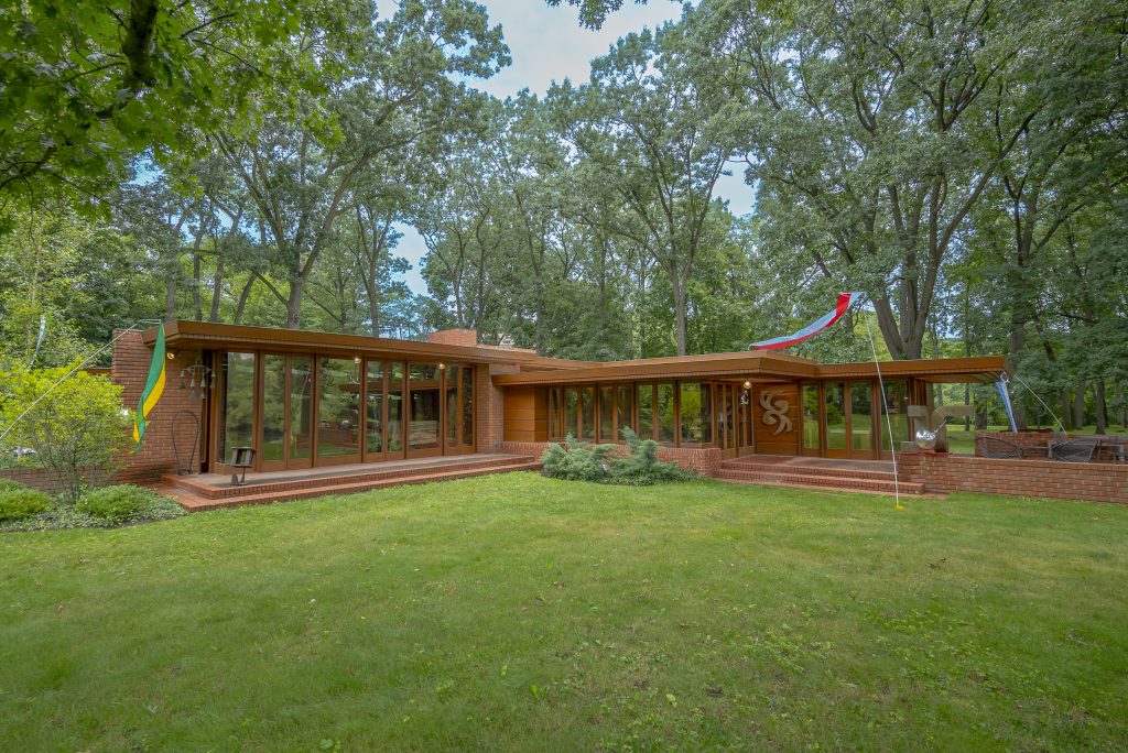
Image: Exterior of Frank Lloyd Wright's Smith House. A brick house built in the style of mid-century Modernism diagonally extends across a green lawn. The house's mirrored windows reflect the surrounding trees. A green and yellow flag hangs to the left of the house and a red and white flag flies on a flagpole to the right of a stone porch. Photo by Mikey Mosher
Image: Exterior of Frank Lloyd Wright’s Smith House. A brick house built in the style of mid-century Modernism diagonally extends across a green lawn. The house’s mirrored windows reflect the surrounding trees. A green and yellow flag hangs to the left of the house and a red and white flag flies on a flagpole to the right of a stone porch. Photo by Mikey Mosher

Wright’s Smith House, according to Webb, was built “against all odds.” Melvyn Maxwell and Sara Stein Smith, two public school teachers, were determined to live in their own Wright home no matter the costs. In addition to adhering to Wright’s strict specifications for the perfect plot of land (no less than three acres, close to a main road, and an “interesting” landscape), the Smiths faced discrimination due to being Jewish. The first deposit they put on a property was returned to them due to their religion. They were eventually able to find land in Bloomfield and start building, but only because their non-Jewish-sounding last name didn’t raise any flags under the subdivision’s discriminatory practices. The house carries iconic Wright attributes—long, horizontal lines; natural, warm materials; commitment to privacy; and a central home space. The house remains activated by new art to this day.
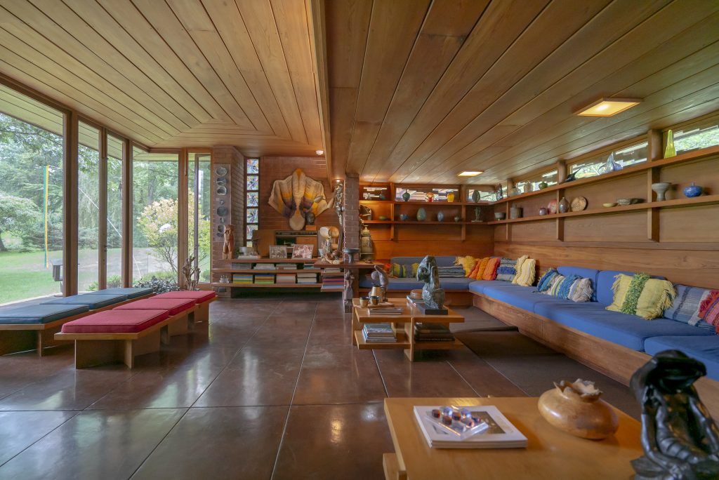
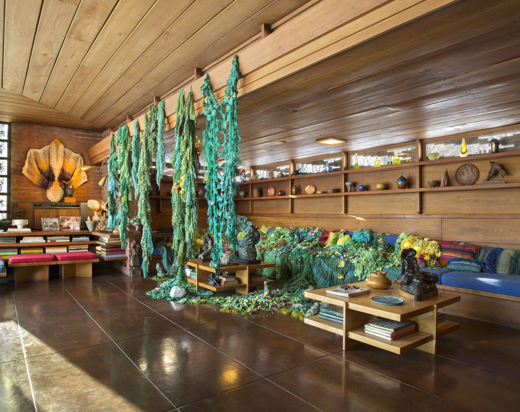
Image: Living room of Frank Lloyd Wright’s Smith House. Wooden beams run in parallel lines across the ceiling as dark tile matches their pattern on the floor. Against large floor to ceiling windows muted blue and red seats are arranged. Books and art populate the space's many shelves and a wrap-around blue couch faces the windows. Photo by Mikey Mosher
Image: Living room of Frank Lloyd Wright’s Smith House. Wooden beams run in parallel lines across the ceiling as dark tile matches their pattern on the floor. Against large floor to ceiling windows muted blue and red seats are arranged. Books and art populate the space’s many shelves and a wrap-around blue couch faces the windows. Photo by Mikey Mosher
Image: Installation shot of Melissa Webb’s local authorities in the spirit world shape shift through time (we call it evolution). Frank Lloyd Wright Smith House, Cranbrook Collections and Research, Bloomfield Township, Michigan. Site specific two channel projection installation with dyed and crocheted vintage textiles. 16’ x 20’ x 10’ / 2020 - 2021. Green crocheted fabric gushes over a blue wrap-around couch like moss or lichen. Red and yellow crocheted flowers dot the mossy crochet, as fabric also hangs from wooden ceiling beams in waves. Two tables, populated with books and art sit besides and underneath the hanging portion of Webb's work.

Contributors: Beethoven's Moonlight Sonata (1st movement) played on Sara Smith's piano by Nathan Costa, Assistant Director of music and liturgist of Christchurch Cranbrook; Copies—castings of original Cranbrook Booth North Gate stone by Ryan Andrew David; Frank Lloyd Wright Smith House curator, Kevin Adkisson of Cranbrook Collections and Research; Title prose by Stephanie Barber. Photo by P.D. Rearick.
Image: Installation shot of Melissa Webb’s local authorities in the spirit world shape shift through time (we call it evolution). Frank Lloyd Wright Smith House, Cranbrook Collections and Research, Bloomfield Township, Michigan. Site specific two channel projection installation with dyed and crocheted vintage textiles. 16’ x 20’ x 10’ / 2020 – 2021. Green crocheted fabric gushes over a blue wrap-around couch like moss or lichen. Red and yellow crocheted flowers dot the mossy crochet, as fabric also hangs from wooden ceiling beams in waves. Two tables, populated with books and art sit besides and underneath the hanging portion of Webb’s work.

Contributors: Beethoven’s Moonlight Sonata (1st movement) played on Sara Smith’s piano by Nathan Costa, Assistant Director of music and liturgist of Christchurch Cranbrook; Copies—castings of original Cranbrook Booth North Gate stone by Ryan Andrew David; Frank Lloyd Wright Smith House curator, Kevin Adkisson of Cranbrook Collections and Research; Title prose by Stephanie Barber. Photo by P.D. Rearick.

Webb approached local authorities in the spirit world shape shift through time (we call it evolution) as a joint effort. “I always consider myself as being in collaboration or my work as being in collaboration in some fashion, which probably comes from my community-centered background.” She credits the installation to the shared work of Kevin Adkisson, the curator of the home; to fellow Cranbrook alum Ryan Andrew David who contributed Copies a small artwork for the installation; Stephanie Barber who gave Webb the title, as well as Nathan Costa who plays Beethoven’s Moonlight Sonata (1st movement), and photography by P.D. Rearick (both featured in video documentation of the project). This collaboration echoed the creation of the home for Webb; as she told me “the House was such a pure collaboration between Wright and the Smiths, because the Smiths had a lot to do with the design and interfered with Wright’s original plans.”
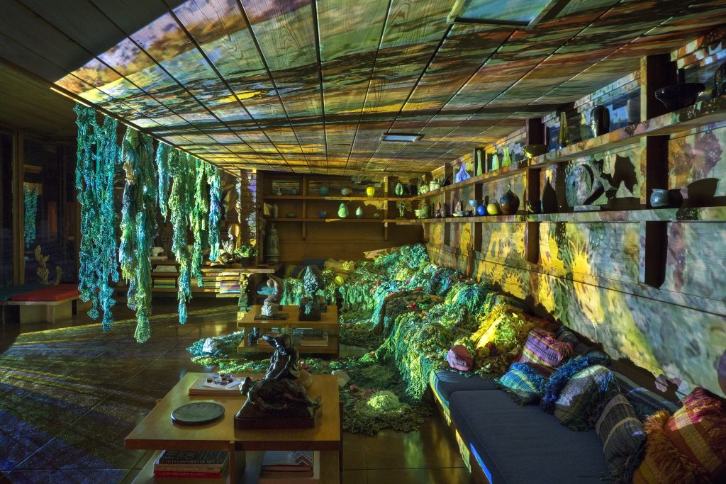
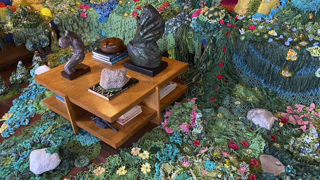
Image: Installation view of local authorities in the spirit world shape shift through time (we call it evolution) at night. Psychedelic light and distorted images of flowers and greenery illuminate the Smith House sitting area. The greens of Webb's hanging installation shift their tones against the light, as the work installed on the couch turns a watery yellow. The projection's source radiates outward, left of frame. Please reference the previous photo caption for all artist collaborators. Photo by P.D. Rearick.
Image: Installation view of local authorities in the spirit world shape shift through time (we call it evolution) at night. Psychedelic light and distorted images of flowers and greenery illuminate the Smith House sitting area. The greens of Webb’s hanging installation shift their tones against the light, as the work installed on the couch turns a watery yellow. The projection’s source radiates outward, left of frame. Please reference the previous photo caption for all artist collaborators. Photo by P.D. Rearick.
Image: Installation view of local authorities in the spirit world shape shift through time (we call it evolution) at night. Delicate pink, yellow, blue, white, and red crocheted flowers dot waves of green fabric the artist has draped over the floor and couch of the Smith House. The greens range in tone from delicate pastel, to a deep oceanic evergreen. The work merges the boundaries between indoor and outdoor space. A table filled with books and art sits amidst the greenery. Please reference earlier image caption for all artist collaborators. Photo by Melissa Webb.

Wright’s original plans would have excluded the very thing that Webb excels in: ornamentation. While she described her work as “living in harmony” with the home’s original design, especially in how the color and shapes of her crocheted pieces mimic natural fauna forms, she remarked that “he would have probably hated my installation. He didn’t really like ornamentation and my work is very feminine.” The Smiths too did not take Wright’s minimalist vision to heart and decorated their home with artworks in a variety of media: glass, fiber, paint, metal. Like the Smiths’ eclectic vision, Webb’s installation “dripped from the furniture and planters” and obscured a large chunk of the living room. Her large crocheted pieces in shades of greens lay over the home’s blue couch and dangle from wooden planters above. Pink and red flowers sprout from the moss-like pieces covering the couch, a visual contrast against the forest green crocheted field. The flowers, too, add height and dimension to the sprawling, dripping crochet.
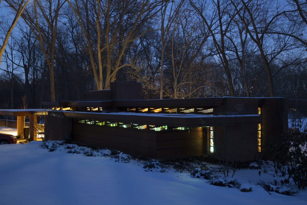
Image: Exterior view of local authorities in the spirit world shape shift through time (we call it evolution) at night. At night outside the Smith House, snow sits on the ground and the yellow light from the installation projection can be seen in pockets through the reflecting windows. Images, shapes, and colors can be made out near the tops of windows and trees near the back of the house are lit up with the projection's light. Please reference earlier image caption for all artist collaborators. Photo by P.D. Rearick and Melissa Webb.
Image: Exterior view of local authorities in the spirit world shape shift through time (we call it evolution) at night. At night outside the Smith House, snow sits on the ground and the yellow light from the installation projection can be seen in pockets through the reflecting windows. Images, shapes, and colors can be made out near the tops of windows and trees near the back of the house are lit up with the projection’s light. Please reference earlier image caption for all artist collaborators. Photo by P.D. Rearick and Melissa Webb.

At night, the installation took on a second life, as passerbys could see the work from outside the home. Webb filmed a two-channel projection of her crochet creations and the volcanic rock garden outside the Smith House, then merged the two into a kaleidoscopic mirage. The projection leaked light through the long, thin clerestory windows that face the front yard. Webb described her projection as a “marriage between my vivid colors and Wright’s intended, more muted palette.” While this one-time installation wasn’t open to the public, it does live on in Webb’s video documentation. Thankfully, I was still able to experience the Smith House and envision Webb’s creations in situ. Usually the word ‘modern’ evokes cold, sleek, and white, but the Smith house and Webb’s conversation with it is anything but.


About the author: Elizabeth Upenieks currently works in the Publishing department at the Art Institute of Chicago. She earned a BA in Art History from the University of Texas and an MA in the History of Art & Architecture from the University of Massachusetts, Amherst. 

More by This Author

Related Articles