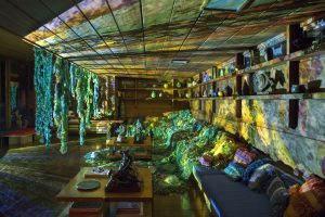
The Chicago Archives + Artists Project (CA+AP) is an initiative that pairs Chicago artists with archives and special collections to spark new experiments in creative interpretation, to showcase the rich histories and materials being preserved in participating archives, and to share archival practices with local artists and their communities. The project explores archives across the city via online features, a series of public programs and new commissioned artwork by Chicago artists. However, due to the ongoing pandemic, this current iteration of the project looks a little different. We have reimagined the project to take the shape of a book to be launched in Spring 2023: The Chicago Archives + Artist Project: Case Studies in Collaboration, which you can pre-order now! In the book, along with the wider history of the project, you’ll find the newly commissioned work of this year’s archive and artist pairing: Shorefront Legacy Center + Ben Blount, and the DePaul Art Museum + Natasha Mijares.
This series of articles profiles these featured archives and artists over the course of their collaboration, exploring the vital role of the archive in preserving and interpreting the stories of our city as well as the ways in which they can be a resource for creatives in the community.
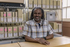
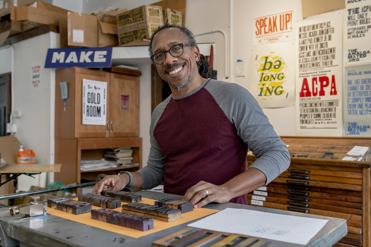
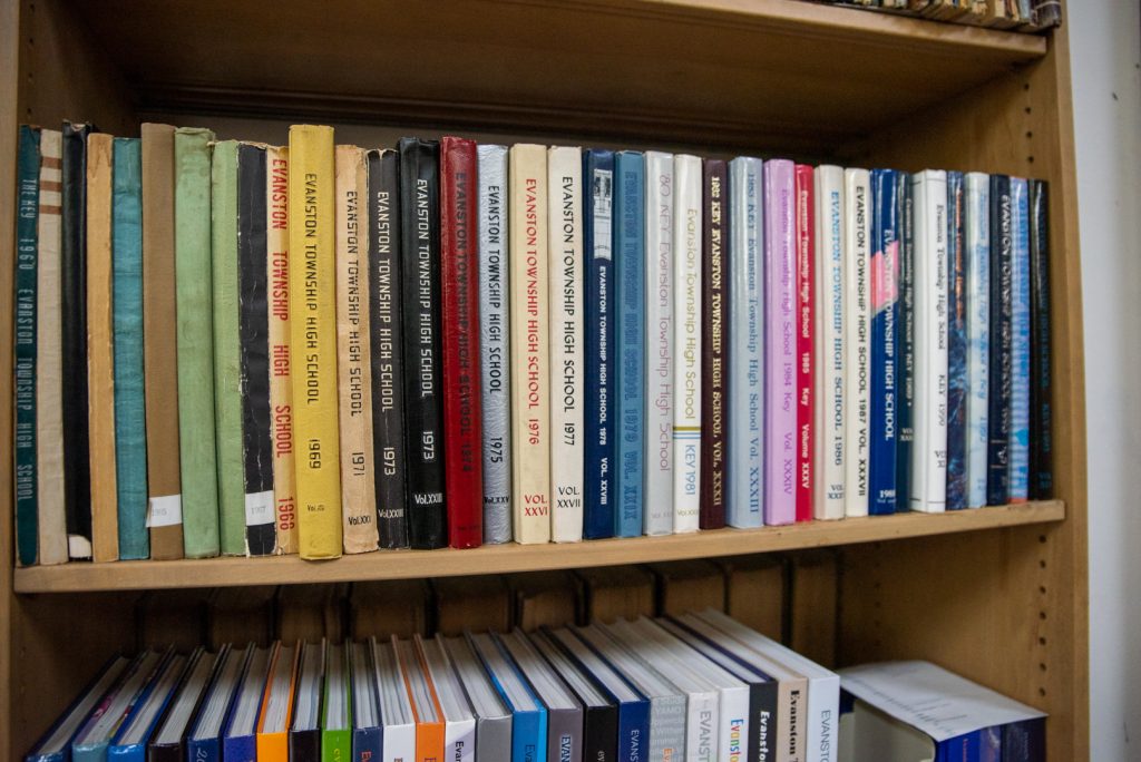
For this installment, Elizabeth Upenieks sat down with the artist, designer, and printer Ben Blount. His printmaking uses vintage type that he has collected over the years to explore race and identity. Prints and artist books by Blount can be found in the Joan Flasch Collection at the School of the Art Institute of Chicago, The Newberry Library, The Metropolitan Museum of Art, and many more. The conversation touches on the connection between artists and archivists, community-centered work, and Blount’s time exploring the archive Shorefront Legacy Center. The following interview has been edited for length and clarity.
Elizabeth Upenieks: What do artists and archivists have to glean from each other’s philosophy, training, and creative process?
Ben Blount: I think they’re both in the business of sharing things with people. Artists have something to say or an idea to put out in the world, and they want to share it with other people. Archivists are on the front end collecting things to share with people, and they want people to have access for research purposes or for inspiration, [so they can see] things to maybe support their effort in making something new, right? I would hope, at least artistically, my work [inspires] someone to make something new [or take] some kind of action. There’s some kind of result from someone viewing my work, whether it’s a feeling or motivation.
I think the act of sharing things is similar [for both archivists and artists]. There’s probably a research component that’s similar. In the process of collecting, and especially if it’s a specific collection, [there is this] search [for] what the person’s collecting, archiving, and sharing. [Similarly] for an artistic project, there’s a certain amount of research or gaining of information to make whatever you’re going to make.
EU: It’s interesting when you think of an artist as a collector—they collect thoughts and ideas physically through their mediums.
BB: Yeah, a lot of times I’m collecting reference materials or little samples of things, and most [artist] studios have shelves where everybody keeps things that may or may not make it into the work.
EU: After doing research into your own work and process, I assume you collect typeface and letterpress, making you an archivist in your own right.
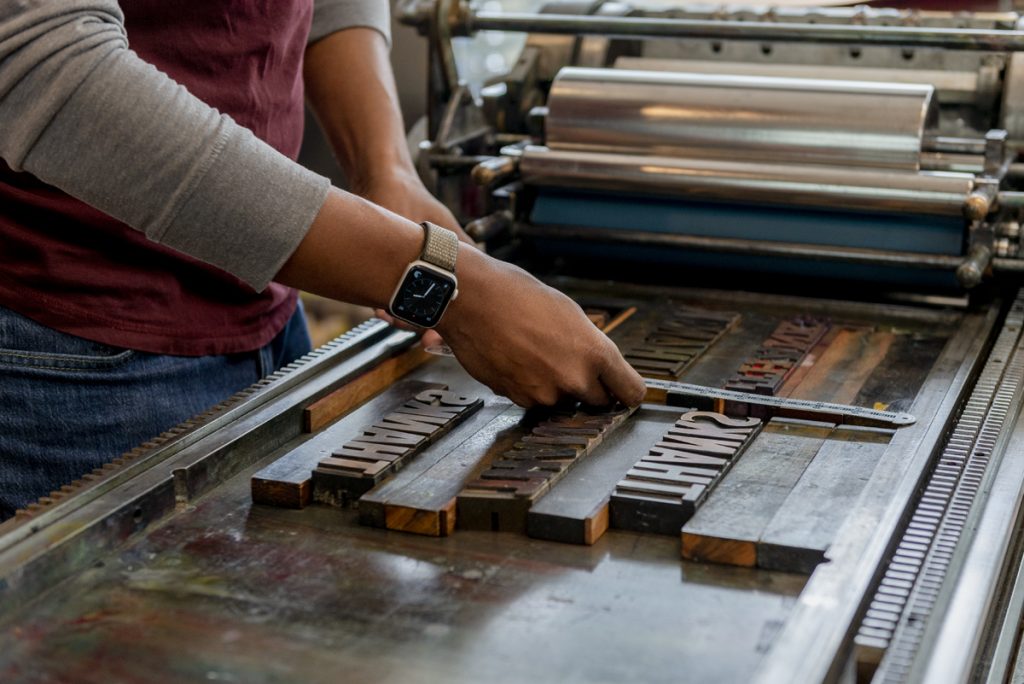
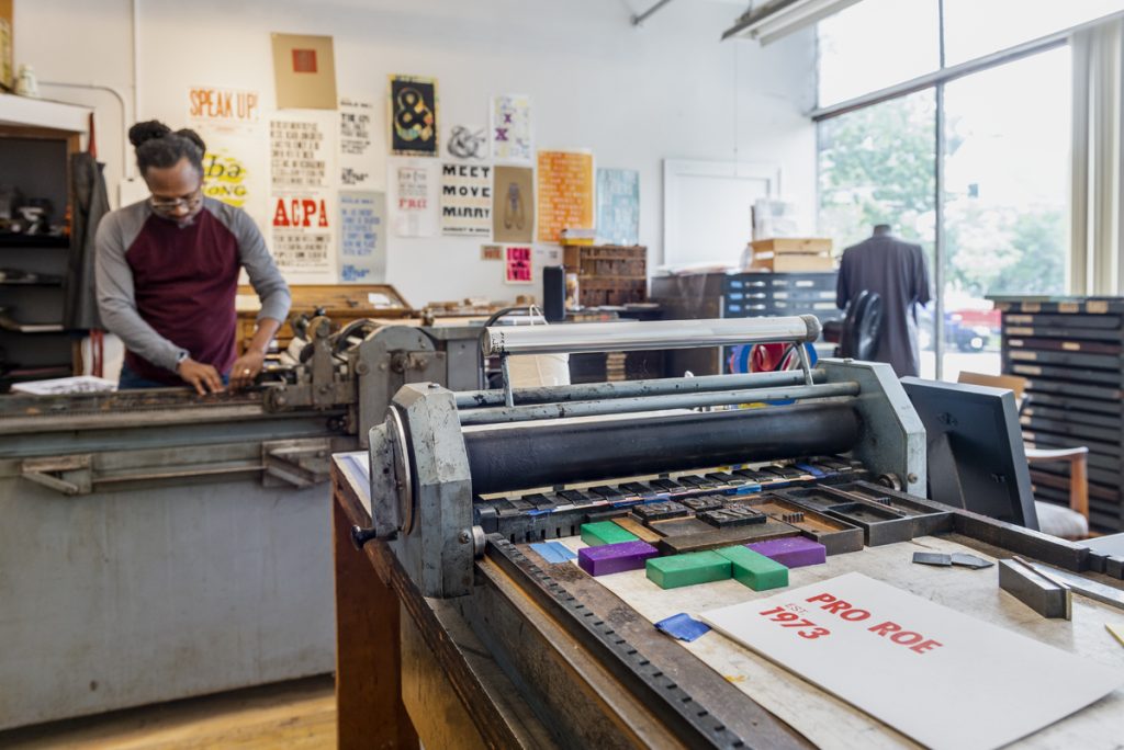
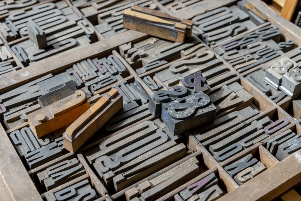
BB: Yes, for sure. There’s a lot of that. Every artistic practice has its own culture of things. For letterpress in particular, there’s definitely equipment and tools, and it is fun finding the tools and machinery parts ’cause they’re likely old. I have extra parts laying around in order to keep everything working. There is definitely a collector aspect to being a letterpress printer.
EU: It is rooted in such a specific history that we’re removed from today with the advances in technology, so you are not only an artist but a historian. It kind of plays into that idea of histories and the overarching idea of preserving community histories, which is at the core of the Chicago Archives + Artist Project.
BB: Working in print and ephemera you can [fall into the role of] an archivist by documenting histories and ideas; [you capture] the zeitgeist of the time. Being a contemporary artist doing that same thing in a less ephemeral way, I think you can see the evidence of that—but maybe not. A lot of my work is based on what’s going on right now, what people are saying, and what’s in the news. [When] you can look back on [my work], it becomes a timeline of what’s going on around me.
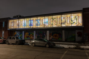
EU: I feel like I saw one of your big community projects, the mural in Evanston, that really captured what you just described. How did that commission come about?
BB: I’ve worked with [the Evanston City Council] previously on a Black Lives Matter shirt and they reached out to me about taking the message from the shirt and putting it onto a wall. That was the original idea, but there was some kind of political complication with the city of Chicago, not Evanston. They were [reluctant] to completely approve it for some reason and they gave a quiet: “Yeah, go ahead, you’re free to do it if you like without full approval.” I was worried about putting it up and then [maybe having to] take it right down, so we pivoted. It ended up being a good move because it allowed me to take another look at it and try to do something more Evanston-based with the message that would resonate more [with the community members].
[To create this mural,] I did some online research looking around for ideas. I came across a resolution [about anti-racism] that the city council unanimously passed. It also turned out that my friend Cicely Fleming was a co-author of this resolution. Combing through it and taking the language from that felt really special and really specific. This idea of trying to be more equitable and more anti-racist is a conversation that’s going on a lot in Evanston and so to be able to riff off of those [top] level priorities that had been codified into an actual resolution from the city—I thought that was really cool. And so the text from that mural comes from that resolution, and it’s using the verbs from the mural to make a statement about how Evanston feels or where everything is headed and their march towards being an equitable place to live.
EU: So what was your process like going through Shorefront Legacy Center’s archive? Have you worked in an archive before, or was this a new experience?
BB: It was really exciting. I got the grand tour of where everything is, just to see what they were collecting. I knew in general that it was an archive of Black people in the North Shore, but I didn’t know specifically what was in the collection. Some of it is about notable people who lived in Evanston, but it also contains ephemera from organizations, events, and family histories. It’s a little bit overwhelming to see all of these things [and] to think about how I can do this or I could do this or I could do this. It’s like, “Oh my God,” but the first day, I pretty quickly found a few things that seemed interesting. Then when I went back and started digging through and really looking at the source material, my idea came pretty quickly.
EU: What is your idea?
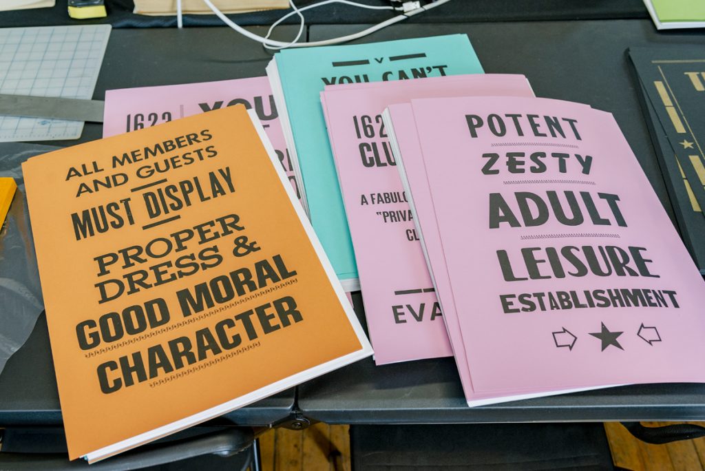
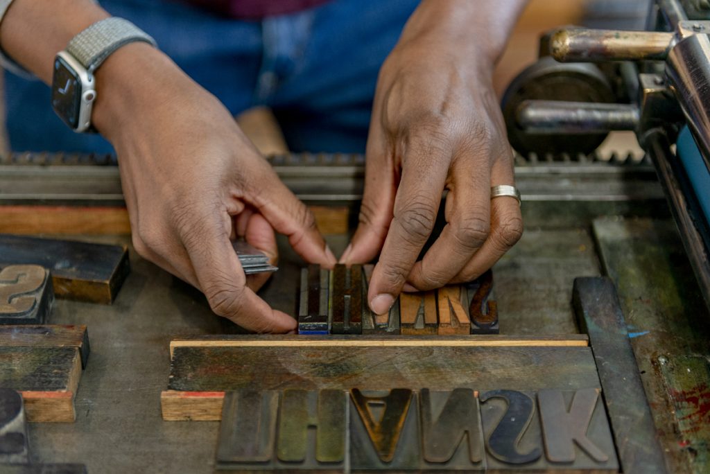
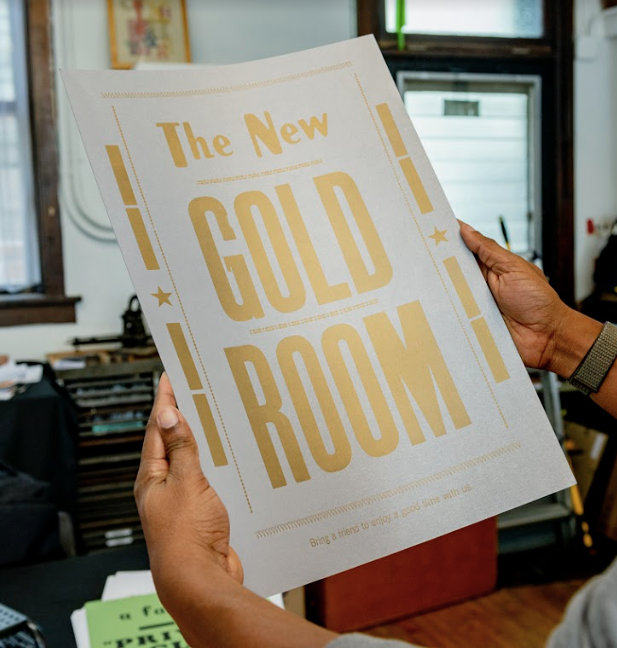
BB: Shorefront has a great collection of resources on Black social clubs in Evanston. Some of them are bigger organizations that lasted several years, but some of them are smaller organizations where a group of friends decided to make a club as a way to be social and get together. They made their own letterhead, they had rules, and they had club colors and mottos. To see the typed-up membership lists and printed materials like invitations for their parties is just so cool, [especially] at a time when Black people weren’t able to just join any organization. I went through those and was inspired by what people built. I’m pulling language from this print material and reprinting it, [I’m] taking maybe a club motto and turning it into a poster or one of the [club’s] rules. [I’m] taking a very specific thing and giving it that universal appeal by presenting it in a different way. So that’s how I’m getting the text [for the work I’m creating for this project]. I’m making posters and other ephemera based on the text from the social clubs.
EU: And are you using the fonts that they have or using your own fonts?
BB: I’m using my own letterpress stuff, but the first print I made I did all black and white pretty much ’cause [the original print] was probably photocopied or printed at some local printer. Sometimes there are lots of typefaces because [the printers are] not the designers per se. I did try to mimic that with all black ink on white or colored paper. I’m using several fonts just to mimic that stylistically, so it has a kind of a naïve or handmade feel to it. The first print I did has that same kind of vernacular look when you see it, I think.
EU: This series of prints that you’re working on, is there an end number or is it ever-evolving for you?
BB: It’s kind of evolving. I’ve written down things that were speaking to me. I’ve made one poster so far, and I have two or three others that I’m thinking about making. I’m just going to see how much I can make in the allotted time.
EU: You told me you were drawn to local Black clubs that are featured in the collection, but were there other collections that you were leaning towards or was that really the only one?
BB: I’m trying to look back at my notes and remember. There was one [idea] of looking at a family history or the history of a certain person in Evanston that I didn’t know and sharing their story with a larger audience. I left that pretty quickly when I saw [the social clubs]. The other connection [to Shorefront I have] is my mom was grew up in Evanston and my grandparents lived here. Actually, as I was looking through some of the folders, I saw a photo of my grandparents.
EU: That’s so cool.
BB: It was at one of the clubs: The Bachelors and Benedicts. So that’s cool—it connects with a little bit of family history.
EU: That’s really exciting. So, did you grow up in Evanston, too? Or was it just your mom and grandparents?
BB: I grew up in Detroit. My mom moved to Detroit when she was older, but she went to the local middle school here and my uncle went to high school and was a bit of a football star, and my grandmother had her own store here. She was a bit of an entrepreneur, so there’s a nice little family history in Evanston.
EU: That’s so exciting. I was talking to Dino Robinson, Shorefront Legacy Center’s director, and he has such a strong family tie to the archive, too, as it was born out of a genealogy project. Hearing him talk about the kind of passion that drove him into something larger than himself was really interesting. The fact that you both have familial ties to this archive is really fascinating. Moving on to more inspiration and other ideas, do you have artists that you look to that work with archives?
BB: That’s a good question. [Artists] that work with archives? I’m not sure.
EU: I feel like there are probably more artists out there than we [know that] actively work with archives, as it’s such a fountain of resources and materials.
BB: For sure. That could easily be a part of someone’s regular process and I do not know about it. I know [working with an archive] is something that I would definitely like to do again. My typical research is online or there might be a book or two I’m referencing, so to go to a physical place of a curated collection or archive is really exciting.
I did a different [archive] project [recently]. There’s a museum called the Hamilton Wood Type and Print Museum in Two Rivers, Wisconsin and they wrote a grant for some artists to come and do work based on a collection of type and printing blocks called The Enquirer Collection.
EU: You know, I would love to hear more about how you got into typeface. You alluded that you have a history as a graphic designer, if I’m not mistaken.
BB: I studied graphic design in undergrad. I was always an artistic kid. I found out what design was in high school and realized, oh, there are people choosing these fonts and they’re not necessarily drawing the picture, but they’re choosing the picture that gets placed there. The actual design of print materials and specifically albums and album covers were of interest to me. While studying graphic design as an undergrad I fell in love with typography and type. It took a few years, and I had heard of letterpress, but I’d never really done it. During an evening adult class at Columbia College Chicago, I got to play with type and print and it was like love at first sight. Immediately I got hooked and it brought to life all of the kinds of typographic principles and ideas of composition [I previously learned], but with real physical material. It really solidified everything for me. And so, that’s [when] I realized there was a whole area of study and activity in the book arts. I did two years in Columbia College’s MFA program in interdisciplinary book and paper art, and that’s where I really learned to press.
EU: Have you made entire artist books?
BB: Oh yeah. I love books; [they] are probably my first love. Before I really knew how to make books, I was making poorly constructed books just for fun, for gifts, for storytelling. I make artist books, as well as kind of printed poster-type things.
EU: Wonderful. You know, I keep going back to the fonts, mainly because of my own personal interests. I love vintage fonts and I also learned about graphic design in high school. How do you find these fonts that you ended up working with and are you always actively searching for your letterpress fonts? Is it a never-ending hunt for you?
BB: I’m always looking for wood type. So, if anyone who’s reading this interview has some wood type, please send it my way.
I got my first press and my first bit of type in the Chicago magic shop Magic Inc. on Lawrence Ave., just north of Lincoln Square. They had this magic trick [that used] a blank newspaper and a small press.They had a whole bunch of type that they used for it and as they were moving to their new location, they had no use for this stuff. My friend’s father was connected to them, so he was helping them move. He was in there and was like, “Hey, there’s all this print stuff that Ben might be interested in.” I was able to get it before they told anyone else about it. So that’s how I got my first setup, and I’ve collected [the rest] in a few chunks over time. There are people who go on eBay and are looking at auctions constantly to find type. I’ve never really done that. I’ve gotten them in like two or three big chunks from other printers who were moving on or needed money and were not printing anymore. Since then, I’ve maybe got one or two additional new ones, but I have enough now that I can kind of do what I need to do. But I’m always on the lookout.
EU: Do you find it limiting to have only a certain number of fonts to use? Or does it push you further?
BB: It is limiting and I love that about it. I try to be creative within those limitations. As an art director, I’m on a Mac all day and using the [Adobe] creative suite, so it’s a great balance [going from] thousands of fonts to having 20. A lot of the problem solving and the choices I make are based on the fonts I have available. I like working within those constrictions, the maximum sheet size that’ll fit on my press and a limited number of fonts. I make do with what I have.
EU: Yeah, I feel like it’s always nice to have those constraints and have to make the most of what’s in front of you.
Going back to the archive, it seems perfect for your chosen medium. I was curious if you went into Shorefront Legacy Center knowing that you wanted to work from text, or were you also thinking maybe you would turn to photos or other non-ephemeral items?
BB: I definitely [wanted to work from] text. Most of my work is hypergraphic, so I was thinking, even if I wasn’t using the exact text, I would be off looking for inspiration for something that I could write. But I [also thought about] using photographs. I was like, “I bet there are some cool black-and-white photos that I could reproduce and print [with] letterpress, which is a beautiful effect.” I don’t do it that much. But I was like, “Well, that’ll be a good excuse for me to print some photographs on the press.”
There are a few photos that I saw of club gatherings and parties with all the men in one picture in tuxedos, white gloves, and tails, and the women have these beautiful ball gowns on. The photos are gorgeous [with these] beautiful Black faces. As I started to pull out [other material], they had such interesting mottos and there’s always a club sweetheart and a club flower. The text was so rich I just stuck to the typographic [material].
EU: I love thinking about the clubs creating their own letterhead and wondering where they sent off these materials to.
BB: Even seeing some of the ads in their program books was cool. The design [and typeface] of the ads for the local hardware store or the local florist [were] very sparse and did not have many photographs. There’s definitely a style to the advertising of the day.
EU: It must be really interesting to see the sparse ads of the past compared to maybe the things you can do now as Associate Creative Director at Razorfish Health.
BB: Yeah, [the ads today are all] bright colors, bold photographs, and videos that catch your eye, [as opposed to the vintage ads] that are all black and white with two or three fonts. [They’re] sparse and almost the opposite.
EU: Dino talked about how Shorefront is a living archive, so he’s gathering materials now to preserve what’s currently happening. Have you added to that archive at all with things about yourself or your family’s legacy?
BB: I’ve been thinking about it. My uncle passed away recently, and as I said, he was a big football star, so he has all these clippings of him playing football and the games that they won. My mom has tons of stories about growing up in Evanston, and so I thought she could definitely contribute something [maybe through] an interview. Dino has collected a few of my posters over the years, so there are a few things of mine in the archive.
EU: That makes sense. Do you think you’ll donate your collection or your own personal archive?
BB: I definitely should, because he [has talked to] me about some things [they] don’t have [that I do]. Also, he told me he’s getting some stuff from the club collection Jack and Jill of America—a large, long-running, Black social organization. [Which means] the area of the archive that I’m doing research [on is continuing to grow].
EU: This collaboration could easily live on beyond the publication of this book. Dino said that he’s had at least one other artist work with the archive, but it would be cool to have more artists come through to bring new life to these recorded histories and uncover these smaller narratives or details, like what you’re doing. I’m curious to see what both of you will do moving forward.
BB: Yeah, it’s really exciting and a whole other avenue of inspiration. It’s a really smart connection to make.
EU: I’m just curious about one nitty-gritty detail: how much time did you actually spend in the archive itself?
BB: I think I did three visits. I went once to get the lay of the land, and I came back a second time to get more specifics and take pictures and think. How many hours did I spend? I probably spent five or six hours or something like that to make sure I went through every folder and took enough notes and photos so I could reference things. The last time I went I measured some things, so I might try to duplicate some of these small books that they had. It was interesting. Almost every time [I went] there was someone else there doing family history research. It wasn’t another artist per se, but to see someone else there at the same time using the archive was cool.
EU: They’re living things that people are curious about and should have access to, so that’s good to hear.
BB: Yeah, 100%. Shorefront is a hidden gem. More people should know about it and be able to access it. It really is one person leading the charge to build this collection, I know he’s not doing it completely by himself, but it’s Dino.
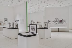
Chicago Archives + Artists Project: Case Studies in Collaboration serves as a site for new archive-inspired explorations, a directory of Chicago-based archives and collections, and a printed space where past artists, archivists, librarians, curators, and other collaborators can reflect on 5+ years of the Chicago Archives + Artists Project.
The book features two new artist/archive pairings with printmaker Ben Blount who spent time in the archives of Shorefront Legacy Center, and artist/poet Natasha Mijares who explored the Latinx art collection at DePaul Art Museum. Edited by Kate Hadley Toftness, with support from Tempestt Hazel, Christina Nafziger, and Persephone Van Ort. Designed by Matthew Austin of For the Birds Trapped in Airports.
The book also features writings from Oscar Arriola (Zine Mercado/Chicago Public Library), Sara Chapman + Dan Erdman (Media Burn), Sky Cubacub (Rebirth Garments), Meg Duguid + Michael Thomas (Culture/Math), Marc Fischer (Public Collectors/Temporary Services), Kate Hadley Toftness (Sixty), Tempestt Hazel (Sixty), Ivan LOZANO (CA+AP Artist), David Maruzzella (DPAM), H. Melt (CA+AP Artist), On the Real Film (CA+AP Artists), Jennifer Patiño (Sixty), Jessica Pushor (Chicago History Museum), Morris “Dino” Robinson (Shorefront), Robert Sloane (Chicago Public Library), Nell Taylor (Read/Write Library), Lauren Shadford (Voices of Contemporary Art), Darryl DeAngelo Terrell (CA+AP Artist), and more.
About the author: Elizabeth Upenieks is a Chicago-based curator, writer, and art historian. She earned a BA in Art History from the University of Texas and an MA in the History of Art & Architecture from the University of Massachusetts, Amherst. Her most recent projects include What We Do in the Shadows and PLATFORM 26: Myoung Ho Lee, Tree…#2 at deCordova Sculpture Park and Museum, Lincoln, MA.
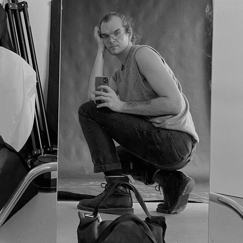
About the photographer: Ryan Edmund Thiel (they/he) is an artist, photographer, and graphic designer living in Chicago. Their work across media explores healing, liberation, and empowerment for the individual and collective. Their mission is to support artists and organizations whose values align with care, social justice, and collective organizing. Ryan is also the lead graphic designer for Sixty Inches From Center and co-lead of Sixty Collective. View their work at ryanedmundthiel.com and @talldarkandryan on Instagram.
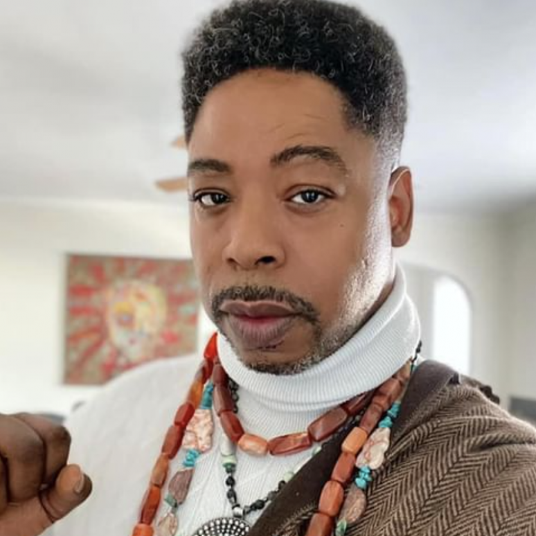
About the photographer: EdVetté Wilson Jones is a Chicago-born artist, photographer, poet, performer, and storyteller. During their childhood years living at the Cabrini Green housing projects, EdVetté was introduced to acting through the work of Chicago theater legends and veterans Jackie Taylor, actress and founder of Black Ensemble Theater, and the late Patrick Henry, founder of Free Street Theater. From there, EdVetté’s practice grew to include not only acting, but screenwriting, storytelling, poetry, journalism, fashion, and more. To learn more about their work, visit their website at edvette.com.