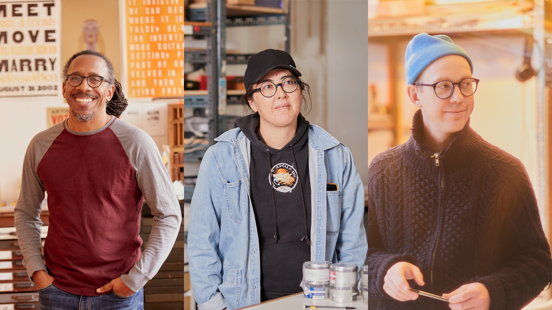
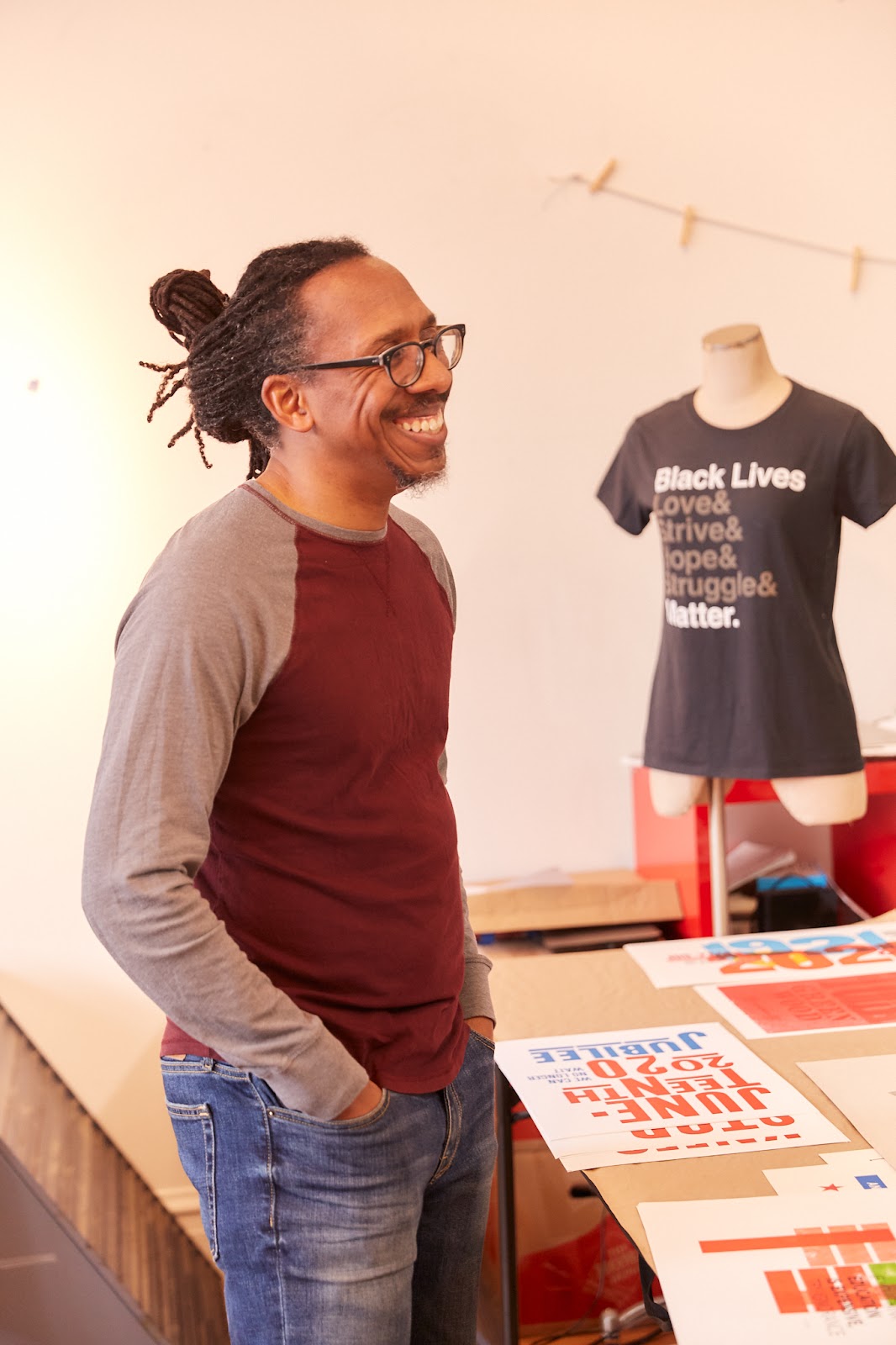
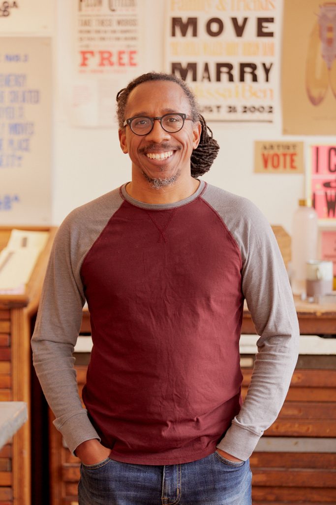
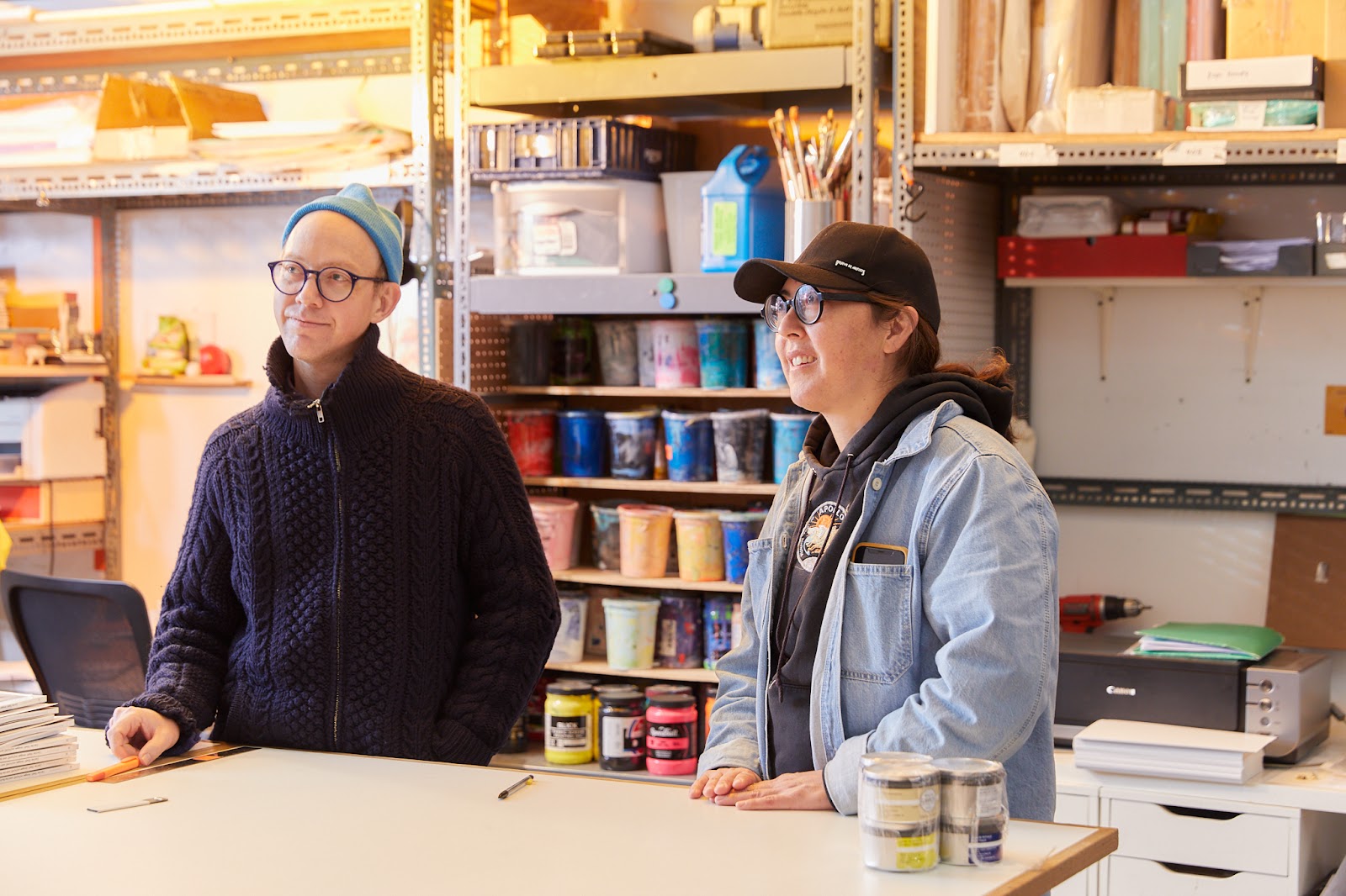
Featured image: Three portraits side by side. On the left is Ben Blount, standing in his studio smiling. In the center is Nadine Nakanishi standing in a studio space. On the right is Nick Butcher holding his phone and gazing to the side. Photos by Sarah Joyce.
This article is presented in conjunction with Art Design Chicago Now, an initiative funded by the Terra Foundation for American Art that amplifies the voices of Chicago’s diverse creatives, past and present, and explores the essential role they play in shaping the now.
“Experimental means you don’t know the outcome,” said Nadine Nakanishi, one half of the collaborative printmaking practice known as Sonnenzimmer.
Avant-garde. It’s French, literally vanguard: the first soldiers into battle, the first mowed down by infantry. It’s a loaded phrase, an attempt to capture the truly unique as part of a cultural movement when, in fact, the “avant-garde” is often without easy description, like trying to catch lightning in a bottle. Often, those who make “avant-garde” art are either unaware of their doing so and are simply being or are so technically proficient that they had to break something in the tradition.
When a piece of “avant-garde” art is born, when the artist unleashes it into the world, it is canonically impractical, tucked away as pointless until somebody makes it productive. It’s a critique of capitalism and white supremacy for what cultures they assimilate and extract from or don’t, for what stories and artifacts they allow to survive and those they don’t. It’s not unique or especially deep to make this critique in this shorthand, but I think it’s an important reminder that keeping one’s own taste is crucial.
I wonder if “avant-garde” is a phrase that allows for gaps to be filled then assimilated. A way to blunt a knife, to dilute an antidote, to break apart the work that resists a name.
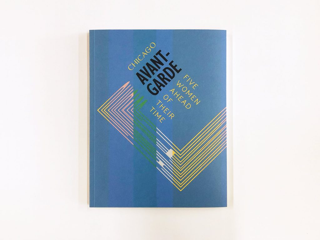
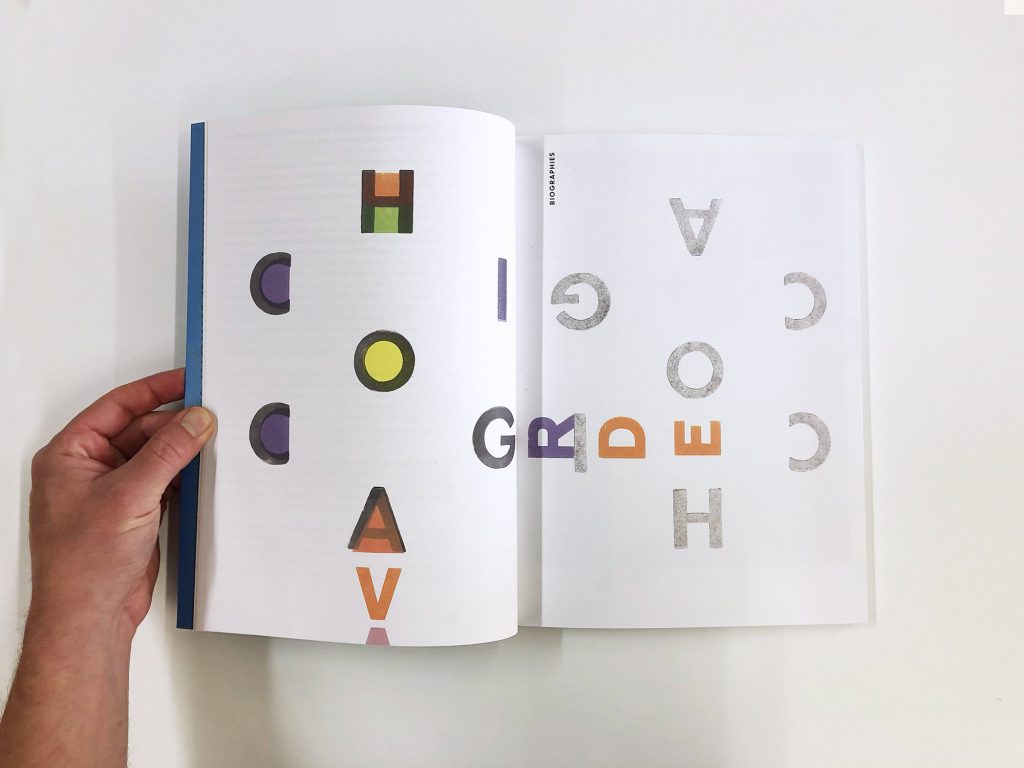
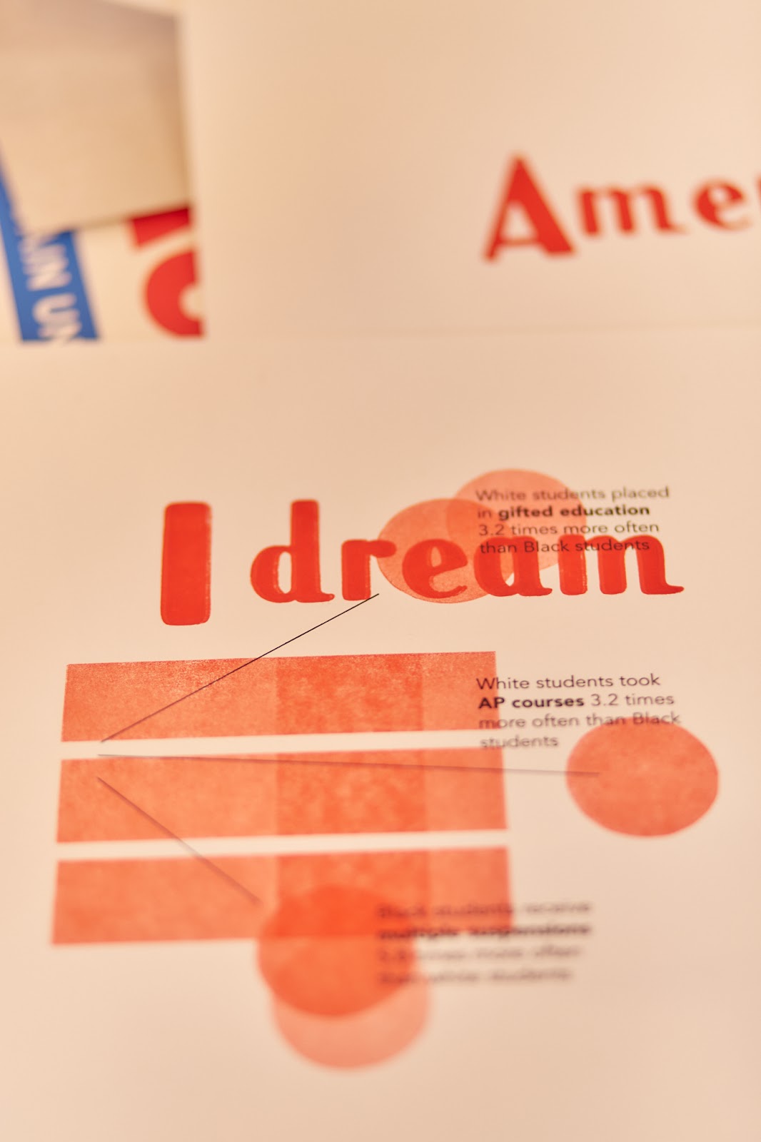
As an addendum to the exhibition Chicago Avant-Garde: Five Women Ahead of Their Time on view at The Newberry Library, curator Liesl Olsen took her wealth of research and created a catalogue describing the world those five artists lived in and what their lives looked like. After their public talk presented as part of Art Design Chicago Now, I spoke to the artist-designers of the catalogue, Ben Blount and Sonnenzimmer (comprised of Nick Butcher and Nadine Nakanishi), about their creation processes and their own practices, including how they made a takeaway poster for participants at the talk. What I appreciated most about my time with Nick and Nadine, and then Ben, is the sheer generosity of spirit with which they both spoke to us (me and the photographer, Sarah) as well as the admiration with which they spoke of each other. We spoke separately and their quotations have been rearranged topically and thematically.
Persephone Van Ort: What does the phrase “avant-garde” mean to you?
Ben Blount: You’re really trying to create something that follows your instincts, your interest, your artistic impulse. As an artist, [you want to be] able to push the economics of it aside. [These artists are] seeing something new, something so different from their time and then decades later, [we get to see] how it gets embraced.
Nick Butcher: We’re really just lucky to be working with [not just] a really brilliant artist, but one who’s really concerned with how it looks, too, because that is the interface of a print—what it looks like. Not on a superficial level, but on a deeply superficial level. And I think this comes from being an artist, printer, and designer. [The catalogue is] manifesting all these ideas. It’s this physical thing.
Nadine Nakanishi: The Newberry approved this collaboration, and we told them how we wanted to do it. We got Ben [involved] and we ran it all in transparency—everything. I bring this up because this process usually doesn’t happen in the industrial sector because of supremacy: someone needs to be dominating the creative process, and controlling and putting pressure on having everybody submit, and the whole team is not as important as the sign-off person. We know those dynamics, but this was a little bit different. They walked the talk at moments where we pushed back and they pushed back. They let us do our thing.
BB: We even said that we weren’t going to reference the [exhibition]. [We wanted to] make a collaborative piece about our experience collaborating.
NB: We can just play around and see what happens. We didn’t put a lot of pressure on the process, it was just generated.
BB: It feels like play. And, yeah, I definitely do stuff that makes me laugh. I’m playing with ideas and I’m not sure how it’s going to go over. I felt like I just needed to do something with this idea. We didn’t want to make anything resolved too soon or push it too much in one way.
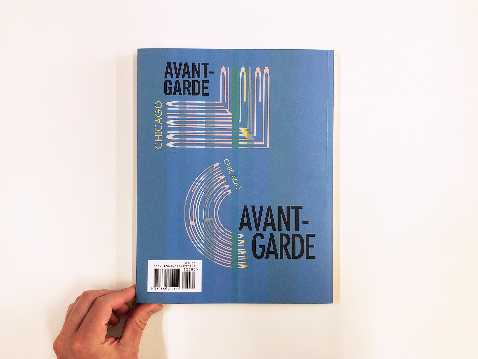
NN: I’m really excited when visual artists make a print together. It is such a snapshot of the moment of these two worlds coming together. [The poster that we created for this exhibition] is not something we would [normally] ever do. It looks different, it smells different, it feels different. The [catalogue] cover, also, we would never do—it would not look like that. It’s a real result of us meeting on a physical carrier. I think that’s something really important. I do feel like making together physically on a plain sheet of paper is really the pragmatic implication of any concept, and you just see it happening and that’s it. The visual result of this is really because you’re mingling every layer into a forward cohesive end result.
We don’t work redactively. We’re really working towards the culmination of an impression, and that yields these decisions that end up looking kind of calibrated to each other.
NN: What can we do to make this alive and change and make—
NB: —the avant-garde not feel like a static concept or a fixed thing?
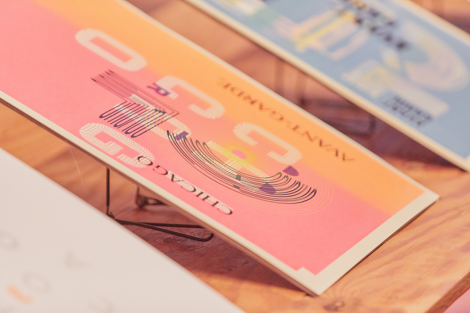
BB: There was no message intended that I wanted people to get out of [the poster]. If you got the poster and never went to the show or never saw the publication, you wouldn’t even know it doesn’t say “avant-garde” on it. It’s just a poster, right? So what do you get out of it, from the poster with no context?
BB: My first layer was pretty abstract. I had a conceptual basis for why I did it, but it didn’t look like anything. I was using the letter “i” and the letter “c” more as shapes than letter forms. And that was easy.
And when [Nadine and Nick] printed their second [layer], I was like, ‘as soon as I put words in it I’m going to start making meaning in a way that [the other layers] probably wouldn’t,’ because there’s just more imagery, more abstraction, more pattern and code. I’m going to be the one that’s going to [change] how people read this piece. When I got [Nadine and Nick’s layer], I immediately thought of [how to do this].
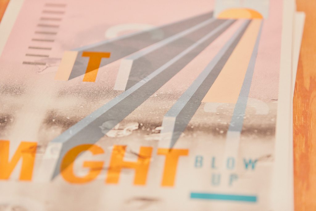
In the corner, there’s that image of a balloon with a pin going into it. And there’s that phrase from the De La Soul song, “It might blow up but it won’t go pop.” That song is talking about crossing over. Are you going to be big? It might blow up, but it’s not going to go pop as in popularity. Those ideas of mass appeal versus artistic inclination really fit for me.
NN: [Ben used] silver, white, orange, blue, and then a lighter blue, so he ran [the poster] five times through the press. [Total], we made seven screens and ran [it through the press seven times]. So if you have 150 [posters], you’re doing that seven times 150 [1050 times]. So it’s really compounding. Over 18 years, when you print editions of 150 three times a week, you’re really ingesting the images you’re making in a way that’s very much like farming. You’re very in tune to it.
NB: After making so many images, we were just trying to get to the bottom of what images are, more or less. You do have to get sort of metaphysical and philosophical because you can’t describe it any other way. Because it’s just a shape or a color. We’re constantly digging out ways to visualize things or to get at inner images, and what collective images are that we all carry around that are cultural consciousness.
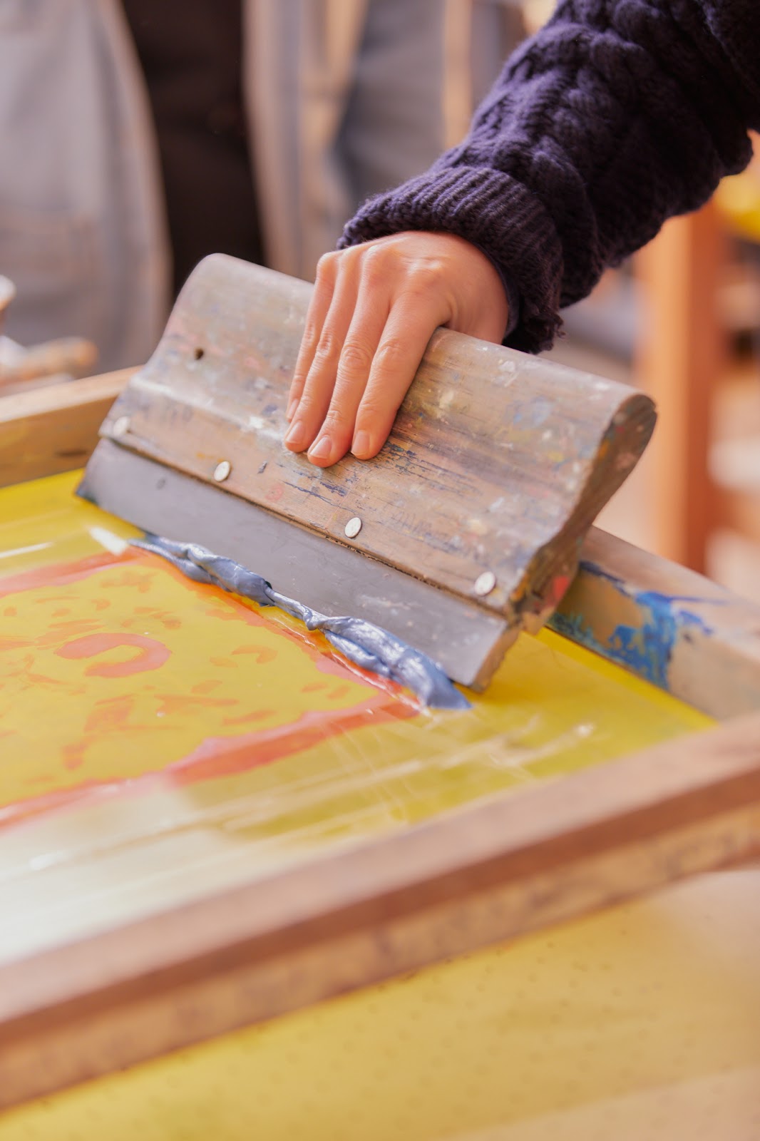
NN: Screen printing is really about choosing the matrix and using the chaos of alchemy to push through it. You go from chaos into structure. We could show you kind of what the [screen printing] process is like.
“I would love that,” I said. And I did. Watching even the most sparsely demonstrative printing is like watching magic.
NN: I think there’s a tide that we have to go through, a cycle of dissolving these inner images for the purpose of self love. And I don’t think that’s something that [industrial artists have] been practicing.
BB: My advertising background seeps into making stuff short, memorable, and palatable so that it sticks in your head a little bit. I do a lot of poster work. Working with language, I want it to be read and understood. I’m trying to make room for poetry in my work. Not literal poetry, but just some space for the unknown, space for other people to fill in a little bit.
NN: Lyricism is so powerful. It’s like brainwashing.
BB: I’m not trying to convince you of something, necessarily. I’m trying to present an idea.
NN: For me, the meaning, the word carrier, and the word-image [of posters] melt together and do something that you can’t do in another medium.
NB: [Posters are] overtly in the cultural fabric. [They’re] very self-aware of where [they] stand. Lots of art is in denial of its place. It’s for wealthy people.
BB: Nick and Nadine talk about trying to make something that’s new and trying not to be referential to the past. How do you do that? How do you create something that’s new? My inclination is to reference something else. I know there’s a set of knowledge or ideas about a thing that I play with, and the birth that leads into that.
NN: All my friends are artists and are struggling. And somehow, we’re all finding a way forward.
Forward, it’s so often forward. Sonnenzimmer, elsewhere, in their essay I’m Not Trying to Change Anything, I’m Just Changing:
“Even after a tree is harvested, its concentric rings, grown a year at a time, still tell us something. A song? A warning? A chemical release? It should strike us that a dead tree is still communicating with us.”
Maybe this is something of what that silly militaristic “avant-garde” means, a phrase which was not born from those it describes. Those who work in this “tradition” are often the marginalized, the queer, the off-kilter. But when we talk about these artists, we talk about a different relationship to a white, capitalist society; to time; to thought and feeling. The grain of truth in that metaphor is that the avant-garde artists are the first ones who are, as Blount says it, “seeing something new.” More than that, they’re creating new ways to see reality, new ways of relating to it.
Maybe those new relations are small sites of pointed resistance, such as Sonnenzimmer’s push backs on how this collaboration was expected to go. Or maybe they’re larger scale calls to our attention, such as Blount’s Eyes Wide Shut. Or maybe it’s a poem about what must wait before attending hell, a dance about the history of lynching, a self-portrait that isn’t of the self.
These are the world-builders. They do not decide to reinvent gravity. They decide to see what floats and, if nothing, make something that does.
Chicago Avant-Garde: Five Women Ahead of Their Time is on display at The Newberry Library until Thursday, December 30th, 2021. The catalogue by Liesl Olsen, designed by Ben Blount, and Sonnenzimmer, which features five original poems by Eve L. Ewing, can be purchased from the Rosenberg Bookshop at the Newberry and other Chicago bookshops.
Persephone Van Ort is a trans, white artist and writer living in colonized Chicago. They are the associate artistic director at the Prop Thtr. Their work has been featured with the Neofuturists, Walkabout Theatre, and others. They write about time, crisis, and dreams. You can find more of their work at jayvanort.com.