“Beyond the Page” digs into the process and practice of writers and artists who work at the intersection of literary arts and other fields. This interview is the second of three with interdisciplinary artist Udita Upadhyaya about “nevernotmusic” — a solo exhibition of scores activated by curated, collaborative performances — and her process of developing these scores into a book (read the first interview here and the third here). In late May, I met with Udita to discuss the book’s first mock-up, her aesthetic choices and decision-making process, and the role of intimacy, the body, and language in her work.
Follow @uditau on Twitter and Instagram and check out her book launch at TriTriangle on September 8, 2018, 7 pm. This interview has been edited for length and clarity.
Marya Spont-Lemus: So, you made a book!
Udita Upadhyaya: Yeah. This is not what it’s going to look like but this is the first mock-up with real pages of the scores and some of the color and stuff being decided.
MSL: Wow. Can I look through it?
UU: Yeah, and I might have some questions for you as well, as the first person other than me and Lauren Zallo from Match Books that’s seen it.
MSL: Absolutely. Well then I’d love to start by just talking through some of the details of this mock-up — decisions you’ve made so far, why these materials, what changes you’re considering making from this mock-up to the final book — and then get into some larger questions about your process and practice and how this “nevernotmusic” book relates to the exhibition and the performances. How does that sound?
UU: Sounds good.
MSL: What are the scores printed on here, a vellum?
UU: Yeah. We were excited about it being vellum so that there would be more of the sort of floating in print feeling.
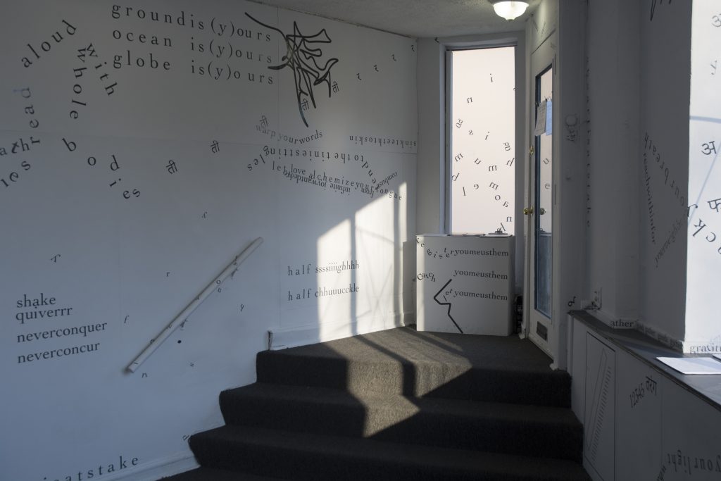
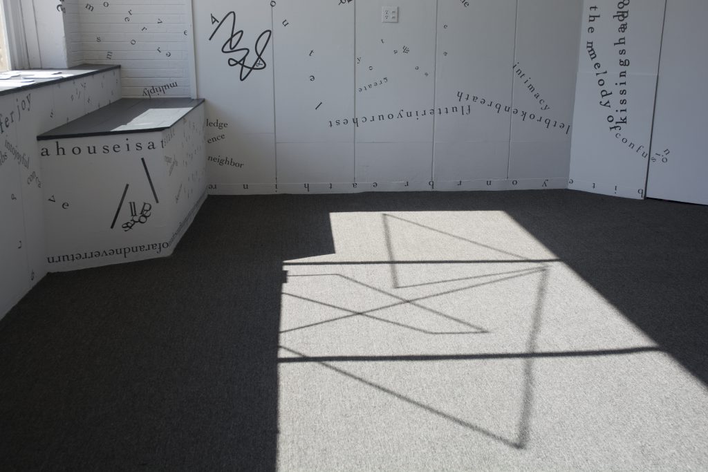
MSL: Yeah, I can see my hand through the score. [laughs] It’s also interesting because some of the lettering from the show was on the windows, right, not just the walls? Vellum’s like halfway between a white wall and a window? [both laugh]
UU: Initially the idea was to have the pages all be vellum, but then it’s complete chaos because you can’t read each score individually. So you read all the scores at the same time. I was like, “I think I have enough chaos in the scores themselves that I don’t want to overdo it.” And I do want the book to be more generous than the walls were. I want you to be able to read all of it. And come back to it and find [reading] “unveil the stories from the folds of your skin” — like I want you to come back to the book and find that phrase again a few months later. I think “misreading” is lower on the spectrum for this book than it was for the show because now you’re able to sit with it and really make it your own.
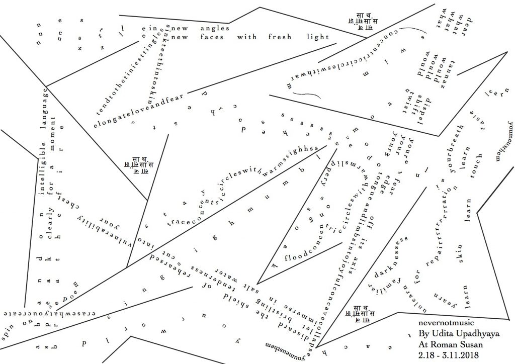
MSL: Are these the exact scores from before?
UU: Yeah, the scores have not changed. Because this is just a mock-up, the cutting of the pages is a bit off right now. I am struggling a little with the specific size — that’s been my back and forth. I’d been pushing back to have a bigger book. And this is a really nonstandard size, and it feels a little weird in my hand. I kind of want it to be just a bit smaller.
MSL: So that each score would be more proportional to or fill the page, and not have these stripes of extra space at the top and bottom?
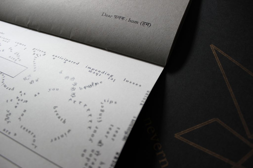
UU: Yeah. We did take out the date of the performance and the person it was gifted to. But now the date is gone, and the “Dear ___: ___” score title is on the opposing page and right now one of my struggles is what happens there and on the back of the page as well.
MSL: Is that because you feel like something should be there, or aesthetically you don’t like how it looks?
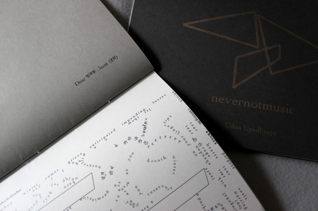
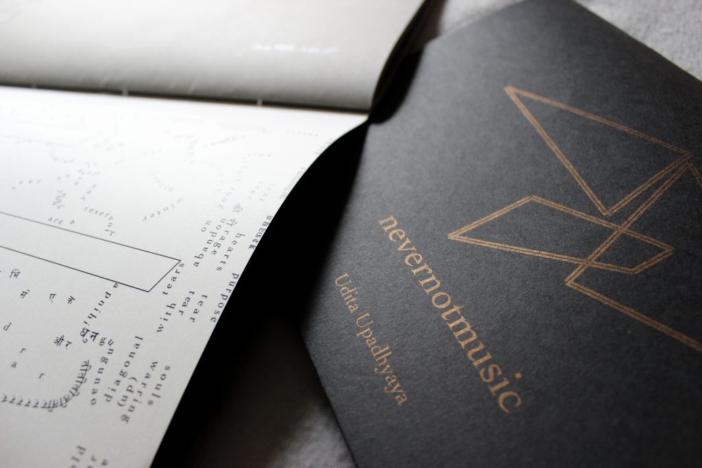
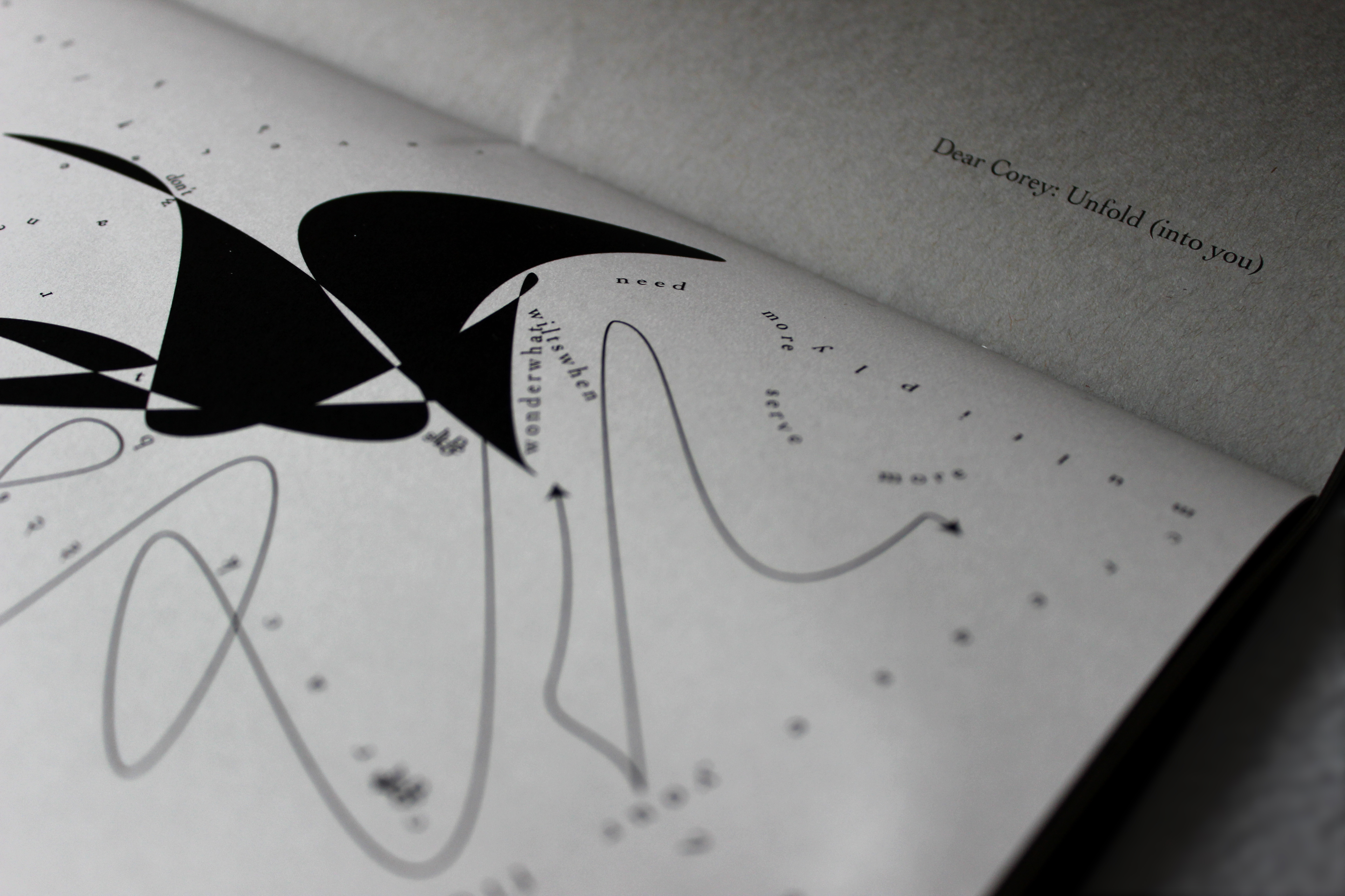
UU: I don’t like it aesthetically. One of the thoughts that we have is continuing the lines through the book — the visual motifs through it — because the score does privilege text. Like there’s something to decipher. Right now the scores are on vellum and the pages between each score are grey paper, and the cover is black. The grey to me feels like a blank page, versus a black page feels like a page that’s breaking the momentum. So one of the things we’re thinking is that we’ll switch the grey and the black, so the cover would be grey. And this text — like the “Dear Corey: Unfold (into you)” — will be in gold, and the stitching is going to be gold as well.
MSL: A saddle stitch? Is that what this is called?
UU: It is a saddle stitch, yeah.
MSL: Is this handmade?
UU: Yeah, they’re all going to be handmade.
MSL: Wow! But not by you. Or are you helping?
UU: By Lauren Zallo, but yes, I’m going to help.
MSL: That’s awesome. You know, about the page opposite each score, I do kind of like that they just have the title and are otherwise blank. I personally like not having a lot distracting me when I’m looking at the score, and feel it’s clear as-is where attention should go. Like where it says “Dear Ethan: (teach) love” — it’s both readable and kind of intimate. And even just the title’s placement on that page — in a bottom corner rather than top corner, which is where I’m more accustomed to looking for a title — reflects that. You have to look for the information a bit but it’s not hard to find. It’s close to the score but not too close.
UU: You know, I’m going to take notes as we’re talking because I need to be spending time with these decisions.
MSL: [laughs] I mean, adding other elements could work too. I guess I’m mostly trying to say that to me the title placement feels clear but also maintains intimacy and is a little bit … not hard to find but also not that far out of form. When I first saw it alone on the page, I thought it was a nice touch. It wasn’t until you said you didn’t like it that I considered it not working or needing something different.
UU: I mean, I think that was what the plan was. I think this is a bit of a tricky park of the process for me to do because I know the scores so well that I know what this is [points to score], but now this other page feels empty, so I look at that and think, “Why is this empty?” I’m almost looking at it spatially, as opposed to experientially. But if somebody hasn’t seen the scores before they’re going to be like, “Wait, what the hell is going on?” and they might need the room to breathe. Whereas I’m just like, “That’s completely comprehensible to me in one look.” I look at that and know, “That’s Ethan’s score.” You know?
MSL: Yeah, even just in flipping through these first few pages together, I think I assumed that you were trying to give each score its space. So the choice rang true to me.
UU: Yeah. I think that’s where it helps to hear from other people who both know the scores and don’t know them so well. Like, as crafted as they are, there are unintentional beautiful things that have also happened in the scores. Even back in February I wanted to keep looking at them, and I would keep being like, “Oh, that’s cool,” when I would notice different aspects of them. I was still finding my subconscious creative decisions or accidents within the scores. Alternately, now some months later, I just know them so well. I’ve spent so much time with them. [laughs] And also, it helps to hear from people in an attempt to make the book be its own thing. That’s been one of the biggest things in this process. How do I succeed in making the book not just be a memoir of the show?
MSL: So, to that idea of the book being its own thing: Do you see the book as its own artwork? Do you see it as another project related to a practice that continues a particular idea or inquiry? How are you conceiving of it?
UU: I’ve been meaning to work in a book format for a very long time now, and for some reason it just has not happened yet. As for the 12 scores, I think of them as a collection of artworks — it is a collection of scores. And we’re trying to give the book an envelope cover, so that it opens to the centerfold where it’s going to say “‘nevernotmusic’ is….” This is going to be the only page that kind of explains what’s up with the project.
MSL: So it isn’t until you get to the middle of the book that it will say, “This is what you’ve been looking at!” That’s nice.
UU: Yeah. We have to figure out paperwise — I’m really attached to the gold, so that’s changing some of our size options — but we might find a way to gently nudge you to open to that page first.
MSL: Nudge you because it’s gold?
UU: No, because the book would eventually have a flap in the cover, that folds into the middle page. I really like the idea of the book, when you pick it up, being this sort of gift, like you’re opening up a parcel of some kind. I don’t know yet if that’s going to work but that’s what I’m thinking.
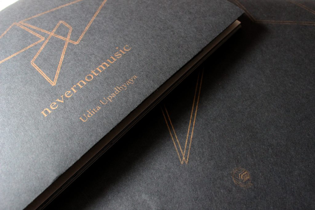
MSL: And do you think without that packaging kind of element that the book wouldn’t feel like a gift? Or is it that you really want to make sure that idea comes across? It’s funny that you say you want it to feel like an envelope, because the motif on the front cover already almost looks like one to me, like the triangular part of an envelope.
UU: Oh, I love that! But it’s going to change. [both laugh] Because it’s actually an image taken from Regin [Igloria]’s score. I mean, this is the funny thing about communicating over email about a design. Because I basically was like, “I want this image on the cover.” And I assumed it would be this image on the front cover — except it’s this image spread across the entire book jacket. [laughs] So, I mean, that’s a completely different thing. And it’s not how I imagined the cover. Those three triangles were the first accident that I feel set these scores into motion anyway. It was the first image I made on Illustrator, back at the beginning of the year!
MSL: So to have the image divided by the binding in a way that feels like a design element just doesn’t feel true to the project’s origins.
UU: Yeah. I mean, I know what it is because I recognize it, but yeah. Right now, I think I want the back cover to be empty, except for the beautiful little Match Books’ logo. I want that just to sit there on its own.
MSL: As long as we’re talking about the form of the book: So, there’s a cardstock sort of paper that alternates with the vellum. And, to my hand, the weight of the cardstock feels greater than the weight of the vellum. That’s interesting in a book that is ostensibly about the scores — or is it about the space between the scores? I guess I’m interested in what is given literal weight in the book and why.
UU: Ooh, I love that. Yeah. We went back and forth so much on what the book form would be, because I think it’s one of those things where, again, the scores are so complicated that you either want to go one way and simplify or to complicate the book as much as the scores are. And then we tried a few things with that and were just like “This is chaos!” And then it meant paring down.
I do like the vellum — the weightlessness of the vellum. I think it’s something almost about the weight of the other paper that makes me feel like it’s too empty right now. And I guess something I’m thinking about is the feeling of grounding. I mean, I like what you said about wall and window, because it does feel like these alternating pages provide the structure that is letting the scores breathe. Literally. Without the — I don’t think it’s cardstock, but the cardstock-feeling thing — the scores wouldn’t be enjoyable or as enjoyable.
MSL: I do I think there’s something nice about the unevenness. Just the varied physical and visual experience, from page to page.
UU: Yeah, I’ve been thinking about that. If you see, I did bring these samples as well. All writing that is not the score is going to be in gold, which would add to that effect. At one point we were going to make it an accordion book and, at the back, there would be a thin gold line just running through it. [laughs] I think I’m still attached to that idea. I mean, I think what I’m struggling with is, am I just giving you too much room?
And this is a silly thing, but I studied film in college, and we always were told, “Assume your audience is stupid.” And I was like, “I don’t want to do that. …”
MSL: [laughs] That’s a very specific film school. There’s definitely another film school. …
UU: [laughs] No, I know. But I think there’s a lot of … “guide them.” And I think I’m constantly fighting that urge, which ends up taking me really far the other way, where I’m overcomplicating it and I’m just kind of trying to overdo the thing.
MSL: Yeah. Going back to your comment about film school and, basically, not trusting one’s audience — [laughs] that’s sort of what I got from that.
UU: [laughs] Yeah.
MSL: I’ll share something I learned from Rebecca Makkai, who’s an author in Chicago I took a course with a couple of years ago. She said something like, “Write for your best reader on an off day — but write for your best reader.”
UU: Hmm. I like that.
MSL: You know, maybe somebody isn’t reading a book all in one try or they’re just not fully attentive in some way — or someone’s crying in the background — and they might not get 100% of the things you’re putting on the page. But they’re still very perceptive and are going to feel spoken down to if you don’t trust them to get what you’re doing. Maybe I’m not following her advice right now. [laughs] So, I don’t know, just a potential framing that was really helpful for me and may be applicable as you think about that balance with this project.
UU: Yeah. Yeah, I think that’s going to really help me. Because it’s been ten years now, maybe more, since college, that I’ve been like, “I don’t want to treat my audience like they’re stupid!” That’s not what I want to do! And I think, for me, a lot of the struggle was that I was in a Hollywood-film-world-oriented program, where what I wanted was always video art! I just didn’t have the language for it. So that is a significant difference. And I feel excited about that. Thank you! That’s your gift to me for this hour.
And making the book its own thing has been an interesting process. I’m kind of glad it’s taking longer than I thought it would, because it’s helping me get over my attachment — to the scores, to the show. It’s helping me let go a little bit and letting the scores be their own things in the world. And I think the book already feels different — even when I see this mock-up I’m like, “This is a different thing.” It has the same ingredients but it’s its own thing.
One of the biggest decisions I made with the book — which I mentioned — was to move the name of the person who each score is addressed to away from the actual score. I would hope that if you read one of the scores you would assume it was speaking to you in the space. And you have a favorite. And it wouldn’t matter that it wasn’t addressed to you or that it was to a different person.
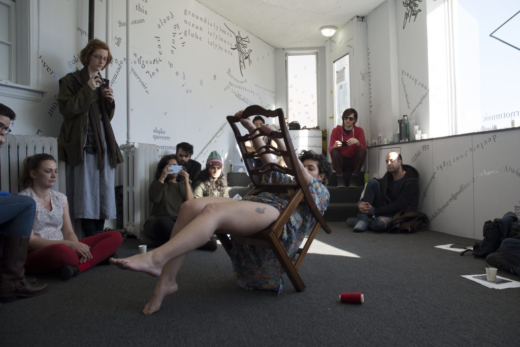
MSL: Well, it’s interesting that you say that because I remember saying something in our first conversation about how if I hadn’t been invited to read the scores I would have felt like I was intruding, or like I was reading somebody else’s letters or something. And — experientially with the book — it’s interesting to think how shifting the position of the title, or the name of the person who the score’s for, keeps that lineage but also makes it possible to experience the score on its own when flipping through. Like, I’m looking at “Dear Lindsey” as the title and then I see the words “Dear Lindsey” in the score, so they’re clearly connected, but I think having the actual page with the score on it not being branded with that name potentially opens it up a bit more for the reader or viewer.
UU: Yeah. And I think there are four scores out of the 12 that have the name repeated in the score. I think it’s Lindsey [Barlag Thornton], Ethan [T. Parcell], Kevin [Sparrow] and Will [Quam], and Falak [Vasa]. Falak’s is also partially in Hindi, so I feel like that already changes the access significantly. I guess the reason I’m sort of quantifying that is that I don’t want the whole feeling of the book to be “I’m reading letters that weren’t written to me.” But I do want to catch you off-guard that these were not just written for you. Like it’s not, “hey universe, rejoice in song,” it’s to this specific person who won’t let herself sing or something. You know.
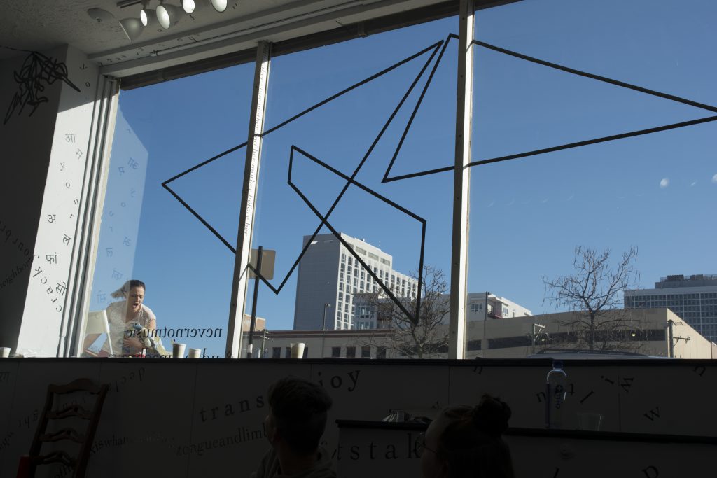
MSL: And to back up, quickly: Can you talk about who you are working on the book with and what that process has been since I interviewed you two or three months ago? How did your idea become this thing?
UU: Yeah, back then I didn’t have anything. In February, as I started making the scores and they weren’t like three sentences each, I realized, “This needs to be a book!” And, again, because I had thought about working in the book format for a while and — actually, mostly — because I went to the Chicago Art Book Fair in November, I just kind of was like, “This is ridiculous, this is what the scores need to be.” And I met Lauren Zallo, of Match Books, which has a very small but mighty team. I met her because she’d done a book for a friend who’s actually one of the performers — Corey Smith — who did a project called “The New Prairie School” at Links Hall. And I’d seen that book and been really excited about it and we got coffee and I said “I’ve got this book idea” and she was on board and now we are working on this. We’ve had a lot of meetings and we’ve finally sort of zeroed in on the vellum and what we want the book to look like. We met yesterday and that was when I got this first mock-up from her. So we’re still working things out. We have been going back and forth on how many copies. And now in my head I’m like, “Wait, 50 is not enough? But we have to make them with our hands!” [both laugh]
MSL: You’re only making 50 of these?
UU: [laughs] Yeah. Should I make more than that? I would much rather sell out than have 20 copies of the book that —
MSL: Well, just to pause: You had 12 people perform?
UU: It was actually 17 people — 12 performers or performance groups — but yeah.
MSL: Okay, so 17 performers. So that’s already about a third of the books, if they all wanted to get one — I don’t know, not to assume they do, just thinking through it.
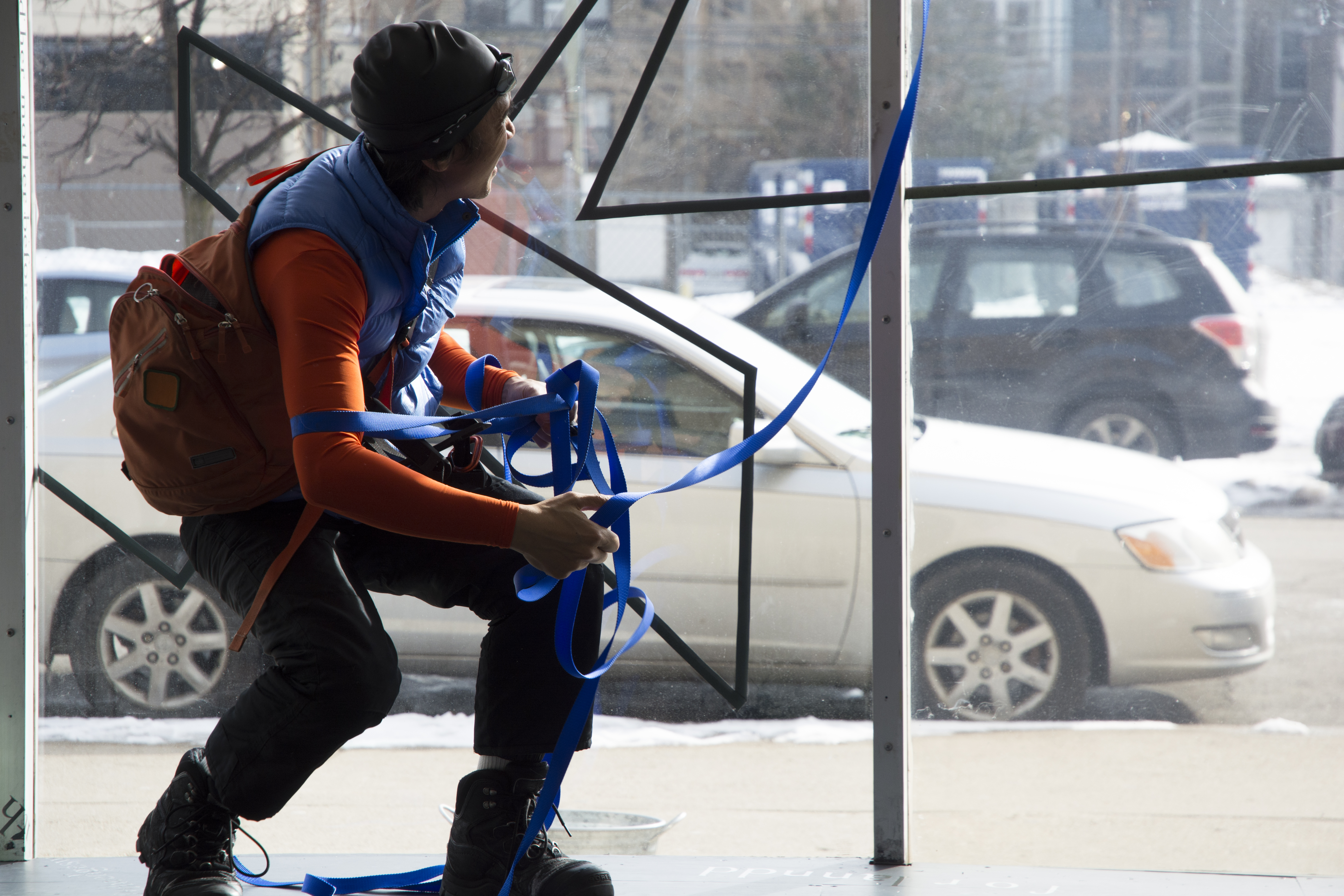
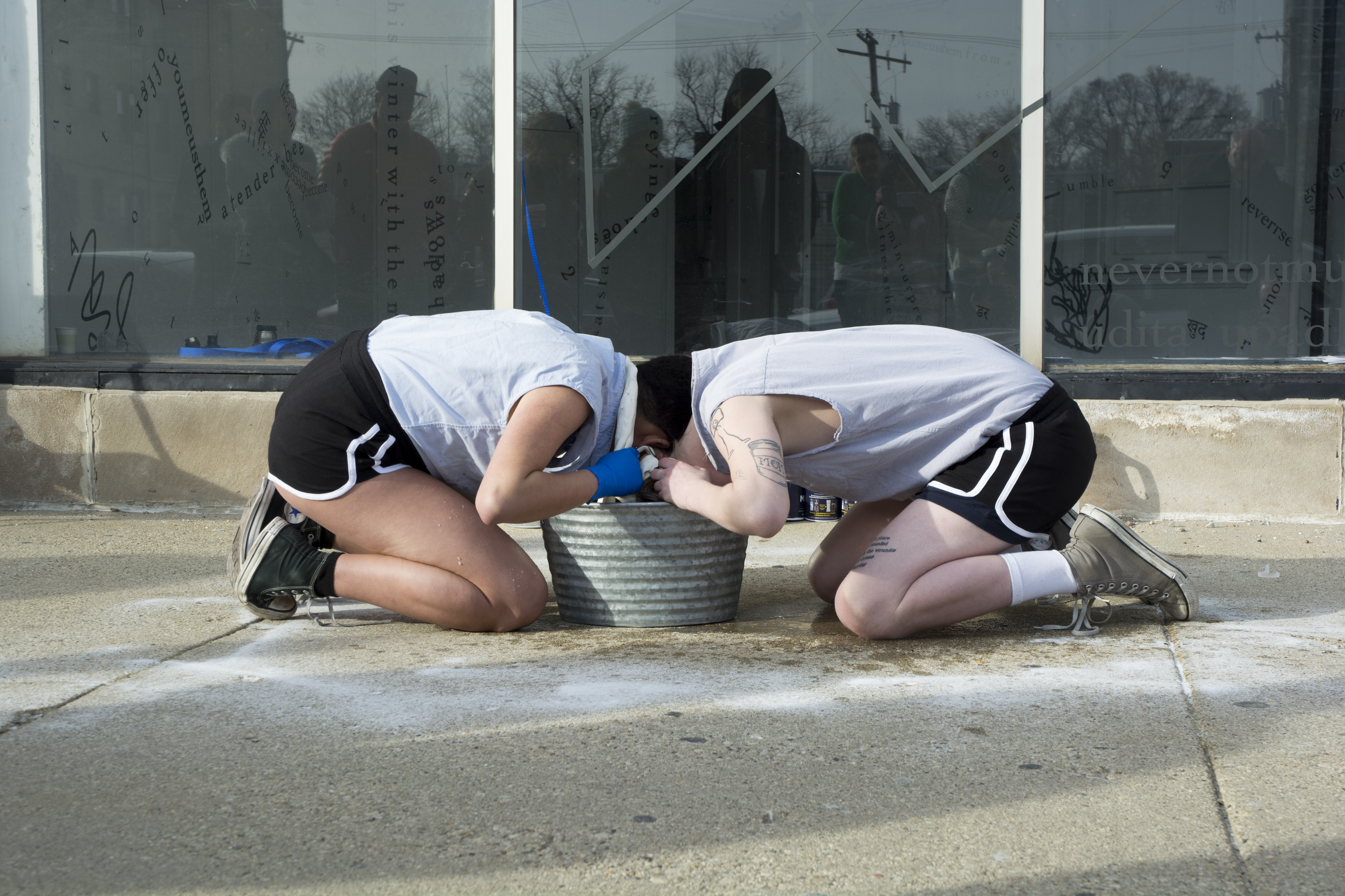
UU: Yeah yeah yeah. I mean, I think that we’ll maybe do an edition of 50 as the first run. It’s funny, I’ve been moving this weekend, as I was telling you earlier, and I think I struggle with creating objects in the world. I actually started out with “Let’s make 25!” and literally that would all be bought by or given to the people that were associated with the show or “nevernotmusic” in some way. So 50 feels like a lot in terms of bringing objects into the world. And I don’t know — maybe I’ll know towards the end of the process — I think there’s something nice about having a limited edition. You know, this is a humble project. Roman Susan is a small, beautiful space — run by Nathan Smith and Kristin Abhalter Smith — in which our focus really was, from the beginning, on the accidental audience. And that’s the thing I was happy to hear Nathan and Kristin say, that they had more people stop in the window than ever before. And I was like, “That’s it! We did the thing.” You know?
Something that I have been working on in my personal life is that I can’t just expect my friends to come to my shows. And for me the value of the accidental audience — that didn’t show up because of me, that showed up because of something else — is far more tender. I don’t think it’s higher in value, but there’s something about that that I am looking for, that I value.
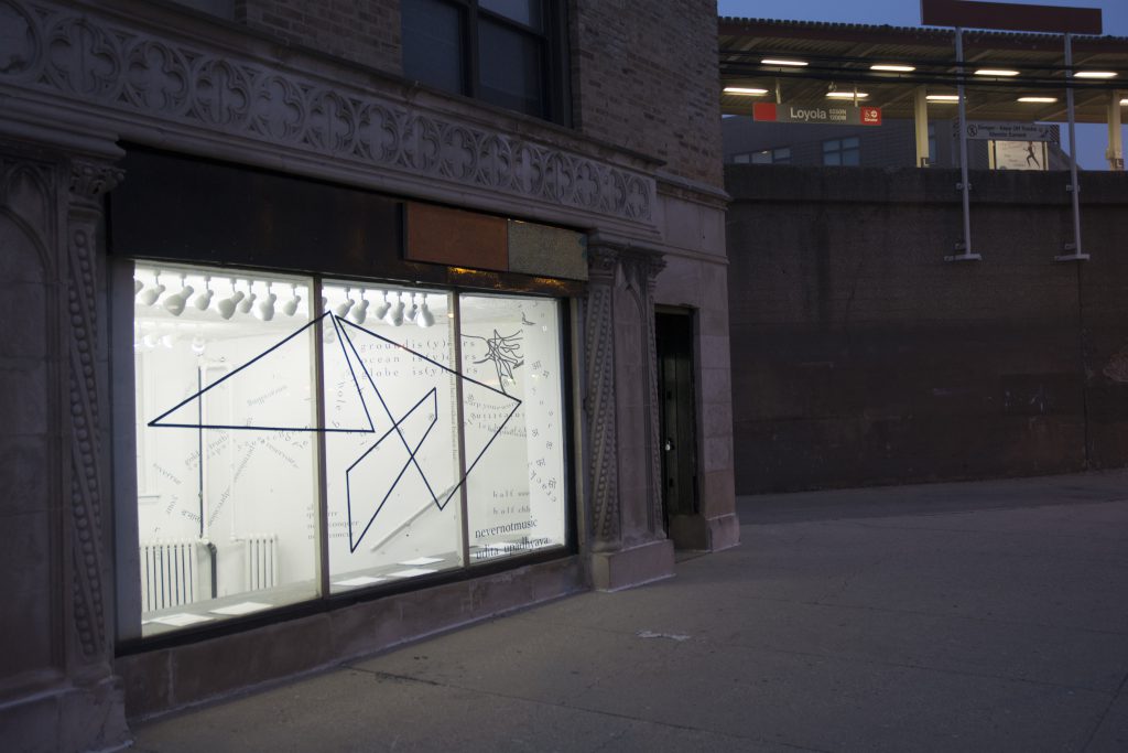
MSL: That’s interesting to think about. There are some ways in which this book is like a literal continuation of objects and experiences from the exhibition, but then, yeah, that gallery was such a public place, and right next to the El, and with all these people stopping by and looking in — that “accidental audience.” On the other hand, it feels like with a book like this there’s a very intentional audience? And especially the smaller the print-run, the more likely it is that you will, at the end of your launch party, know every single person who’s walking away with this book. And maybe you would have already known them before. [laughs] You know. So I don’t know if that’s intentional — beyond the fact that you are making these by hand — or if that was important to you.
UU: Right. Yeah. I think that’s definitely been important. The crazy person that I am, there was a moment where I was like, “I want the books ready during the run of the show” — and I’m glad that that didn’t work out, because I really was so exhausted from, like, birthing the scores. I almost worked with someone in D.C. on the book and we would have, you know, not handmade everything. Everything would have been outsourced. As it is, there will be something physical that I have done in each of the copies. Right? So there is that feeling of the gift.
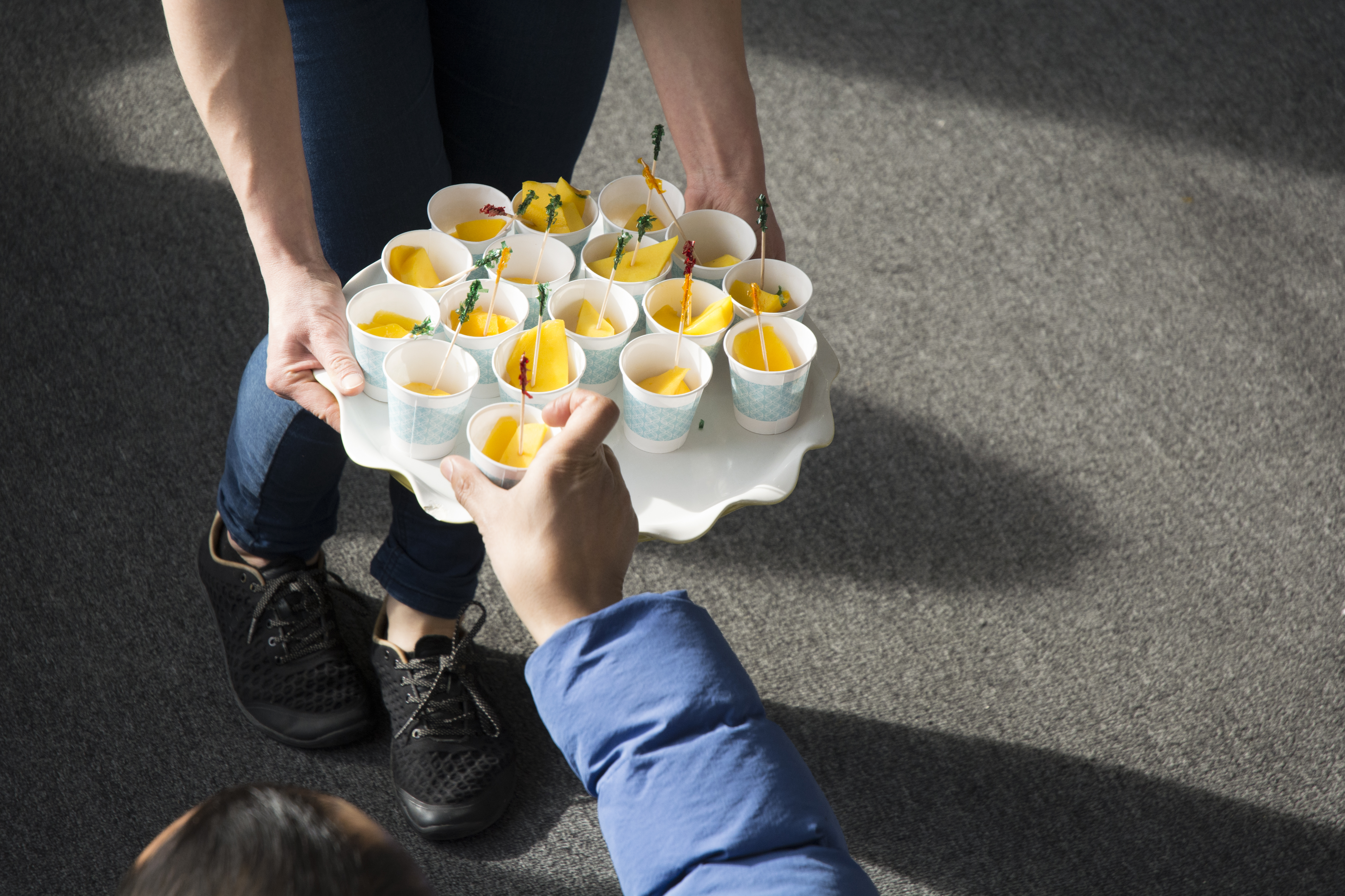
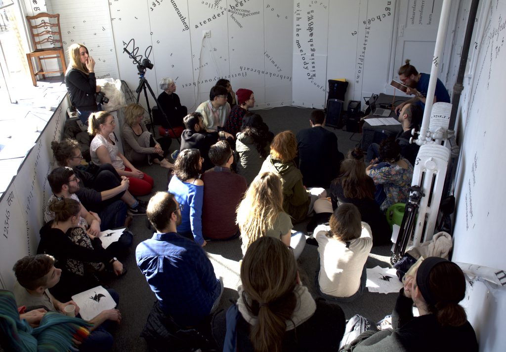
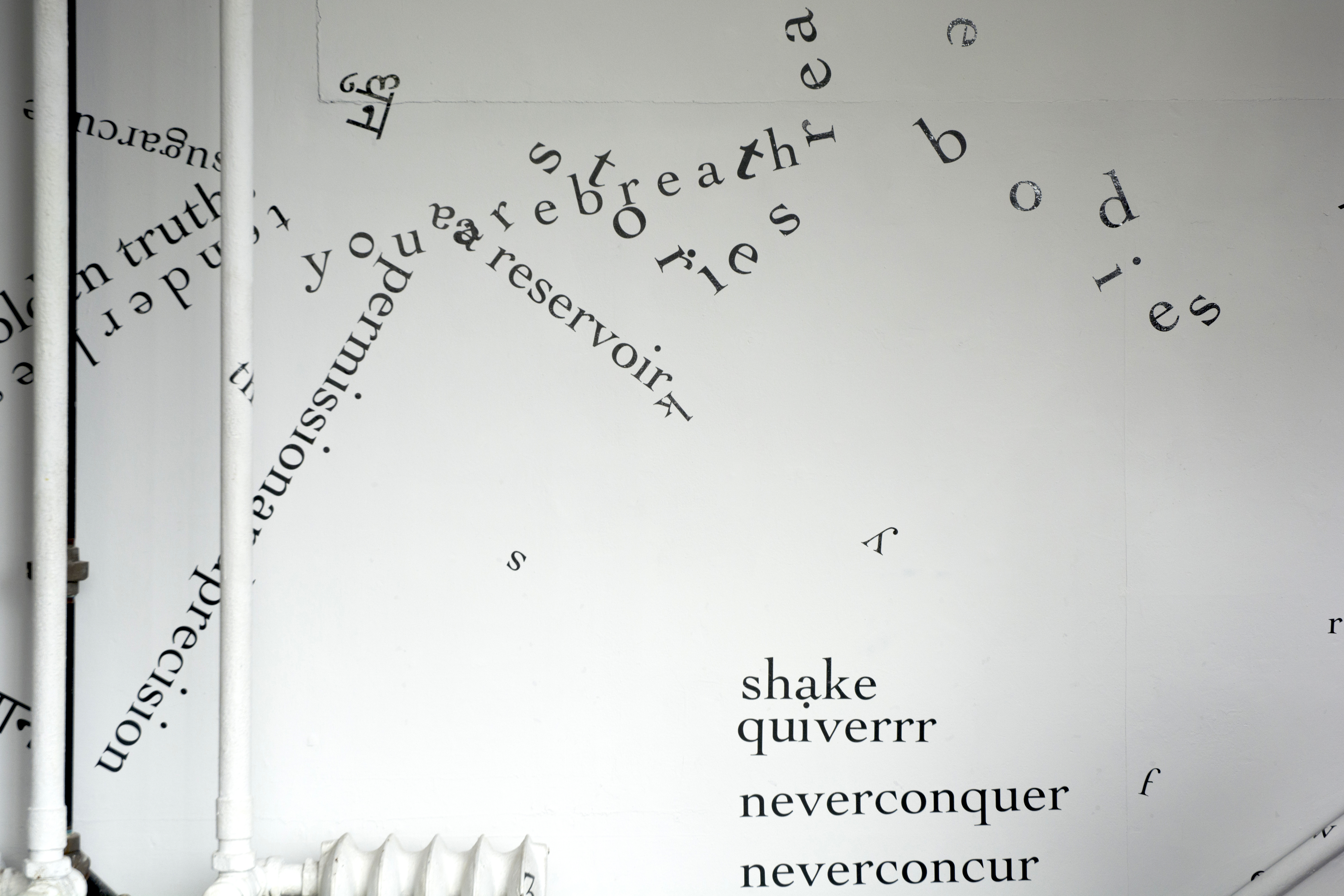
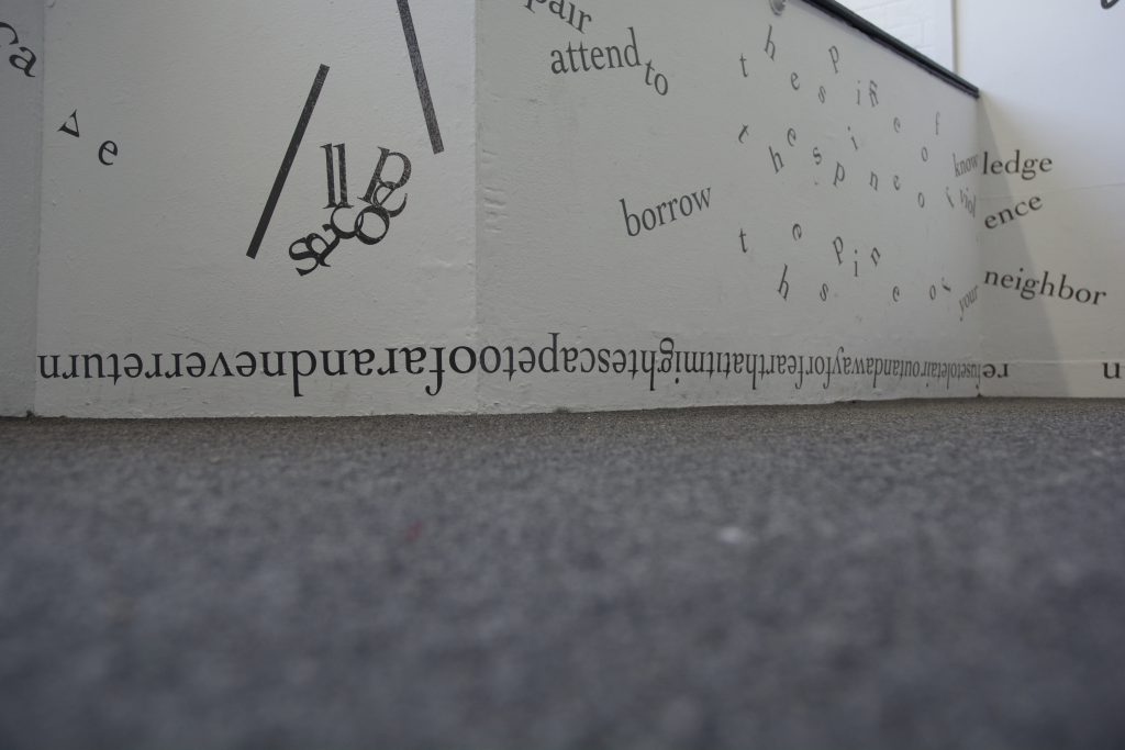
A lot of the scores are birthed from what I did last year — I did a word of the day every single day. When I was writing the scores I actually went back to all my words of the day. Because I wanted to “catch” what I had been feeling. What are the words that I constantly feel? And I love that they were simple. There was only one word that I had to look up in the dictionary, and I still don’t remember what it is, like what it means, because that’s just sort of not how my making works. Like, it’s simple. It’s talking about the sun — and it was the winter when I started — and it’s talking about land, or feet, and knees, and all of these things that I find myself thinking about and feeling regularly but I never catch. So the purpose of the word of the day was to catch that, right? I think I actually did it for 3 days more than the year, so I started it on the 29th of December, 2016, and it went on until the last day of last year. But out of all of those words, I think that at least 10 or 12 days were “quiet.” And “quiet” in Hindi and English. The bilingualness of this project is very important to me. Both in the book version and the version on the walls. In a weird way, at Roman Susan it felt like a self-portrait from the windows, to have others see, “Okay, this is this person’s body.” And then maybe wonder, “Why is that an alphabet I don’t recognize?” So I’m already sort of placing myself in this way where I’m like, “I’m a marked body, marked similarly to this unrecognizable letter for you,” versus the person who sees it and is like [claps hands] “That’s an Indian body, that’s an Indian Hindi-speaking body.”
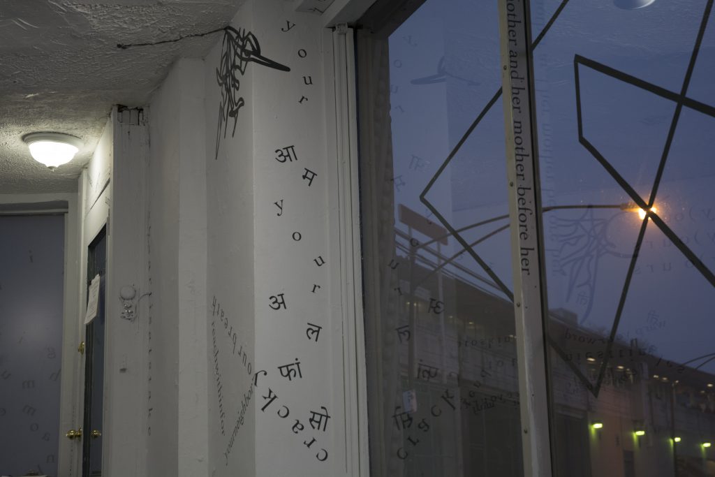
Something really interesting that happened with the Hindi for me was that I invited Lise McKean to the gallery to come look at the work. She’s an anthropologist. She studied India and lived in India for a significant amount of time, and I was talking to her about Hindi and she was like, “Hold up. You are Hindi-speaking in Mumbai. That’s where you grew up.” And I sort of had forgotten in my active brain — I didn’t forget it — but in my active brain I was thinking about Hindi in the national context, where it’s, like, the privileged language. It happens to be my mother tongue but it is also the language that the state is behind, right? India has a lot of languages, but Hindi is the one that’s privileged as “the national language,” a privilege which a lot of the other states absolutely don’t get. So I have the accident of the national language being my mother tongue and of coming from a family where it was really important for me to be able to speak and read and write that language. But I also grew up in a state where the fact that that’s my mother tongue makes me sort of susceptible to being asked to “go back where I came from.” Because the financial capital is in Mumbai and the capital capital is in Delhi, and while I’m not from Delhi, Delhi and that area is Hindi-speaking and Mumbai is not.
I mean, it’s funny because I didn’t realize until I was speaking to Lise — because she was able to read the Hindi — and then she was like, “Wait, you grew up in Mumbai,” and completely brought me back to the Mumbai airport a few years ago. At the Mumbai airport somebody was checking my passport and I asked them, “How’s the weather in Mumbai been?” And he saw that my passport read “Born, New Delhi” and said, “In my Mumbai, it’s been good. I don’t know what it’s been like in your Delhi.” And my home address is also on my passport — you know, all of these little markers, all on the same document — and it’s Mumbai! I’ve lived there my whole life. So it was funny because that was a moment where I realized not only, yes, the privilege of being Hindi-speaking in the national context, but also the absence of privilege, where my family definitely is being told that they are migrants in that land and that they have taken up all the space. So the Hindi is very important to me, in the book as well. And, I’m done. Yeah.
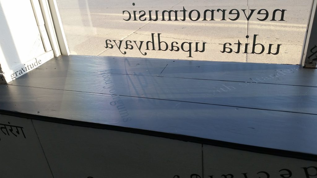
MSL: I mean, hearing you share that sort of sends me back to a place where I love that it’s such a small print-run and you’re going to know everybody who’s getting it, or most people. Because then that context — and that context of and to you — becomes even more important for being any person encountering the Hindi in the book.
UU: Yeah. I mean, I think it’s funny because the system of scores for me showed up because — as somebody who was making performance-based work and lives in a female brown body, and a legibly foreign body — I found that I had very little agency over what was being taken from me when I was performing. The reason there’s so much about knees and toes and elbows in “An Inventory[: Remnants from a constellation of lived performances]” — and in general in my scores — is because initially scores were a way for me to make self-portraits in language. I think it’s hard to have a complete story of the book without talking about that piece — maybe the scores individually you could, but the book without “An Inventory” is kind of hard to do. Because that is my body in a very obvious, literal way, that gets away from my physical body. And this is the next chapter of that.
MSL: This “nevernotmusic” book is the next chapter of that.
UU: Yes. Because I think all of the scores are gifts to specific people but they’re also gifts that I wish I could give myself. You know? Permissions I could give myself. And they’re sort of this convoluted way of caring for someone else, or self-care through caring for someone else. Which has success and failure in its own various measures. In a weird way, the book is my body — [laughs] that sounds very Christlike — but I don’t want everyone to have it. I want there to be an intimacy. This is the kind of book that I wouldn’t be happy if it’s on Amazon or even at a Barnes and Noble, or Brookline Booksmith, which is my favorite bookstore in Boston, which maybe you know!
MSL: I have been there once!
UU: It’s so cute! Anyway, I think a lot of the scores are to combat the feeling of exhaustion. And being taken off of. To me, 50 feels like plenty. Like I kind of want it to be 40. Something like that. Where I want to hold it dear.
MSL: Mmm hmm. And I think the labor is such a real part of that, too — making them with your own hands, even if other hands are also involved, and being conscious of the labor of the process.
UU: Yeah. And the labor of the scores! I mean, I literally had an injury making the scores, a shoulder and wrist injury. And [laughs] the scores look easier to make than they are!
MSL: [laughs] I think that any artist or writer can appreciate that. Yeah. Another thing about audience.
And when you mentioned doing a “word-a-day,” you didn’t mean that you were on an email list that emailed you a word every day or something, you meant that each day — at the beginning, at the end, whenever — you thought of a word and said to yourself, “This is my word for today.”
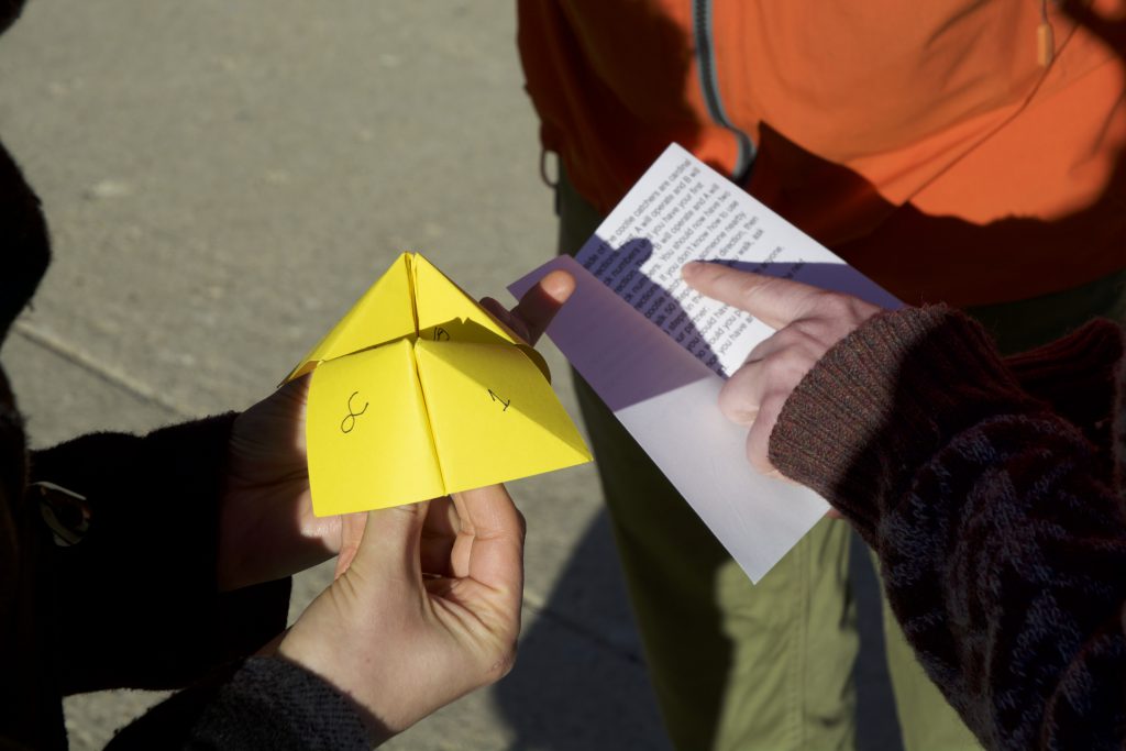
UU: Yeah. I’ll show you my Twitter. I am a Gemini, sun and moon. What that means is that, since I was a kid, I’ve been told that I don’t follow through with anything. It’s mostly true. But! In December 2016, a person I know wrote on her Facebook profile something like “I’m going to write a poem! Every single day! In 2017! It might be short! It might be long! But I’m going to do it every single day!” And I was like, “Yeah, there’s no way I’m doing that.” At that point I had already been feeling like I didn’t have a daily practice. And I have this beautiful assignment that I use as a teaching artist that is like, “the Daily Art Ritual,” which I was like, “I’ve been using this for too long without actually doing it myself.”
And I realized that the thing I could do was have a word every day — and I still do this, so “brim” and “crisp” were examples of that — where I “catch” a word that’s floating around and sort of captures the feeling of some of these things that we don’t have words for. I’m really interested in things that we don’t have words for. One of the scores refers to that, too — maybe more of them have it. So I started this word-a-day thing and literally at 7 o’clock every evening my alarm would go off. Eventually it was really annoying actually — it was great for a while and then in December it was really difficult. [scrolling and reading] August 2nd was “fluster” … “grace” … “people” … “threat.” This is all on my Twitter. It started out very literal, like “word of the day” and then the meaning. And then I started getting really bored by that. Then it became phrases too and then it became basically whatever I wanted it to be. But with that feeling of “catching” something.
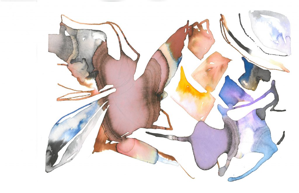
MSL: And it’s the thing that was in the air at 7 p.m. when your alarm went off? Or at 7 p.m. it was like, “What am I meditating on and catching from the day up until now?” I love this idea.
UU: Yeah, you’re welcome to do it! It was surprisingly hard. At 7 p.m. it was reflection. The alarm was just so I wouldn’t miss it. Sometimes I would just know the word at the beginning of the day. Other times the alarm would pass me by and I would just be sitting with two or three words in my head. I only missed a few times and usually when I missed it I was so bummed that the word would be about how I missed it. And “hungry hands,” for example, was something that I had been thinking about for six months. It was just that specific day that it was like, “Today’s the day that it’s coming in and I happen to be thinking about it at 7.”
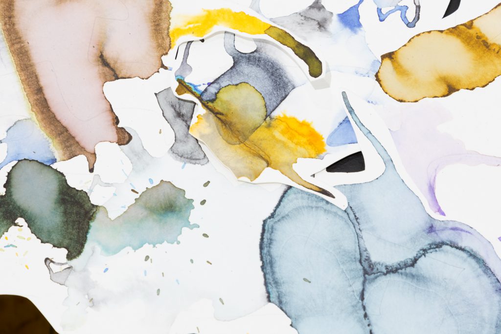
MSL: This is so lovely. So, many of your words from that long-term word-a-day process made it into the “nevernotmusic” scores — and then continued onward.
If you feel like we already covered this it’s fine, but were there any dilemmas or especially hard decisions that you encountered while you were translating or adapting the scores into book form? My understanding is that you made the scores — these rectangular, single-piece-of-paper scores — that then became excerpted and recombined and rearranged to become the works around the walls at Roman Susan, that also got activated by performers, and viewers … and then the pages of this book are again those rectangular scores. So it’s like a lovely completion of a circle. Or, in another way, “Oh, these other things happened — but this is also still the original thing.” I don’t know, but there’s something interesting happening there.
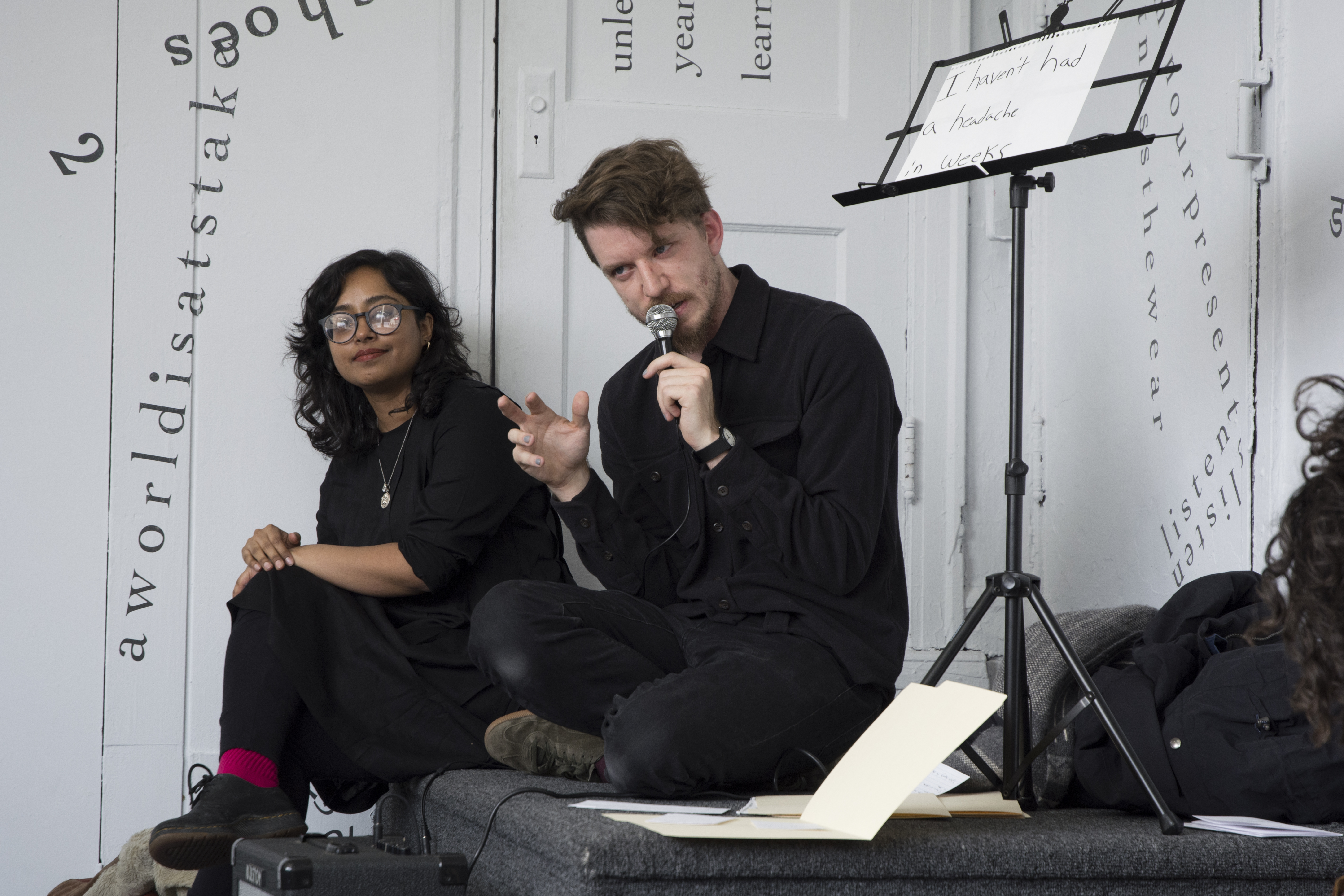
UU: I like that. Yeah.
MSL: I guess a more specific question is if there were big moments when translating it or adapting it — readapting it, returning it — to this more rectangular booklike form, when you wondered about the scores’ presentation or how you would set an order to them? Because when someone enters the gallery, they might see a word by the door first, or see a word across the room first, or one of the words on the windows first. Whereas, in the book, there’s something more specifically ordered about the scores — literally in an order — whether people open to the middle or the front or somewhere else. I guess, just kind of how you thought about those things and that process?
UU: Oof, yeah. I mean, I should always do studio visits with you. [both laugh] That’s my most important thought. I’m going to go back to the question of the 50 for a second, because I think the reason the book exists is because I wasn’t happy with the scores only being seen by 12 people — like, each score only being read by the person that it was written for. So in a way 50 is the number that is coming from one. I feel like I’m still very much in the dilemma stage. I think part of the biggest problem has been, I guess, semantics — like “book” versus “collection of scores.” I’ve been hesitant to write much about the book itself, because it kind of feels like I did all the writing. [Marya laughs] It kind of feels like there’s nothing more to say, really. And that’s been a really good struggle.
But also, when you separate the scores from the world that they literally had become in the gallery, what am I missing? What happens to a person who just sees this book? I mean, maybe I need to find people who haven’t seen the show to be like, “What do you need to know about this?” Right? It’s hard. It’s like the kid that’s trying to go to college and I’m like, “But what if you took a gap year? And did something at home?” [Marya laughs] It’s identifying with its family and it’s not itself yet, and I think I’m in the middle of those issues.
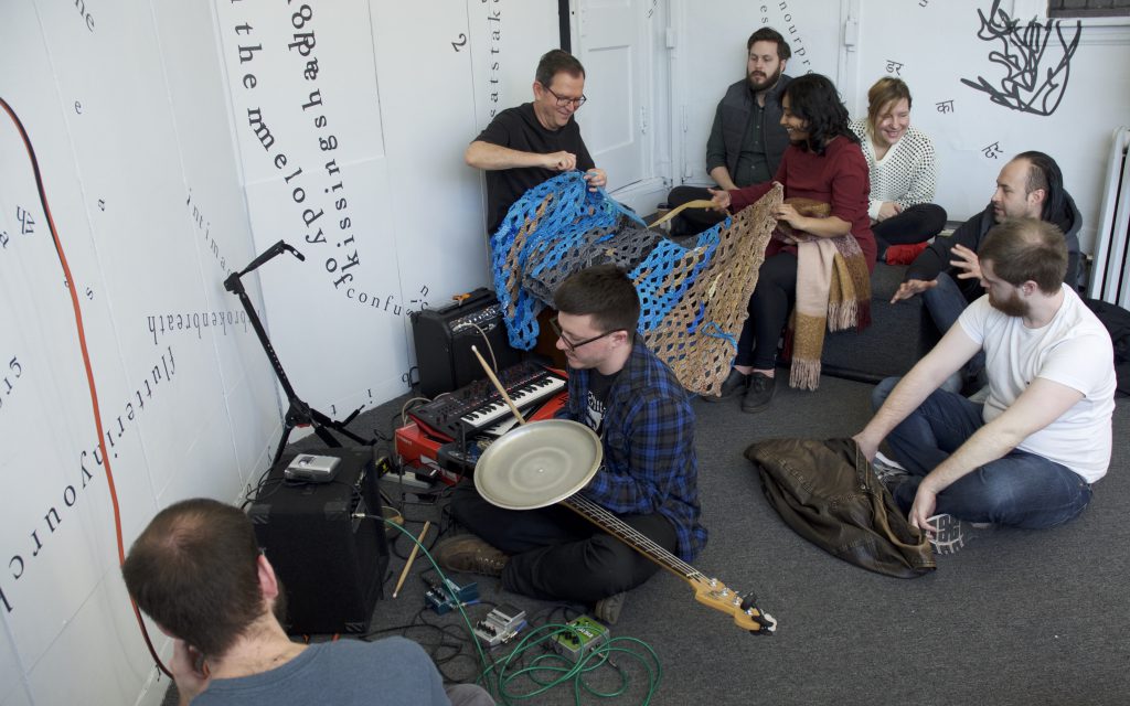
And I think a big thing has been, ironically, as flooded as the scores are, there’s also minimalism in the entire project. Which, throughout the project, has been a push and pull. I think I always have to overdo and then take out. I mean the drafts — You don’t want to see the documents from which these scores are created. They’re insane. There’s just hundreds of words in them. “But I want to put everything in there!” And I’m definitely in that stage of the book — having just seen this copy 24 hours ago — where, again, I want to include that thin line running through somewhere, and I’m like, “This is too blank!” So there’s a lot. This is still gestating and it’s still … struggling to break away from the parent. Because I do think that this book is going to be the bigger project, at the end of it, for me. Because of its longevity, because of its completion, because I want somebody to find the little moments that I feel delighted by. And speaking of the order, I know which score is related to which score. It’s almost like a call and response kind of thing in some of them. I want someone other than me to find those resonances.
MSL: Yeah, that’s great. And maybe this is related to the minimalism, but I think I initially assumed that the book might look something like the mock-up that’s in front of us, maybe because of how you had been talking about it. But as I was on my way here — knowing that you were bringing a mockup to our meeting — I was thinking, “Well, she also has a lot of documentation from the performances … maybe there’s going to be photos of the performers in the book, too, across from each score?” It didn’t feel like something you were going to do, but it occurred to me that that would be a way somebody might approach this project — almost more like a catalog of the show. And there’s not necessarily anything wrong with that, I just wasn’t actually expecting you to take that approach. And so it’s actually sort of nice to see the book in this form and to feel like … the root of it is still there. It’s still connected to what happened in the gallery space — and the performers who came into the gallery space to do that or to the sidewalk and alley outside to do that — but it also respects that experience by not trying to replicate it in a single photo next to a score. Maybe that contributes to how — while obviously it’s connected to the exhibition and the performances — it also feels like its own thing.
UU: I am hoping to have, at the book release, a few people perform their scores. So there is a thread. But I also think the scores don’t need performance. I think, as a human with a small attention span, maybe I do? But I don’t think that the scores do. I’m excited about people curled up in a chair reading them and, you know, cocking their head to one end to follow the shape of the words. You know, I can imagine that if I encountered something like this I would be reading by moving my head until I recognized that it’s easier to actually move the book around. Because I think the scores are so bodily in that way.
MSL: Yeah, that’s such a great way of putting it. I guess my last question is, as of now, how are you feeling about the book?
UU: [laughs] I think I’m still very stressed about getting it perfect, and getting these things, and getting those things, and I haven’t resolved it yet. It’s funny because when you said, “Let’s meet on the 29th of May!”, I kind of knew that I would have just gotten back from India and that I would a little bit out of touch with my life here, which is what I’m feeling.
MSL: Oh, sorry!
UU: No, it’s okay. It’s good. I feel like I’m still making the book. Like I think you had more of the feeling of “Oh, it’s a thing!” when you saw it than I had. [both laugh]
MSL: Which totally makes sense. Yeah.
UU: I think part of it is I saw the mock-up and thought, “That’s not the cover I imagined.” So it’s still sort of in trial and error. I think this conversation is really helpful for me to get the feelings about space, and weight, and gratitude that the book doesn’t have pictures from the performances. Because of course I considered that for like a second and then was like “No.”
MSL: And when it popped into my head, too, I was like, “She could do that, but I don’t think she’s going to do that.”
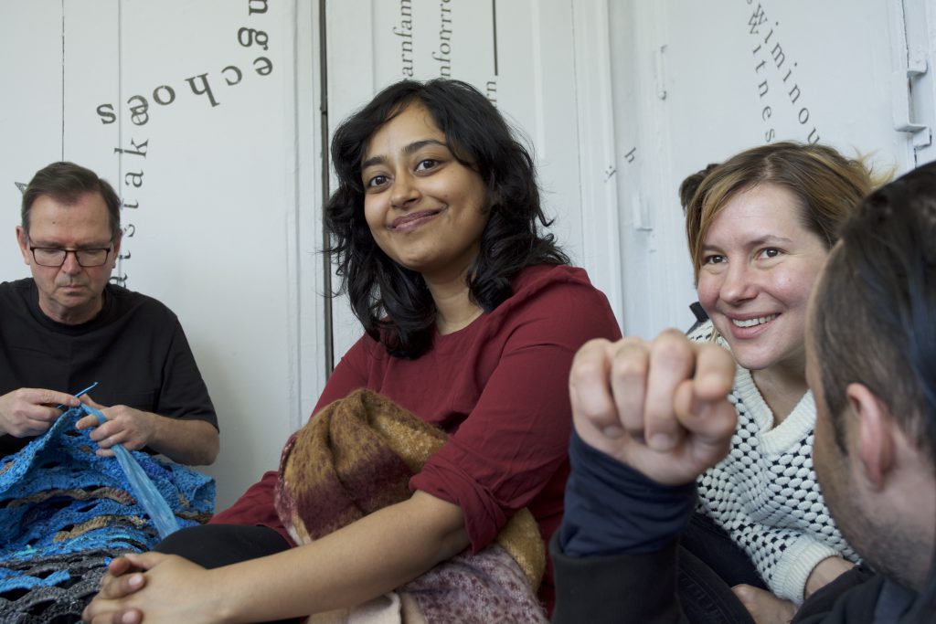
UU: Yeah. I think that one of the struggles is that the show itself felt so much like I was the curator. And I was! And there’s nothing wrong with that. But I had also made a lot of work. And while I love the liveness of performance — it is at the heart of my practice — sometimes it just really feels like performance is this shiny thing that’s happening and taking over because of the liveness, and the not-live component needs distance and space and its own thing to exist. And it’s not that scores didn’t have a chance to shine — they did — but I think the work didn’t get to live, to breathe. And that’s why the book exists. And, I mean, it would break my heart if this book didn’t exist. It needs to exist. Like, this is my work, in a really real way. So I’m excited about it. It just … needs to get through the semester. I don’t know why this college metaphor is what’s happening, [both laugh] but it needs to get through the high school semester to actually make it out to college. But yeah.
MSL: Yet, in another way, it’s well on its way there. So, here are my copies of your 12 scores, on 12 sheets of printer paper. This doesn’t feel like a book.
UU: Yeah.
MSL: [holds mock-up] But this feels like a book! Right? And so even there’s just something about its physical weight and the space it takes up and its togetherness that gives it presence. It gives it literal presence.
UU: Yeah. I think that’s why Lauren and I started to talk about having an envelope or book jacket. Because I actually feel like it doesn’t have enough weight yet. And part of it is that we are still trying to be minimalistic. At one point I was considering if I wanted to write something more about each score … but realistically, there’s not that much more to say. There’s just “I hope you enjoy this!” I mean, each score is “I hope you enjoy this.” “I hope you know you’re loved.” That’s basically what the scores are saying. So I don’t know. It feels superfluous to have many more words in there.
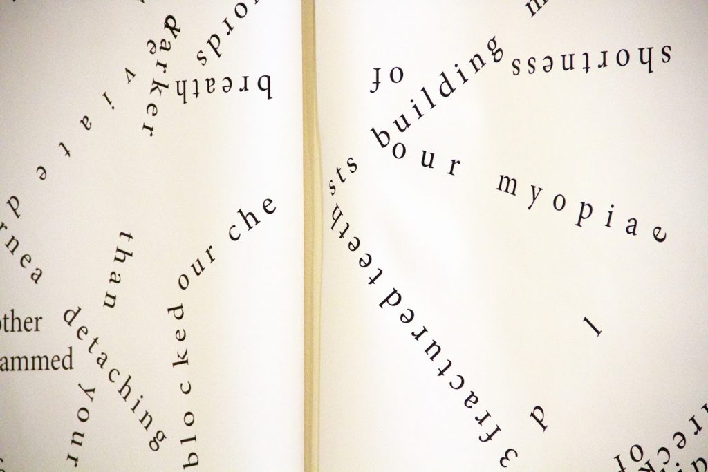
Featured image: Udita Upadhyaya, detail of “nevernotmusic” book mockup, showing part of the score “Dear Corey: Unfold (into you).” This image depicts part of a performance score, bound into a thin book. On the top page, toward its bottom-right corner, it reads “Dear Corey: Unfold (into you)” in black ink on grey paper. Across the binding, on the bottom page (the majority of the image), text, lines, arrows, and shapes appear in black ink against a whitish vellum background. Solid black abstract shapes connect and overlap, creating white space where they overlap. Lines swoop, loop, and change direction, and some end in arrowheads. Text appears in different sizes and spatial orientations (e.g., right-side up, upside-down, diagonal, vertical, and organic shapes), with some words/phrases expanded in space, condensed, or intersecting with other text. Photo by Caleb Neubauer.

Marya Spont-Lemus (she/her/hers/Ms.) is a fiction writer, interdisciplinary artist, and educator focused on teen creative, leadership, and professional development. She lives and works on the Southwest Side of Chicago. Follow her on Twitter and Tumblr.

![[placeholder image]](https://sixtyinchesfromcenter.org/wp-content/uploads/2020/12/Quenna-Lené-Barrett_Headshot-300x99.png)
