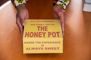
The city of Chicago is a visual feast of typography. Running a quick errand involves Helvetica humming on the CTA map while the municipal typeface Big Shoulders stands proudly across City of Chicago banners. Familiar customized fonts like Portillos and Mariano’s backdrop each passing block. Grabbing a coffee from McDonald’s will be an explosion of Speedee, from the restaurant signage and food packaging to the employees’ name tag.
This city, brimming with dancing fonts, catered to catch our eye, becomes white noise. Letters Beyond Form: Chicago Types, currently on view at the Design Museum of Chicago, turns this white noise into a symphony. By removing all other sensorial stimulation and extracting typography, letter by letter, this exhibition opens an atmosphere of curious celebration for the fonts that build our city. Letterform becomes a means of investigation into the deeply personal and profoundly political impact of type.
A series of four letterpress prints on paper titled “Compliment Cards” exemplifies the change in connotation that can be applied by choice of lettering. The description reads:
“Lettergang styles in gang or part crew culture can hold significant meaning depending on their depiction…In Chicago gang culture, we see these ornaments and letterforms moving off compliment cards and into graffiti and street art. The ornate style of blackletter, iconic in this culture, is referred to as Old English.”
Chicago’s organic need for efficient, eye-catching, and affordable advertisement led to the recognizable fluorescent primary color palette paintings that populate the city, highlighting savings at local grocery stores. The painting HoneyDew Melons 2 for $5.00 by Tom Lee exemplifies the cultural aesthetic that was born from this need. Though originating in Chicago, this technique has since been adapted in the surrounding cities. This piece indicates the ripple effect in font and design choices that are strong enough to circumvent mere trend and instead become an integral, recognizable pillar in a growing community.
After visiting this exhibition, I felt as though I was gifted a sixth sense. I noticed how the typeface populating each surface that cradled my walk home changed from neighborhood to neighborhood, block to block, then building to building as my vision zeroed in. Each letter carried significance, an opportunity to consider its creator and the problem that typeface was solving. In an effort to absorb this sixth sense into a long-term practice, I set out to capture typefaces. This exhibition highlights the life cycle to typography that if not intentionally cared for, can lead to its extinction. To reflect this ephemeral nature of type, I chose to document the typefaces I encountered in lumen prints. Using a slow, sun-dependent process, lumen prints are characterized by unpredictable shades of pinks, purples, and blues. Importantly, the unfixed print will eventually fade as time passes. Though photographing type would have served as a useful solution to my goal of collection, the slow process and inevitable erasure of the lumens allow me to spend more time with each form, contemplating it’s shape, significance, pitfalls, and triumphs. By stripping the remaining senses from the typefaces and working with each font closely, I was able to study each letter with the care that Letters Beyond Form: Chicago Types so beautifully exemplified.
. . .
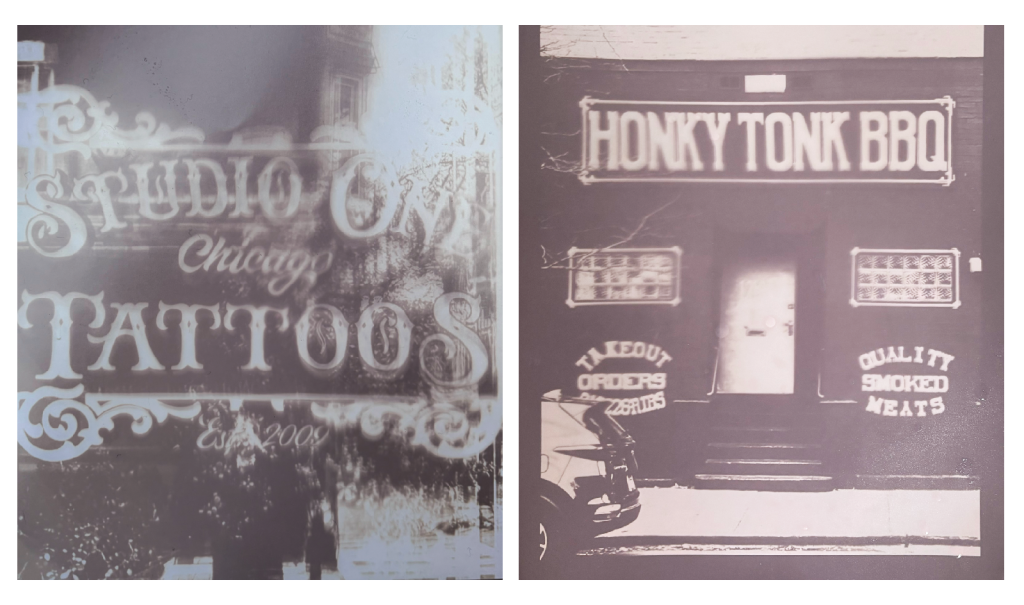
On the left, a sign reading “Studio One Chicago Tattoos” is proudly framed by a swirling, art nouveau-style design. The background is a deep purple, while the text and frame spring forward in a light pink tinted with a touch of yellow. The slippery illustrative movement of a tattoo pen leaps off the skin and onto Studio One Tattoos’ sign. The typeface is enveloped in curling lines, summoning images of intricate tattoo sleeves, wrapping around a forearm like vines on a tree trunk. Contrasting this is the typeface of Honky Tonk BBQ, which squishes rectangular letters in a strict, orderly manner as if branded onto steel. Beneath the sign sits a door propped open ominously. On each side of the door sit rectangular windows each made of eighteen glass cubes. Toward the bottom right of the print reads “quality smoked meats” in the shape of an eye, with “quality” the upper lid, “meats” on the bottom lashline, and “smoked” on the iris. A feeling of seriousness is served up proudly on an imagined rectangular metal dinner trays, all from the choice of font alone.
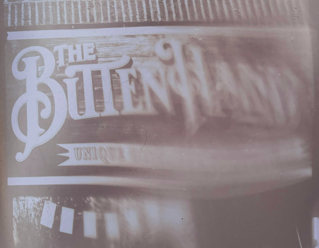
This print sits horizontally, depicting a wooden textural sign that predominantly reads “The Bitten Hand,” sitting on top of a ribbon shape that reads “Unique Gifts for Unique Guests.” The left side of the print is crisply in focus, while the right side gets gradually more smudged, as if a palm was drawn across the print from left to right when damp. There are seven rectangular forms hanging from inside the shop that creep out in the bottom left corner. Each letter of the Bitten Hand’s signage offers its own playful flourish while nuzzled tightly together, inviting a child-like whimsy. The typeface communicates selling lightning in a bottle with such ease that their tagline “Unique Gifts for Unique Guests” is nearly redundant.
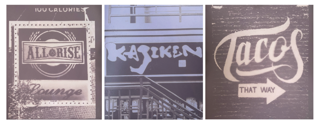
This triptych starts on the left with a sign reading “All Rise” in all caps, embellished with swirling serifs as the phrase packers in the middle. “Lounge” is written beneath it in a sultry italicized cursive, inviting a sense of intrigue to the location. The combination of these two quarreling fonts presents the function of the space as a mystery. The sign is framed in a light, dotted rectangle. The middle image reads “Kajiken” in a thick, handwritten type that almost looks carved out of wood, as it stands proudly against its pure deep purple backdrop. On the right image, the word “Tacos” appears in a swirly, loosely cursive font, punctuated by an arrow pointing right with the words “That way” in an all-caps font. The large, painterly letters of the top text resting upon the understated bottom text feels like a scream, then a whimper.
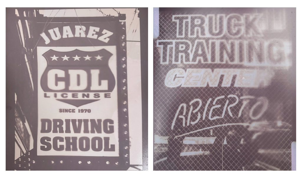
On the left hangs a sign that reads “CDL License Driving School” in thick, block capital lettering on top of a shield shape with five stars peppering across the top. The text is framed by a dark outline with lightbulbs, emulating a sense of eye-catching authority. On the right is an image of a window backed with a sheer, square netting, with text reading “Tuck Training Center” in another authoritative all-caps font, punctuated with the text “Abierto” underneath in a soft, handwritten-like font, reinforced with a sketched out underline. When it comes to the automobile industry, we expect to be greeted by a feeling of trust, security, and safety. The commanding presence of these signs for a driving school and truck training center scream vehicle louder than a tire screeching to a halt. Though executed differently, both of these typefaces are honest, authoritative, and undeniably auto. This use of type is effectively timeless, as its recognizable across generations. There is no experimental pretense, only forthright and sincere communication.
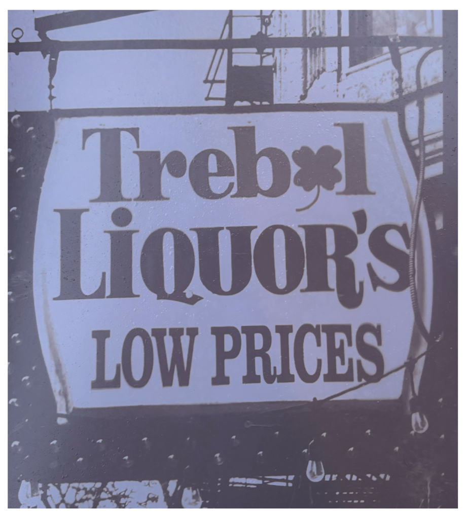
This image includes the text “Trebol Liquor’s” in a bold, serif font with the “o” replaced with a four-leaf clover, and “low prices” stands proudly underneath in a squished, tall typewriter font. The sign bulges in the middle, and the remaining plane of the image includes shapes and shadows of the surrounding cityscape. Playing with the form of the letter “o” as an opportunity for imagery stretches the imagination and summons a playful energy, helping this business stand out against the oversaturated landscape of liquor stores.
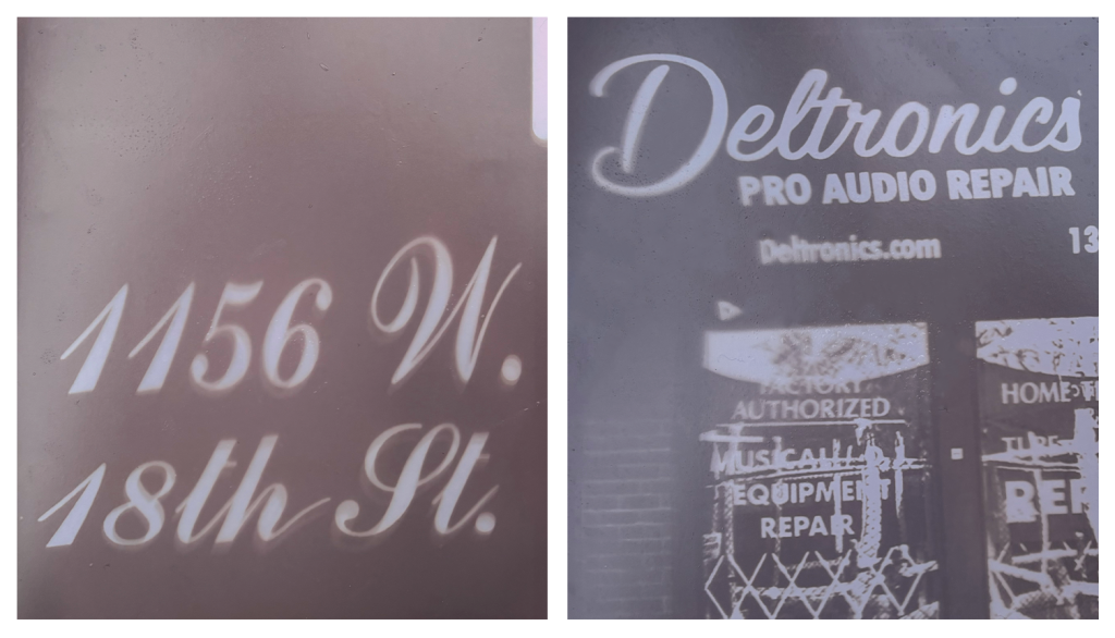
On the left, the print shows a gradient purple plane with the address “1156 W. 18th St.” peeling through in a classy, cursive serif font. On the right, “Deltronics” is depicted in cursive on top of the entrance door. Beneath this is “pro audio repair” and “Deltronics.com” in a san-serif, bold font. The doors have “Factory authorized musical equipment repair” pasted onto them, and diamond fencing indicating the store is closed. Cursive is a curious creature, as it can communicate both elegance and satire, depending on its placement. The address on the left reads regal and proud, while the Deltronics sign feels eclectic and playful. One invites you in with open arms while the other remains shy and standoffish, exemplifying how versatile these dancing, lazy letters can be.
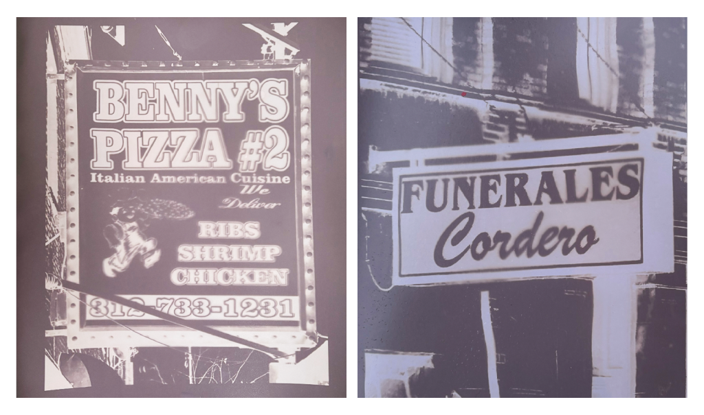
On the left is a sign that reads “Benny’s Pizza #2” in a big, bold, outlined font. The same font also sketches out “Ribs shrimp chicken” and the phone number for the business. In a small, more animated font reads “Italian American Cuisine” and “we deliver” in cursive. There is a negative of an illustrated person holding a pizza. The sign is framed in theatrical lights. On the right is a sign that reads “Funerales” in an all-caps, sobering font with “Cordero” underneath in cursive. Both signs exemplify the power of combining two starkly different fonts to communicate urgency, even through their different tones.
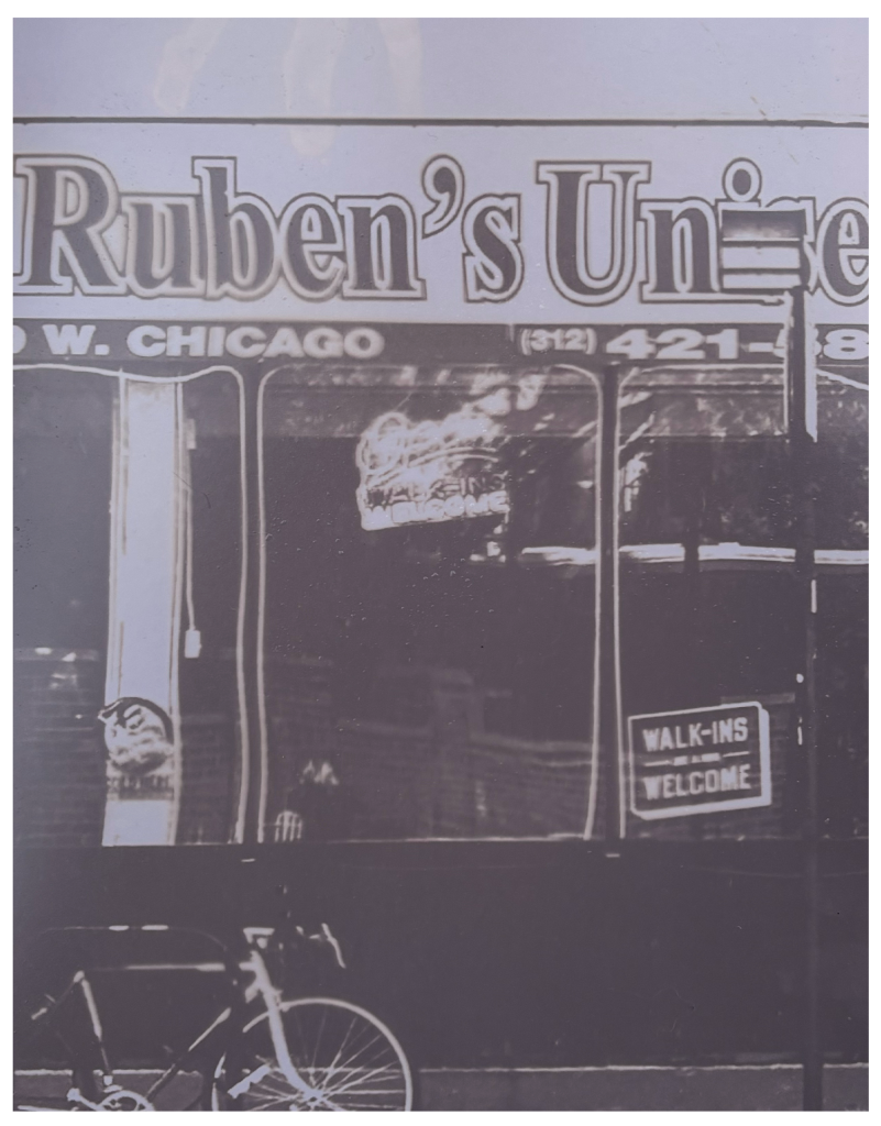
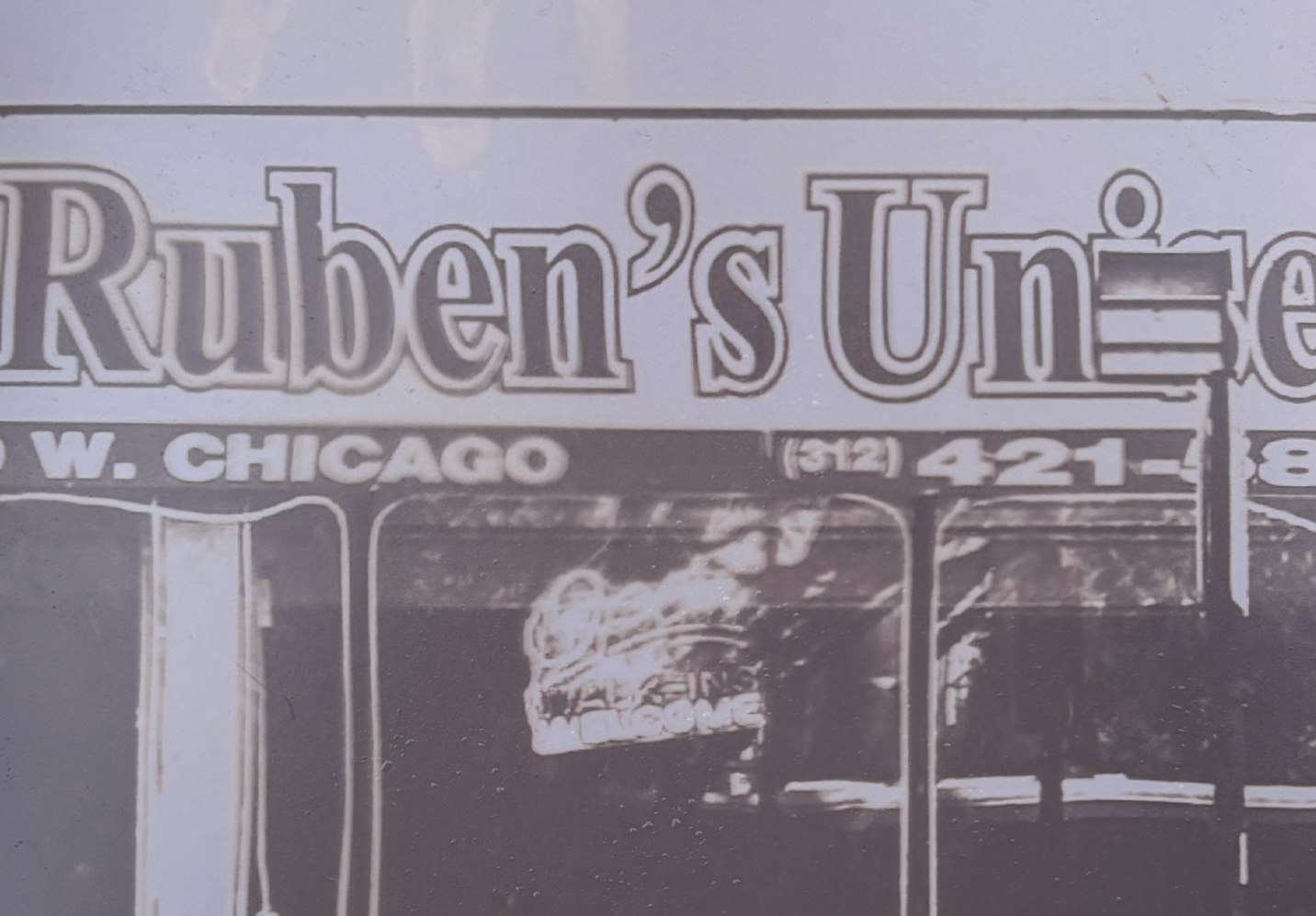
At the bottom left of the image is a bicycle tied to a rack, standing in front of a window front with an awning that reads “Ruben’s” in a bold, outlined font, standing dark against the pale purple shade of the draping. The address and phone number to the business stands proudly on the lip of the awning in a thick, no nonsense font. Toward the bottom right is a sign that reads “Walk-ins welcome” in a purposely haphazardly, upward tilted direction that communicates a genuine sense of openness.
. . .
The typography that ripples through Chicago is more than a powerful visual tool—it is a reflection of this city’s diverse communities, history, and ever-evolving identity. Letters Beyond Form: Chicago Types invites viewers to slow down and study typography for what it is: a dynamic form of communication that shapes our life experience, so quietly and effectively that we barely notice. This exhibition invited me to notice, and I invite you to join me in noticing, too.
Letters Beyond Form: Chicago Types is on view at the Design Museum of Chicago from November 9, 2024 – April 4, 2025. The exhibition is presented as part of Art Design Chicago, a citywide collaborative initiative organized by the Terra Foundation for American Art. The exhibition is among more than 35 Art Design Chicago exhibitions that highlight Chicago’s unique artistic heritage and creative communities.

About the Author and Photographer: Ally Fouts is an arts writer and graphic designer based in Chicago, IL. She holds a BFA in Graphic Art, Media, and Design from DePaul University. With writing, she is especially interested in investigating alternative photography and sculptural work, and jumps at the chance to amplify dedicated arts workers through interviews. In addition to Sixty, she contributes writing and design to Newcity, and Chicago Reader.
