Room Tone was a 2026 solo exhibition by artist Adda Farcus (they/them) at Eureka College, curated by Alexander Martin (she/her). Farcus, a Midwest native, grew up in Coal City, and has taught in higher education at a handful of universities including Illinois State University, University of Illinois at Urbana-Champaign, and Texas Tech University. They are currently an Assistant Professor of Instruction and Assistant Director at the University of South Florida.
I have worked with Farcus periodically since 2017 through various exhibitions and events relating to our separate artist-run spaces of Project 1612 (Bingham) and Lease Agreement (Farcus). Farcus wrote that Room Tone is “a stage and environment of sound and color which explores mortality and climate change.” The exhibition included a series of poetry booklets, two installations, sound, and a film projection. All works in the exhibition, and related projects for this interview, are dated between 2023-2026.
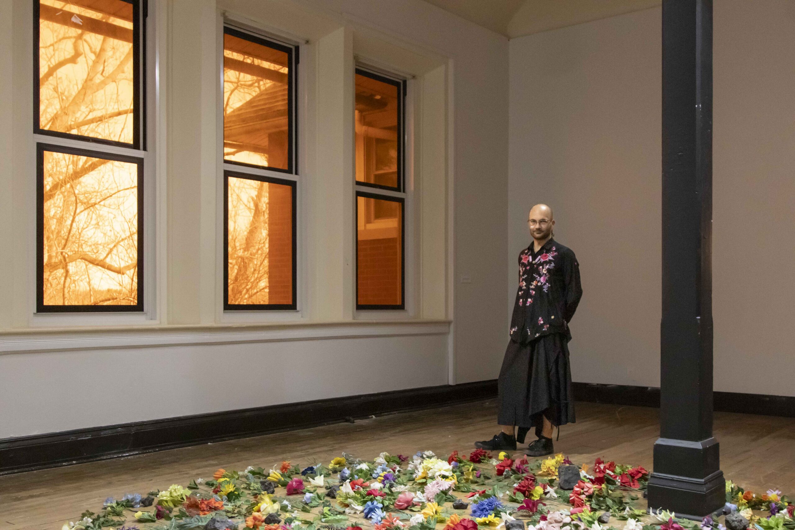
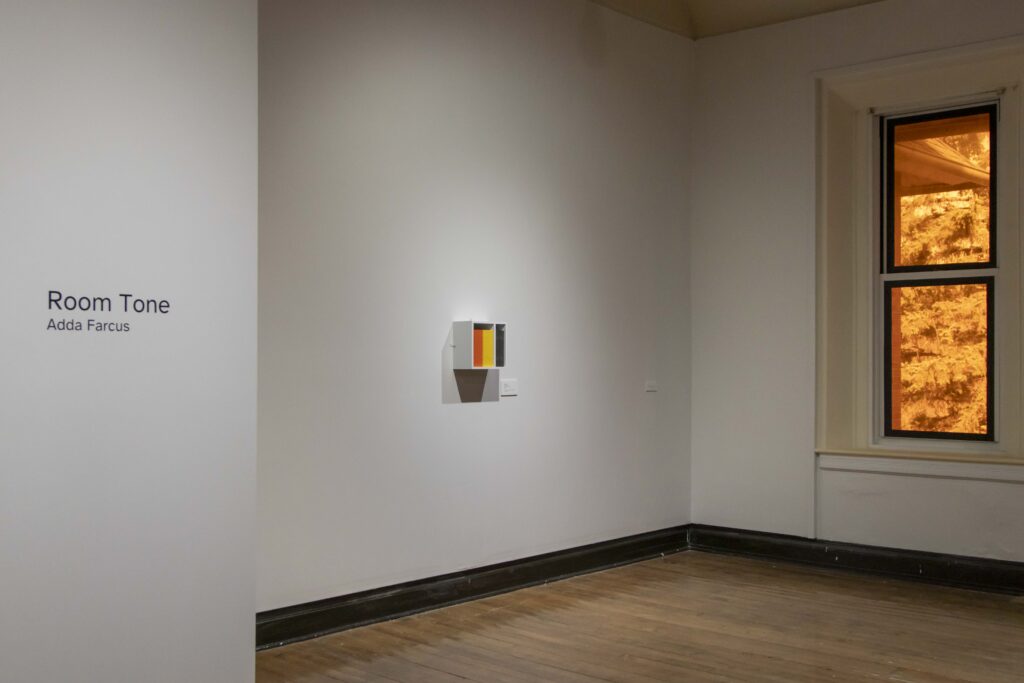
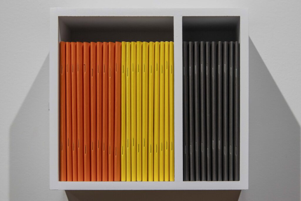
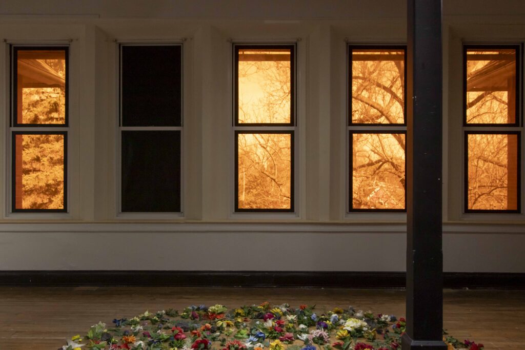
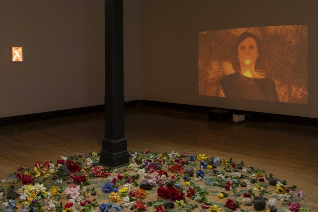
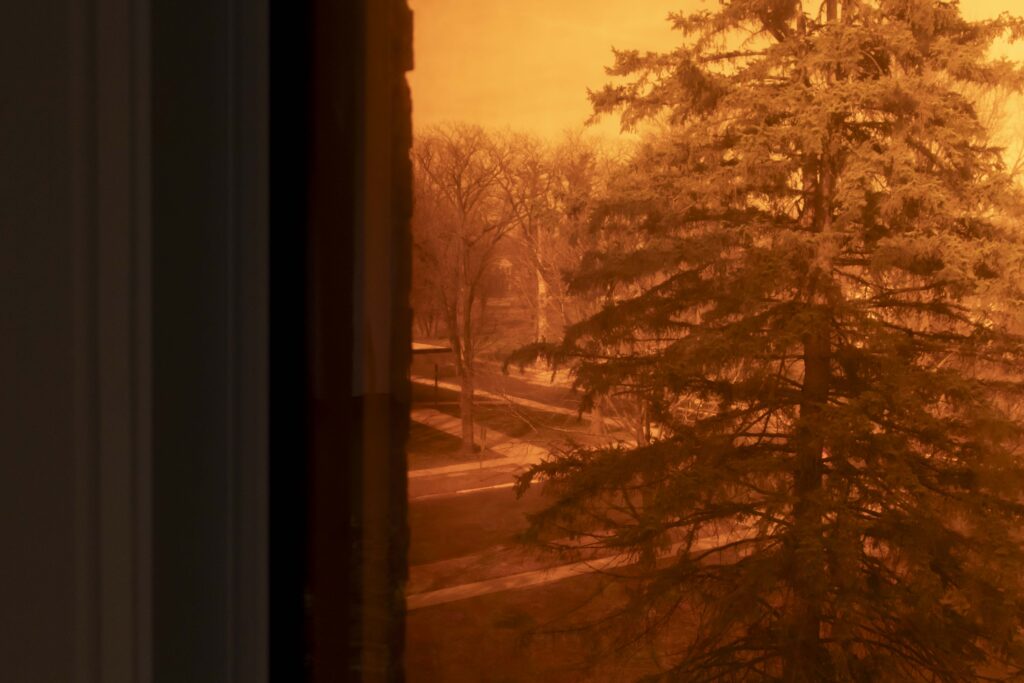
According to Farcus’ Room Tone exhibition statement, the pieces at Eureka College were inspired by interviews and partnerships with “people in death-and-grief-related professions regarding their thoughts and feelings about climate change.” The color orange is a prevalent aspect of this series, and the color of several of their interviewees associated with climate change. Three of the four large vertical gallery windows were covered with a burnt orange film, and when peering outside, the spring trees waiting to bud eerily resemble charred trees against a wildfire orange sky. The fourth window was entirely black, while a small light box mounted on the wall glowed the same orange as the other windows. A series of chapbooks (readers) fit snuggly in a white box on the wall opposite the light box; their pages filled with collected poetry about wildfires led readers to imagine their own fiery catastrophe. Centrally placed in the gallery was a large circular floor installation titled “Wake”. Made with discarded cemetery faux flowers, the green stems all pointed the same direction. The faded fabric petals appeared brighter next to dark grey clinkers—coal remnants of fossil-fire power plant combustion—collected by Farcus in Springfield. Connecting various aspects of the exhibition was a film projected on the wall which illuminated the space with the same burnt shade as the windows. The short film, titled death doula Ames Meeks chose this color to represent their feelings about climate change, featured an interview segment between Farcus and death doula Ames Meeks. The interview exchange between Farcus and Meeks is captioned at the bottom of the frame while musical components by Farcus make up the film audio. The scenes show macro and micro shots of dry grasses, trees, signage for burned areas, and Ames within the landscape with their dog. Dystopian audio plays through headphones resting on a bench where viewers could individually immerse themselves in the flame-like light, words, emotions, and sounds of a climate changed landscape. This film was recorded in Tucson (Cuk Ṣon) and Mt. Lemmon (Babad Do’ag), AZ, and Tampa (Tanpa), FL; related audio is linked in Farcus’ Bandcamp page.
The following interview focuses on a continued series based on what Farcus calls, “eco-grief and climate-driven anxiety.” Considering the physical distance between us, Farcus in Florida and myself in Illinois, this interview was completed through email and Google Docs.
This interview has been edited for clarity and length
Jessica Ott (Bingham) (JO): Your work builds upon the ongoing climate change issues we are facing today, and also emphasizes the emotional impact it has on humans.
I am curious to learn more about your process of connecting with death-and-grief professionals and the use of materials you collected.
Adda Farcus (AF): I am always collecting objects that I find to communicate some element of the climate-change-related emotions I’m mining. In finding death-and-grief-workers, I understand my process to be similar. I’m collecting people to engage with who can support and deepen the understanding of these emotions. I am using creative strategies that include chance and play to create pieces that are not didactic in how climate change related emotions are portrayed.
JO: Can you elaborate on what “climate-change-related emotions” are you referring to when searching for materials? And since the found objects are crucial to your practice, are there specific items you are searching for, certain criteria that you have in mind? What does this part look like for you?
AF: Another term for these emotions is psychoterratic states, which Glenn A. Albrecht defines in his book, Earth Emotions: New Words for a New World, as “Emotions related to positively and negatively perceived and felt states of the Earth.” For myself I’m thinking about a few different emotional states: eco-anxiety, global dread, solastalgia (the loss you feel when your home changes around you), mermerosity (in one’s sense of place, the worry about what’s common in being replaced by what’s uncomfortable), and the hydrosumbiosic (water-centered more-than-human mutual interdependence). The objects I collect have emotional resonances that match my psychoterratic emotions, which recently has mostly been eco-anxiety. A lot of the objects are abject, which is aligned with anxiety, I think. As a process, finding objects is really like “I know it when I see it.” I don’t think I could teach someone to do it for me because it is so internal and emotional. Occasionally the objects are related to climate change—such as dead coral, hurricane Harvey rain water, or charred wood from the 2018 Camp Fire in Paradise, California—but not always. I keep these objects in my studio where I have space to play with how they fit together formally and conceptually.
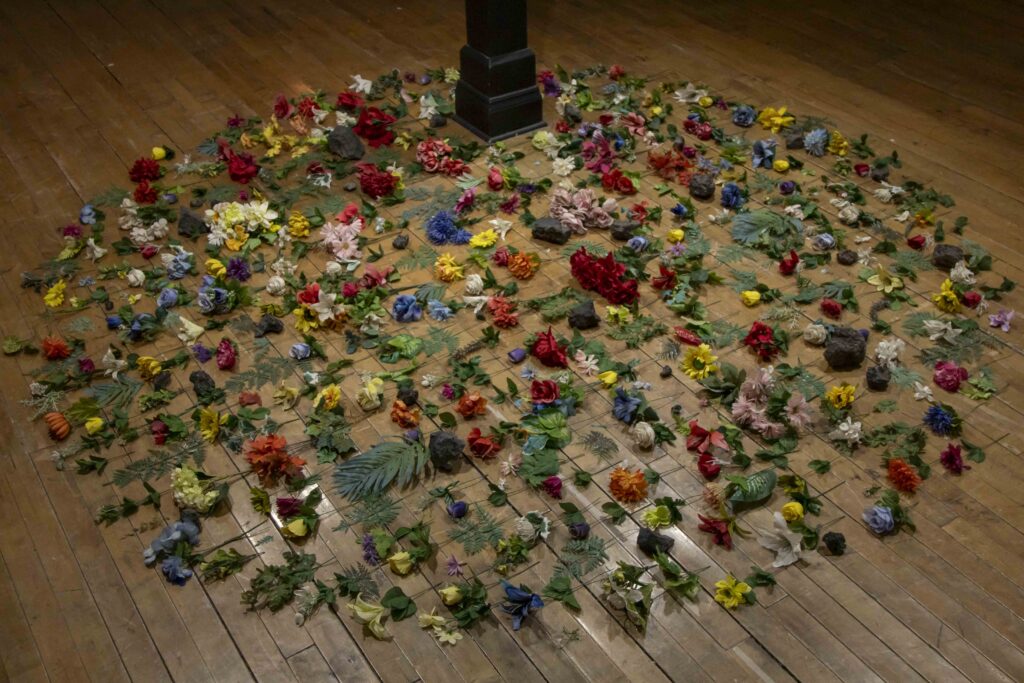
AF: The one found-object piece in the exhibition, Wake, is made with objects that I had collected at about the same time. It is made of discarded faux flowers that I collected at a few graveyards and “clinkers,” which are rock-like remnants of coal-fired electricity generation. I didn’t know the name of those rocks until after I talked to my dad about them—he used to work at the Collins Generating Station in Morris, Illinois. I knew these two things went together to address ecological grief: the flowers represent loss and grief and the clinkers are the direct symbol of the fossil fuel industry. And, they felt right on the floor because both objects were found on the ground. The process of making Wake started with me playing with organization of the objects into different shapes on the floor: a pile, a square, a line, and finally a circle. I think the circle worked because it is an inescapable form. It keeps your eye trapped inside, akin to how grief can have a perpetual emotional hold on you. The longest part was finishing the piece by deciding that the clinkers would be spaced in a random manner, while the flowers would all be oriented in the same direction. These final decisions about orientation and spacing were only formal, but the layout does help to create a work that can keep people’s attention. The title came early in the process. Like many of my titles, Wake has multiple meanings that can influence different interpretations of the piece. A wake means a vigil before someone is buried (connecting again to grief), to stop sleeping (meaning to become aware of eco-grief), and a track or path left by something, like a boat. I know that the effects of climate change feel like waves crashing on my emotional body.
JO: Why was it important to you to exhibit this specific work in central Illinois?
AF: I have been working toward exhibiting these works together for two years. It was the material resources, Alexander Martin’s curatorial support, and opportunities granted by the gallery space at Eureka College that let me create the installations that I haven’t been able to execute before. For the new installation of the light-based piece, the color Andrea Estrada, a funeral director, chose to represent her feelings about climate change, I was finally able to make the piece in a form that I had wanted to do since 2023. I used lighting gels to cover the gallery windows, then the daylight made the space glow with Andrea’s color. At night, when viewed from the outside, the gallery looked lit-up with an unsettling light. The effect of altering all of the daylight makes the piece immersive and matches the way that Andrea described the overwhelming feelings she has about climate change.
JO: Can you walk us through the process of interviewing death-and grief-professionals? What sorts of questions do you ask and how do these interviews show up in the physical work?
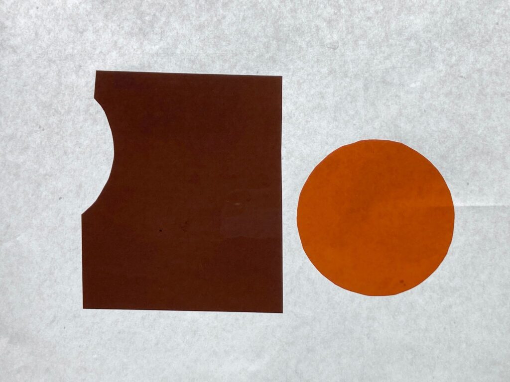
AF: I start the interviews by talking through the project, which describes why I want to work with grief-and-death workers. After that it is a conversation where I want to hear about three main things: how and why the person got into grief or death-work, what their feelings are about climate change, and what color they would pick to represent their feelings about climate change. I point them toward picking a color from a palette of color effect filters, or lighting gels, because the task is easier to do when you have some options in front of you and because lighting gels allow me to use their color to make light-based works. It is common that the interview evolves into a discussion of books we love, experiences we’ve had, common connections between us, and things I’ve heard from other grief-and death-workers. It’s usually these unplanned conversations that lead me toward the final form and the meaning of the work. Sometimes I’m taking what I learn from the interaction and making a piece, but with other people it is more collaborative. It depends on the person and our interactions. In some cases the process is short—an interview and a few email exchanges—while in others we work together for months or years.
JO: Could you elaborate on the questions and relationship you built with death doula Ames Meeks. You’ve based several pieces on Meeks’ experience with climate change and wildfires, including death doula Ames Meeks chose this color to represent their feelings about climate change, Score for Ames Meeks, and Mt. Lemmon, among others.
AF: Ames Meeks is doing cool and important work. They are a death doula, zine maker, and a Program Manager for Southern Arizona Senior Pride. The interview with Ames started with a cold email to them, which led to an initial video call in mid-2024. Ames took some time after our call to pick a color, “512 – Amber Delight” as produced by Lee Filters, that represented their stress and anxiety related to climate change and directly matched the color of the sky over their home during a wildfire. I spent about a year and a half doing research (consuming video, articles, poetry, and field guides about wildfires), playing with materials, and talking to Ames until I scheduled a trip to visit them in Arizona. On that trip, I recorded the video for death doula Ames Meeks chose this color to represent their feelings about climate change (2026) and some of the audio for the album Mt. Lemmon. Mount Lemmon is a mountain over Tucson that periodically has wildfires, evidence of which is still present and included in the video piece. This process produced a number of works: a set of ongoing zines, a graphic score, a few poems, an album, and a video. Except for the poems I wrote, all of these works were included in Room Tone. Ames and I have gotten closer through all of this and now I usually see them on Wednesdays in an online trans poetry writing group run by TC Tolbert, Trans/Space, that Ames invited me to.
JO: Were you surprised by the consistent association for grief workers with burnt orange, or as Lee Filters calls it, a “dark dirty orange,” as a connected color to climate change?
AF: I was surprised, because past experiences of asking this question has led to more variety, and also not because I think orange brings up connotations of alert, warning, heat, and dead matter. The colors that Ames Meeks and Andrea Estrada chose look very similar in the gallery, but they are slightly different. Andrea picked a color, “511S Bacon Brown,” that is more desaturated, like brown, and Ames’ color is more warm and orange. They also picked them for different reasons. Andrea said that the color felt like the anxiety she has regarding climate change and that if it were painted on a wall that it would be a constant reminder about the world’s mortality. Ames picked their color because it matched the color of the sky over Flagstaff during the wildfires they experienced there.

JO: As an educator who was born and raised in the Midwest, and has since lived and worked in various locations around the United States, how do you think climate change has impacted your students and their emotional states?
AF: When I have conversations with students about climate change (they come up naturally) I am struck by how broadly they understand how urgent and dire the situation is. For them, the local environmental effects of climate change sometimes trump the more well-known news headline concerns. For example, in Lubbock, Texas, many students understood how their immediate environment has suffered from a long-term drought and high levels of underground water extraction for monoculture. In Tampa, the climate change effects—sea-level rise and more extreme storms—are issues that most people know of. The emotional responses are similar across the board, though. There is a lot of anxiety, avoidance, and hopelessness. In my classes, students have the agency to choose what their work is about and it isn’t uncommon for some of them to want to address climate change and ecology in what they make.
JO: Climate change impacts us all. Are you open to interviewing other professions, perhaps therapists or school teachers, and/or students about their ideas and color associations with climate change?
AF: Yes! In the past I have done similar projects where I’ve interviewed an array of Texas panhandle locals (Solastalgia (Lubbock)) and central Illinois climate activists (after the winter). Though, in this current series of works I am interested in investigating the psychoterratic state of eco-grief. By working with death-and-grief-workers I hope that we are able to communicate ideas about how we need nuanced understandings of mortality and climate-related grief.
Moving forward, I want to further mine social overlaps. Climate change does affect us all, but it does not do so equally. The effects of climate change intersect with and multiply the impacts of classism, economic inequity, racism, gender inequity, xenophobia, and other forms of oppression. I’m particularly drawn to Edwige Tamalet Talbayev’s research on necropolitics and climate-driven migration. I do not know what this work looks like yet, but I know that it will need to start with me asking to be invited into communities and talking to people.
JO: For as long as I have known your work, collecting found objects is a significant part of your practice. I view the act, or art, of collecting as your way of not adding to climate change or overconsumption. Yet, I am curious if you wrestle with your own contribution to climate change?
AF: Working with found objects, often trash, is about economy in multiple ways and can lead to a few kinds of interpretations. The objects speak to an ethic of recycling (as you alluded to), and they are accessible or common. If my work can get people to think about the capitalistic drive to consume more and more without consideration for the ecological impacts of the system, that is great. If the works reach people emotionally and personally, I hope to affect larger impacts on their knowledge and awareness, leading to advocacy and actions.
For me, this brings up a question about climate activism because, like all kinds of activism, it is a kind of practice that has both larger impacts, like my work in Room Tone, and smaller humble actions. By example, I live and work in a sub-tropic region where climate control is a ubiquitous modern convenience—so my AC is currently running, but is set to 80°, and my choice to be a vegetarian is related to ecological concerns. (I also don’t enjoy meat). For how I navigate how I am contributing to climate change, it is a matter of ongoing reassessment and informed decision-making. Because of the seemingly unstoppable post-industrial capitalistic death-drive of our society and country, it is hard or nearly impossible to live in a way that doesn’t have some negative ecological impact. My hope is that my activism, teaching, and art does some work to counter the extractive structure and lead to a more sustainable future.
JO: Room Tone places an emphasis on wildfires caused by climate change. While wild fires do impact the Midwest, the damage and impact is significantly less than other regions of the country.
AF: I think it is important to bring the climate change reality of other lived experiences to audiences who might only know these stories from the news. The major impact seen in the Midwest has been smoke and air quality when there have been fires in Canada and the US Rockies.
JO: Are you open to considering tackling climate change related issues? Extreme floods and drought, and more specific to the midwest, there have been tornadoes as early as December.
AF: For sure! My piece, Wake, which was included in Room Tone, is made of materials from central Illinois. The discarded cemetery faux flowers were from graveyards in Urbana, St. Joseph, and Bloomington. And the “clinkers” were collected in Springfield. Growing up in Coal City, Illinois, I have a connotation with this part of the state being heavily influenced by coal extraction and fossil-fuel power generation.
For after the winter, I used an interview process similar to the one I am using with grief-and-death-workers, except I was interviewing central Illinois climate activists. It was my interactions with them that guided that video toward its central themes: the unsustainable practices of corn and soybean monoculture, fossil fuel power plants, human domain over nature, and the hope for an ecological renewal.
The timing of the invitation and installation for Room Tone didn’t allow me the time to make new work about the local context but I’ve made connections from that exhibition and my lecture that I hope will lead me toward new collaborations and works.
JO: I know you recently put out a call asking for more connections to death-and-grief professionals. Have you had any takers and can folks still contact you to participate in this evolving series?
AF: Oh geez—more than I expected! As of the time of writing this, I have talked to multiple death doulas, a florist, an architect who studies the architecture of death, a funeral apprentice, a clinical social worker, a 17-year emergency veterinary technician, a psychotherapist who works with LGBTQIA populations, and a hospice nurse. These have been caring and deeply human interactions. More conversations are going to happen over the next few months. I have some new pieces in the works, but none are finished and I’m waiting to get confirmation from the grief and death-workers that I’ve accurately represented them and their feelings about climate change.
JO: The exhibition tied so many elements of your work together for me, and it was visually beautiful as well. The way the sun filtered through the orange film on the windows, making the gallery glow, was quite an incredible experience. Sadly, your work seems evermore grave considering the recent wildfires in Canada that significantly impacted air quality across the United States. Thank you for raising awareness and for bringing this work back to Illinois. I always look forward to seeing how your practice unfolds.
AF: I was just visiting family in the Pacific Northwest and saw some of the effects of those fires. It is a sign of our times for sure. It feels odd to say that I’m happy to hear that those fires—right now I’m thinking specifically of Spokane—are getting attention and that those communities are receiving support. And, it is telling to me that of the wildfires happening year-round around the globe, the ones that make it to our news cycle are in Western countries. There are major fires in Angola right now, and this is only looking at one effect of climate change. There is so much work to be done and I am privileged to have the time and space to be part of it.
Thank you Jess! It was great to be welcomed back and to continue the conversations we’ve been having for years now.
. . .
The exhibition “Room Tone” was on display at Burgess Hall Art Gallery in Eureka, Illinois from March 21, 2026 – April 17, 2026.
About the author: Jessica Ott (Bingham) (she/her) is an artist, curator, mother, and educator working in Central Illinois. She is the co-director and co-founder of Project 1612, an independent artist-run organization focused on ephemeral exhibitions, community development, and participatory performances located in Morton, IL. Follow Project 1612 at @Project1612.