Read this essay in Chinese here.
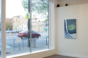
Preface / … yet flavourful showcased Dasha Shishkin’s drawings and prints alongside Braden Bandel’s paintings and ink on paper. The former often constructs scenes with figures, where the brushstrokes reveal layers upon layers; the latter frequently depicts sceneries, using the designated colors to render the subjects in an irrational manner.
Some things captivate your attention more than you might expect at first glance.
Art writing can sometimes constrict your understanding of a work, which is why part of my purpose in this review is to counteract that tendency, allowing for a degree of freedom both for the work and for myself. It’s essential to maintain a sense of distance between the piece and myself because ultimately, it is my interpretation that is being expressed, distinct from the self-contained nature of the artwork itself. I hope the reader can appreciate this nuanced approach.
“[Matthew Metzger] was the first contemporary painter I encountered who showed me how profoundly the medium of painting could evoke emotion. Since then, I’ve developed a different kind of affection for painters and have wanted to read more deeply into their works.”
When my eyes were seduced by the vibrant colors of Braden and Dasha’s works, I realized I had interest in writing about it. Perhaps this impulse stems from having recently finished Erika Balson’s detailed writing of James Benning’s film Ten Skies. The film’s literalness and flatness didn’t hinder the writing—a medium inherently vivid and expressive. Since Ten Skies is literally ten shots of skies, Balson’s work revealed what lies beyond the apparent flatness of things. She uncovered a depth and sophistication that is profound. Another reason for my captivation is that it reminded me of the feeling I had when I first encountered Matthew Metzger’s painting series That Which Can’t Be Played in a New York gallery during a trip in winter of 2023. He was the first contemporary painter I encountered who showed me how profoundly the medium of painting could evoke emotion. Since then, I’ve developed a different kind of affection for painters and have wanted to read more deeply into their works. Balson’s meticulous study of Ten Skies sparked my impulse to write. So I instinctively sensed that the works before me were something ineffable that I should not overlook.
On Braden Bandel
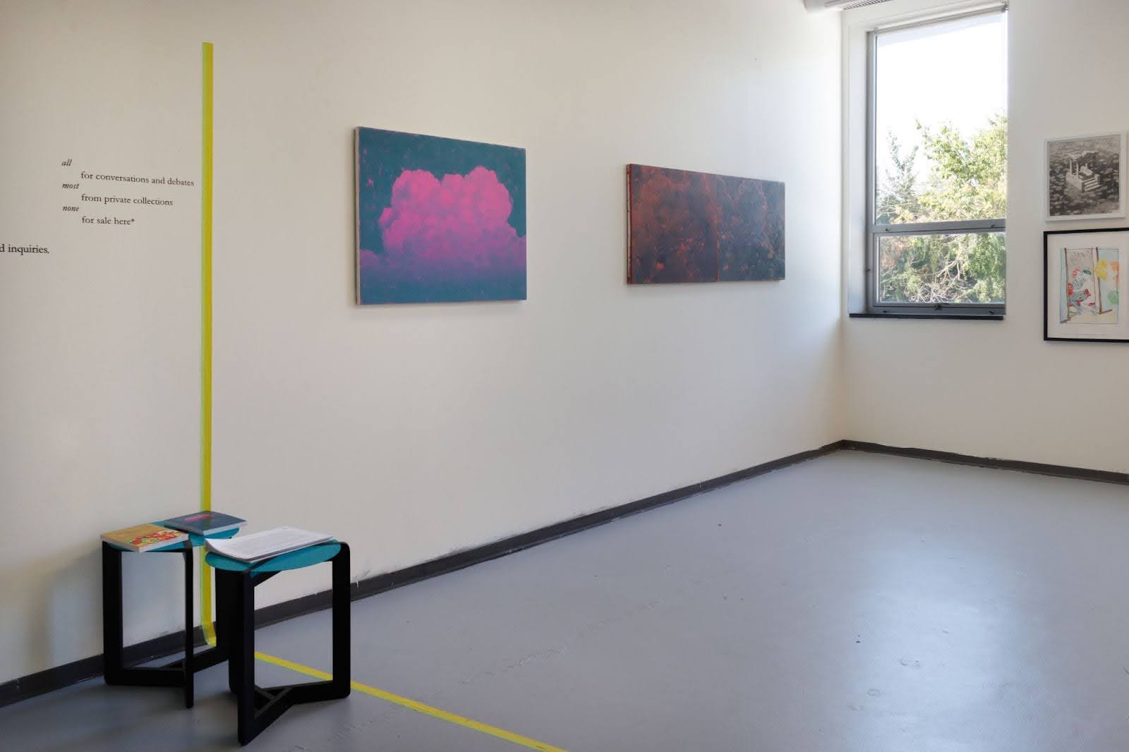
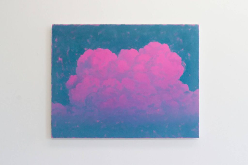
Pink Cloud is composed of two shades: cyan and magenta. Braden places a defined cloud in the center of the composition, with the illuminated upper parts appearing sharper and the lower parts becoming diffused. The vertical thickness of this cumulus cloud does not exceed its horizontal width, and its top has overlapping arcs resembling cauliflower. If, at first, I register magenta as the component of the cloud and cyan representing the non-cloud elements—or the rest of the sky—then the faint, airy strokes of magenta layered over the cyan subtly blurs the boundary between these two states. Along the edges of the canvas, small traces of magenta also appear, the intentionality of their placement resonates with the verbs used in the dictionary definition of atmosphere to bound, engulf, escape, and collapse.
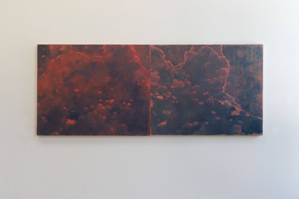
Braden’s Cloud Diptych stands in stark contrast to my experience with Pink Cloud. The way these two pieces inform each other comes not from contrast, but from a shared sense of coherence, especially in how they convey the movement of cloud phenomena. Braden shared with me that there is a five-year gap between the creation of the two paintings. This fact corroborates my subtle intuition that he seems to be investigating very different problems, even though both oil paintings depict clouds.
Pink Cloud feels like diving with an oxygen tank—completed in one breath without needing to surface for air. Cloud Diptych, on the other hand, is like disciplined lap swimming in a pool. The cloud shapes in the later work are looser, but looseness is harder to master than compact clouds, as it requires constant “breathing” adjustments—balancing the shape and weight of the clouds, much like coming up for air in swimming. Even though the two paintings are placed side by side, the clear edge of the canvas physically separates them, and the content does not seamlessly continue the depiction of each painting like a puzzle. However, this arrangement, along with the similarities in the balance of highlights and shadows and the painting techniques, makes me feel as if they are not too far apart “in the sky.”
The shape of the cloud in the Cloud Diptych is more murky and dispersed. The absence of a solid shape suggests that the thickness of the cloud is insufficient, which makes me consider what factors (like wind speed, weather conditions, and humidity) might be at play? Though both works depict clouds, the pair of paintings made me realize that perhaps Braden is not just painting clouds—he’s also capturing something else, something temporal. It’s as if the more saturated orange-red paint marks are moments on the verge of being carried away by the wind, about to drift off in the next instant.
Braden’s paintings evoke a similarity with the art of photography due to the portrayal of clouds and the use of color. In early analog landscape photography, the sky was often a challenging subject, specifically avoiding overexposure or underexposing the sky. Ansel Adams, a landscape photographer, used a zone system to divide the various tonal ranges of his subjects into 11 zones, adjusting exposure in-camera and then using dodging and burning techniques in the darkroom to preserve essential details. Color photography, too, underwent extensive experimentation before achieving its current ease. While photographers were still working with additive or subtractive color processes on filters, one could argue that the sky and the color blue in a photograph were treated as two separate entities. When Braden uses oil paint to depict clouds with such seductive, artificial, and industrial colors, his engagement has an intriguing resonance—both parallel and distinct—with the twin challenges faced in photography’s evolution of exposure and color development.
The pursuit of balanced exposure in photography parallels his creation of something out of nothing with paint and canvas. Yet in his use of color, he bypasses realism entirely, moving away from a photographic likeness. Instead, these exaggerated hues recall an era of color photography when the lack of control over industrial color filters often led to striking, unintended colors—unreal and compelling in their imperfection. This subtle relationship with photography makes the image presented in Braden’s oil paintings seem to be placed ahead in the timeline, almost as if the final result precedes the technology in Braden’s oil paintings. This sense of temporal dislocation, along with the role and placement of the word “preface” in the exhibition title, much like its function in a book, creates an intriguing dynamic.
On Dasha Shishkin
The scenes and figures Dasha creates feel simultaneously frenzied and elegant. I believe achieving this duality is closely tied to some of her formal choices in composition. The evidence of layering, chaos, and interweaving within her works becomes distinctly visible, resulting in this unique effect.
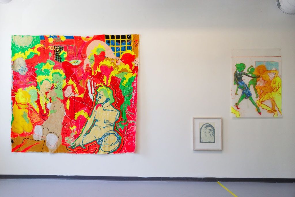
For a figure with eyes depicted in an image, how confident are you that the figure is looking at something, looking at something specific, or whether it is possible for a figure to have eyes but not be looking at anything? These questions come to mind when I look at Dasha’s works, and they are all open-ended, leaving me with plenty of room for imagination.
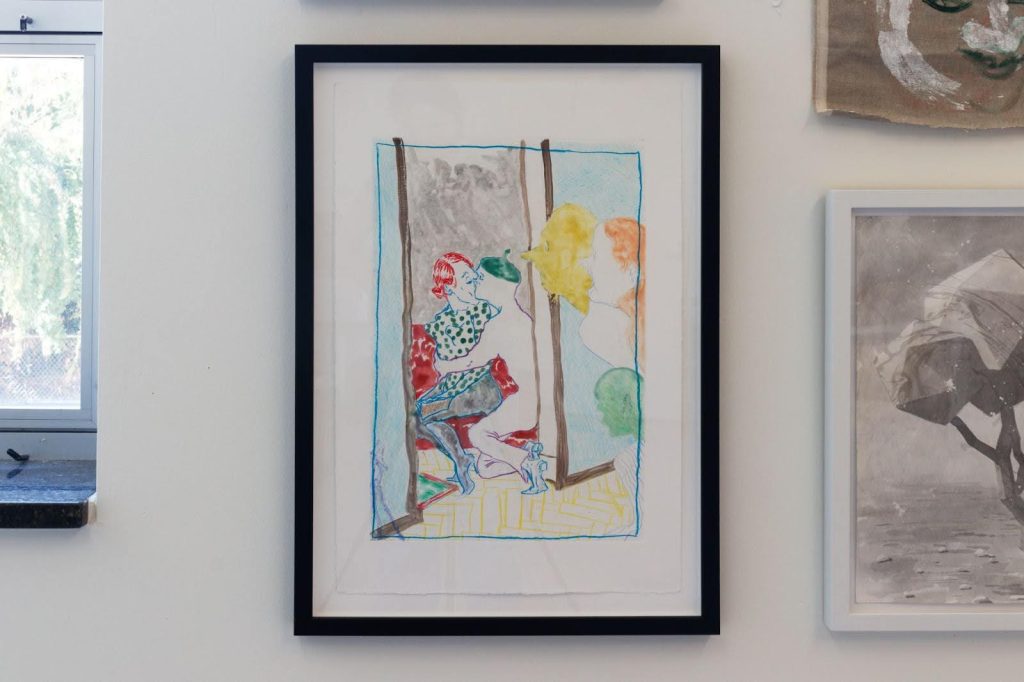
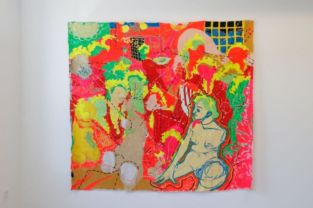
In Dasha’s watercolor monotype onions, I see a depicted indoor scene. The space is divided by a doorway structure, creating an interior—like a separate room—and an exterior—like a hallway. Inside, two figures sit on a red sofa: a green pepper-headed man is holding the red-haired, green-spotted blouse, black stockinged woman in a tight embrace, kissing her passionately. Both figures are wearing pointed shoes, and their legs are posed elegantly. Outside, there are three figures: one entirely yellow with a long nose, one with orange hair and a slightly open mouth, also with a long nose, and another with a green round head and no facial features. They are peering inward. They may not be accomplices, as they don’t seem very familiar with each other. I’m really curious about what these three figures are up to, but I can’t determine whether they’re spying on the kiss or sneaking a glance at the book spread open on the woman’s lap. I think it’s because I can’t decide whether the kiss is more captivating or if the open book is more intriguing—whether one form of voyeurism brings greater pleasure—that makes me so fascinated by this work. Even if neither the kiss nor the book nor the three figures are actually spying, their presence in the scene is so humorous that it keeps me engaged. onions gives me a sense of lightness. I suspect this comes from the subtle certainty in the medium of monotype itself, in addition to any potential narrative the painting may present. Beyond the application of paint, monotype involves the acts of pressing and unveiling in one decisive motion—both of which, in my mind, are inherently certain and deliberate actions. This certainty seems tied to the artist’s confidence as well, allowing me, as a viewer, to be effortlessly convinced of the world within the work. Everything feels natural and unforced.
The painting on the following wall, completed in 2008/2009, does not have a title. In the bottom right of the composition, a figure stands out from the rest of the intricate scene, as it is the only one whose underdrawing was outlined in pencil, giving it a visual weight that anchors it in place, with its right hand and left knee firmly supporting its stance. Dasha’s use of black and white dotted lines appears layered on top of everything happening in the scene. These dashed lines bounce, weave, and point to different figures or simply guide the viewer’s gaze in specific directions. To the left of the central figure, there is a figure with one hand resting on their chin and the other seemingly engaged in drawing or writing. Following the white dashed line, which aligns seamlessly with this figure’s forehead, nasal bridge, and philtrum and extends down to their active left hand, the line then flows back and upward to another figure knitting a white object. Here, the dashed line does not trace the outline of this figure’s body but instead stops directly at their left eye, which, notably, is not looking at the “drawing or writing” figure. Rather, it is focused on the action happening within its own hands.
“Whether it’s a writer, an artist, or any creator, the projects we encounter in this exhibiton are often presented as discrete moments, one after another.”
I’m struck by how much my visual orientation is guided by the dashed lines.The reading of these lines in the composition is far more than a simple guide for the gaze or a suggestion of relationships; they move through layered figures, crossing over bodies and floating in space, with neither beginning nor end.
Returning to the title of this exhibition, I believe preface itself is a very romantic concept. The word comes from Latin, meaning either “spoken before” (prae and fatia) or “made before” (prae + factum). Whether it’s a writer, an artist, or any creator, the projects we encounter in this exhibition are often presented as discrete moments, one after another. For me, State VIII Project, Studio 8 serves as the preface to their work; with the space and project launched by Tongji Phil Qian, I am able to continue “turning the pages” of these two artists’ creations. The latter part of the title, yet flavourful, seems to suggest that I should not miss it, while at the same time, the sensory appeal of “flavourful” makes it something I can’t possibly want to miss.

About the Author: Tianjiao Wang is interested in acknowledging the presence of things. She is a practicing artist focusing on photography and film. She was born in Beijing and now lives in Chicago.