Late in her essay on the painter David Salle, Janet Malcolm records his thoughts on Francis Bacon, for whom she sees a comparison in the “dire cast” of their figures on canvas. Salle’s women (“degrading, depersonalized, fetishistic images,” per one review), and Bacon’s men (troubling, car-smashed meat sacks, per my own recent Google search), do share a quality of doom. Yet Salle is quick to deflect an affinity. “Bacon is actually not an artist I’m interested in,” he says, “but lately I’ve been thinking about him a lot in attempting to defend myself against certain criticisms.” He continues:
“If you turned these criticisms around and leveled them against Bacon, it would be absurd. And it’s purely because his work is homosexual and mine is heterosexual. The same attitudes transposed are incorrect.”
“Why [asks Malcolm] are dire images done by a homosexual more correct than those done by a heterosexual?”
“Because in art politics, to be homosexual is, a priori, more correct than to be heterosexual. Because to be an artist is to be an outsider, and to be a gay artist is to be a double outsider. That’s the correct condition. And if you’re a straight artist, it’s not clear that your outsiderness is legitimate. I know this is totally absurd. But the fact is that in our culture it does fall primarily to gays and Blacks to make something interesting. Almost everything from straight white culture is less interesting, and has been for a long time.”
Do straight artists have less license to describe dire conditions? Does straight, white culture produce less interesting work? The brute subjectivity of these questions encourages rude answers that nonetheless stop short of explaining real conditions. Their asking (and who is asking matters) seems more often a strategy to defer such critiques based on privileged status or to anticipate and thereby neutralize the tonus of derision lobbed at the art world’s donor class (especially when the horse they’ve betted on, per Salle’s grousing, is perceived to be a has-been, a misogynist and a poor draftsman).
I reproduce the above exchange at all (it’s 27 years old: it appeared in The New Yorker in 1994) to foreground an anxiety pervasive to our own moment and recently illustrated by a show still up at Goldfinch Gallery, Andreas Fischer’s And apologies for bringing this up. The tentative, demurring quality of Fischer’s paintings begins with the show’s title, meekly saying sorry for something unsaid, and until you’ve arrived at the gallery, unseen. And once you have seen these images, it’s difficult to fathom what they’re repenting for.
Before I get to the paintings, I want to linger a moment longer on the question of privilege and identity, made tantalizingly specific by Goldfinch’s owner and director, Claudine Isé, and taken from her side of a conversation with the artist. The congruences between this dialog and Malcolm and Salle’s are readily apparent:
“Many other of your [Fischers’] paintings address the dynamics of power as they occur in the realms of sex, politics, race, as well as in romantic relationships. I know from many of our previous conversations that you are acutely aware of your social status as a cis, straight, white male who enjoys a number of privileges that come with that. And as a cis, straight, white female who grew up upper-middle class, I too enjoy those privileges. What makes your paintings so interesting to me is the way they go about critique: you paint what you know, which is the subjectivity of white men (or, at least, your own as a white man), but there is no valorization, only a sense of confusion and visual dislocation. You are aware that you’re painting from a privileged subject position and yet your contempt of what that position actually entails and signifies—your desire to refuse it, if only symbolically, in the work—necessitates a certain kind of retreat from the definitive, from straight (or straight-up) illustrative depiction, and even to a certain degree from the certainty of knowledge itself.”
One senses in Isé’s helpful contextualization an almost touching degree of portfolio management. She really wants her artist to win, and wielding a spokesperson’s baton, she runs the gauntlet of identity politics on his behalf. Fischer is “acutely aware” of his privileges; his critique of power quarters no “valorization” for himself or his audience; and his refusenik sensibility almost—isn’t there just a hint?—queers his paintings. If I over-read and Isé overcompensates, Fischer does us the more generous turn by declining this charity altogether. “I am not sure if I actually refuse anything in or through painting,” begins his measured reply. “[…] I just want to put stuff out there, I guess would be the more casual way of putting it.”

I find Fishers’ lack of surety refreshing and truly, he seems to refuse very little. There’s a googly eye glued to one painting and on another some blobs of cloth and felt. The pencil lines undergirding his compositions confer a lack of precision (no tape lines here!) while adding to their feeling of handmade-ness. He seems fond of cats which is always a winning trait. I mentioned the tentative aspect of Fischers’ work that stand in eerie, unhurried relief to the overdetermined copy on Goldfinch’s website, but the painters’ dominating quality isn’t just elision or mystery. His images are irreverent and fun.
Take, for one example, a painting nearest the entrance, “When I died in my cat’s arms” (2020). A deftly suggested, adorably playful feline holds (why not) a leggy little bulbous man, made more awkward by both subjects looking out at the viewer. Of course, we’re interrupting something terribly intimate (death), a fact punctuated by the impudent lip-curl on the tuber-man’s face. The other cat painting, “Habits so you don’t have to remember” (2020), shows more of the tuber folk (tübermensch?), this time in the eggy halo of sixty-nine-style sexual intercourse. The male figure holds the cat this time, or more precisely, the cat (as cats do) uses the man as a bed.

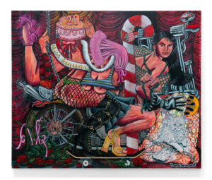
If I resist the idea of “privilege” or “identity” as the threshold for entry into Fischers’ paintings, perhaps that’s because these weighty themes seem so lightly taken up by the artist. These are not “serious” paintings in the sense of the gravity of what their images reveal—they reveal a good deal of playfulness. (I think their less-than-medium scale makes them, on the whole, cute. They would not, at first, appear out of place on the walls of a bougie ice cream parlor. They’re decorative. Indeed, Fischers’ color palette recalls Jeni’s Splendid Ice Creams company, the food and its packaging, and his use of paint—mostly acrylic, at a semi-gloss—has the velveteen smoothness and murky translucency of a half-melted treat.) If there’s a unifying feature among his canvases, it’s in their legibility as memes, or anyway in their assumption of the visual and verbal strategies of memes to elide moments of humor and shame (e.g., “Replacing anxiety with danger” (2020), where a woman absorbed by her iPhone 12 gets face-smashed by a soccer ball). And that is where, I think, the paintings find their disturbing success. By reproducing, in pastel-hues, jewel-tones, and candy colors, that stab of delight the best memes produce as well as their inborn, doomscrolling melancholy.
If there’s a wrinkle to my assertion, it’s in the exhibition’s larger works, which do go heavier on the doom. “The Deciders” (2020) hits hard, both in its visual impact—in the bright white of Goldfinch, it stands out on the far wall like a window onto ocean waters—and its didacticism. This is very much a message painting, nearly an editorial cartoon. In it, two bizarrely familiar figures, white, pinched, choose among photos of dark-skinned faces. They could be casting the next genocide, brown washing a climate disaster, or considering prospects for a future James Bond. The fine quality of light that permeates this painting has that cloying sheen of a Hollywood executive’s suite, pacific blues, and lambent haze, doubled by a quick landscape behind “the deciders” of a sunset in Yosemite National Park. Either a quotation from Albert Bierstadt’ Valley of the Yosemite (1864) or a gesture toward a more hackneyed cliché, the landscape undercuts some of “The Deciders’” Lynchian perversity by enlivening the scene with a touch of grandeur.

Fischer’s men seem almost nameable. At their least contorted, I was reminded of Dana Schutz’s series on corporate retreats—“Party” (2004); “Men’s Retreat” (2005)—where the likes of Donald Rumsfeld, Ted Turner, and Bill Gates appear. (While I’m on it, Schutz, in a very different painting, also quotes from the Hudson River school.) Fischer agglutinates the sagging jowls and receding hairlines of politicians, captures their dark under-eye bags and navy suits, to synthesize a whole new model of blowhard. Is that Dick Cheney in “The Deciders”? Joe Biden in “When everyone changed at once” (2020)? Trump in “Likeness” (2020)? Impossible to say for sure but the bad vibes abound.
I got the sense from this show that apart from my day job and other biographical distinctions, Fischer and I had probably consumed the same media diet this year and at the same frenetic pace. The unceasing parade of incompetent assholes doing weirder and meaner shit was making everyone—union leaders, QAnon stooges, Jeffrey Toobin, whoever heads the USPS—look like the same feckless creep, at once flattening meaningful character and category distinctions while creating dangerous mistakes in recall and representation. For days now I’ve been trying to place a final figure, the stern, sad face from “Nothing you’re doing is making me feel any better”(2020). I thought surely, he’s from conservative talk radio. This was unso. I googled, as one does, famous Bolsheviks. With the announcement of the Golden Globes this morning, it struck me that I was remembering a face from TV: Lord Varys, Game of Thrones. My brain had moved through representations of power in much the way Fischers’ canvases do, by assuming the disparate, blurry loci of its internet manifestations and then disgorging an unsettling and impotent white dude.
And apologies for bringing this up is on view at Goldfinch Gallery until February 20th.
Featured Image: Andreas Fischer. Replacing anxiety with danger, 2020. Acrylic and pencil on canvas. 26 x 22 in. This painting depicts a young woman absorbed in the goings-on of her iPhone, when a soccer ball crashes into her face, sending her red glasses flying. Primarily blue and pale blues, the zone of impact in this image is brought to comedic relief with subtly contrasting ribbons of pale orange and tints of green. Photo by Ryan Edmund Thiel courtesy of Goldfinch Gallery.


Evan Bryson studied painting and writing in Indiana. He lives and works in Chicago. He blogs very infrequently at Duck Beater.