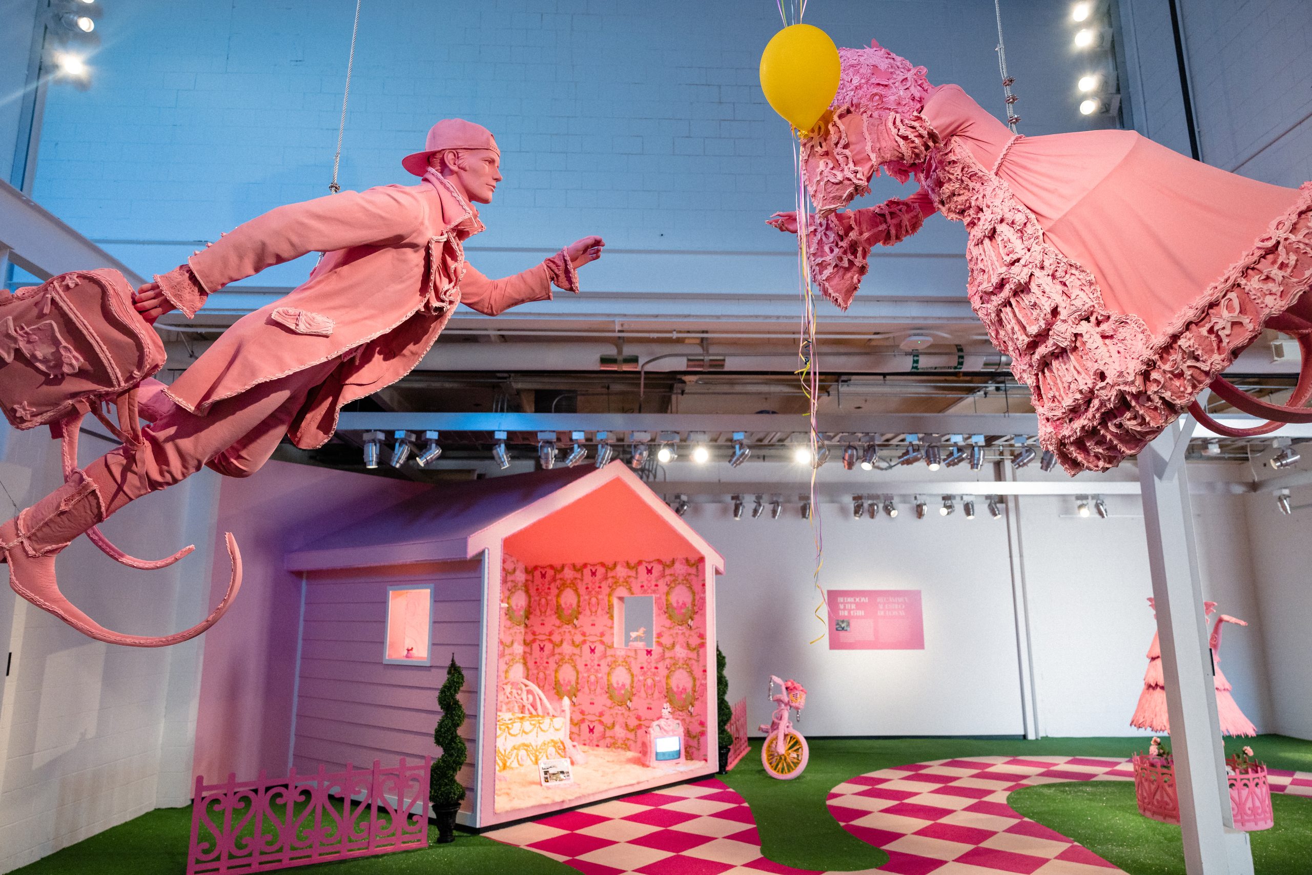
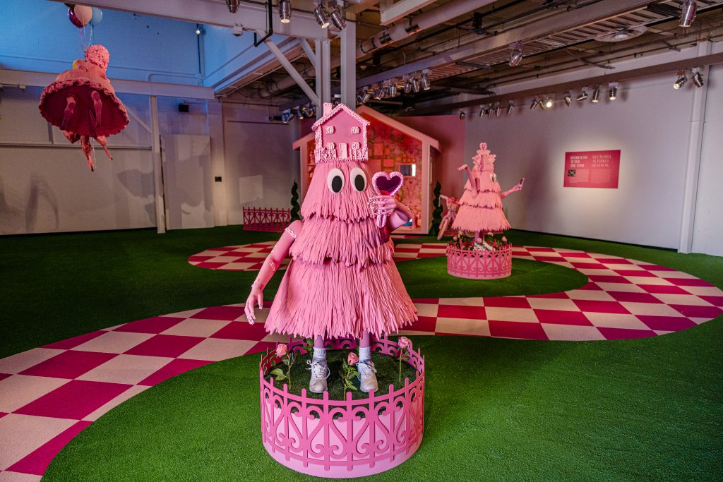
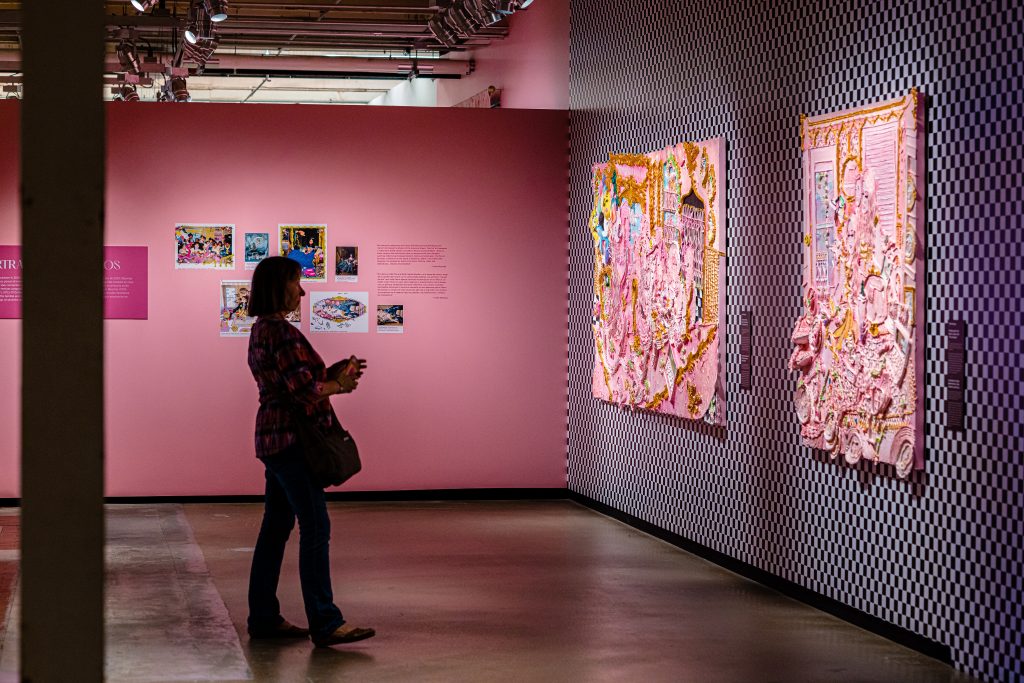
There is a limited, yet intense palette to the world of Yvette Mayorga’s solo exhibition at The Momentary, currently on view in Bentonville, Arkansas through October 15, 2023. In What a Time to be, pink, green, black, and white dominate; and, while Mayorga’s consistent color palette is grounding, her use of pattern and scale sends viewers into a topsy-turvy spiral. Floor patterns creep onto the wall and cake-like paintings contain whole worlds in their nooks and crannies. Moving around the space, you can quickly lose a sense of scale: vases skyscraper over you and a fountain from Versailles almost fits in your pocket. Quickly, everything you know to be true falls away. An outdoor fountain exists inside the museum and a bedroom sits in an artificial yard. But when I catch sight of myself in one of the mirrors, I am suddenly reminded of the present day and all its imperfections—the persistence of white supremacy, violent immigration practices, and ongoing class inequities (to name a few). In an article about Mayorga for Artnet, Barbara Calderón writes “part of the experience of a Mayorga work is the sensorial overload, the burden of artificial sweetness. But, if you aren’t left with an unpleasant aftertaste, were you even paying attention?”
Mayorga’s multidisciplinary work is deeply informed by her upbringing and her intersectional identity as a Mexican-American woman of color from a working class family. The work is expansive, referencing multiple locations and eras. For example, her contemporary acrylic piping technique simultaneously embodies her mother’s labor as a cake decorator in 1970s Chicago as well as the Rococo art canon from eighteenth-century Europe; or, she recreates canonical Western artworks with people of color as their new centers. This attitude epitomizes rasquache aesthetics, which Tomás Ybarra-Frausto defines in his essay Rasquachismo: A Chicano Sensibility as “an outsider viewpoint [that] stems from a funky, irreverent stance that debunks convention and spoofs protocol.”
Mayorga often includes the text “F* ICE” in her work as a form of protest against the U.S. Immigration and Customs Enforcement, which is well known for its separation of families and poor treatment of children at the border. These issues are the “unpleasant aftertaste” that Calderón speaks of. In spite of the heavy subject matter she deals with, Mayorga’s use of pink buoys a sense of levity. We walk away from Mayorga’s work with a real sense of what is wrong in the world, but also with an awareness of what is right—the profound resilience of human beings. Through Mayorga’s work, the color pink and the practice of rasquachismo become an aesthetics of adaptability.
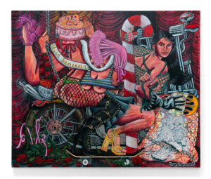
Rasquachismo, a concept born out of the Chicano Art Movement, is a playful aesthetic sensibility that Ybarra-Frausto describes as “[finding] delight and refinement in what many consider banal and projects an alternative aesthetic—a sort of good taste of bad taste. It is witty and ironic but not mean-spirited (there is sincerity in its artiface).” We see this manifest throughout Mayorga’s work, specifically in Smile More Riot Control. On top of a pale pink background is an amalgam of the mundane—toothpaste, tuna cans, shoes, a bandaid, and lots of Cheetos. The items seem casually arranged, though consciously symmetrical; the heads of two swans meet at the tips of their beaks right above a pair of Adidas slides that almost touch. In the very center of the composition is the depiction of a toy soldier, which equally symbolizes Mayorga’s concern with militarization and “dollar store trinkets,” which are typically equated with poverty. Josh T. Franco explains that rasquachismo is “often described as kitsch, but that’s not quite right since kitsch typically has a universalized applicability […] rasquachismo is mostly anecdotal: it’s about the back story as much as the artwork or object itself.” Mayorga seamlessly interweaves her lived experience, conceptual interests, and material choices—they build off of one another in a concerted effort to convey her message.
Mayorga’s pink palette deepens her connection to rasquache. In Pink: The Exposed Color in Contemporary Art and Culture, author Barbara Nemitz speaks about pink as an underdog hue: “worthless material becomes valuable when used in the context of art, as aspects other than conventional ones are discovered and appreciated. The same could apply to pink. Its inherent qualities are merely waiting to be explored under different conditions.” This idea that pink has yet to arrive at its potential aligns with the theory of rasquache; both aesthetic devices are in the business of making do, of realizing new possibilities. While pink isn’t always bright, the visual experience of pink is intense, regardless of its saturation. In 2018, Nemitz gave a presentation at the Fashion Institute of Technology (FIT) Museum’s Pink Symposium in which she declared pink as “a color of fantasy.” In Mayorga’s work, the fantasy is one of reclamation.
In an episode of the Clay in Color podcast, Mayorga describes her use of pink as challenging the notion that it’s “a color that’s frivolous by using it to talk about topics of militarization. In that way, I feel that I am regiving pink its power.” But, pink has been in power before. In 18th-century France, “the richest and most influential people in the country were enveloped in rose, salmon and coral hues.” In Jillian Hernandez’s book The Aesthetics of Excess, she explains how “the curvaceous forms, floral designs, and gilded surfaces of the rococo eventually fell out of fashion and became associated with frivolous, fake, and vain women as Enlightenment discourse, which privileged reason and truth (authenticity), grew more influential, and ushered in the clean, masculine order of neoclassicism.”
Presently, artists and musicians alike are complicating and reclaiming the gendered and classist narrative still surrounding pink. In Janelle Monae’s song Pynk, which embraces queer love, she says “we’re all pink.” She also makes reference to the color of lips, tongues, and our insides more generally. It is true that this color is inside all of us and therefore connects us on a supremely human level. Nemitz states “in situations in which acts of great courage are on public display, it is possible to use the vulnerability of pink nakedness to depict strength and determination.” Pink shows us that there is strength in vulnerability. Pink has gone through periods of being more and less popular and it has overcome, despite society’s wavering support. Pink shows us that inside, we all contain the capacity to persist.
At its most gendered, pink is used to indicate toys for girls over toys for boys. A prime example of this is Polly Pocket, “small compacts containing tiny dolls, each with their own miniature world… At less than one inch tall, Polly and her friends could be carried around in a compact, just like girls’ moms carried their purses.” The phenomenon of Polly Pocket is alive and well in Mayorga’s work. Many pieces feature a round canvas, mimicking the profile of the toy when closed. The most explicit example of this is Surveillance Locket, in which the compact is cracked open like a clam shell. Inside, a slide connects the top and bottom of the composition. There is a suggestion to the story of Rapunzel as a stream of hair runs parallel to the slide, before weaving its way under a bridge and eventually into a pond of ponytail. Curator Angelik Vizcarrondo-Laroy, cohost of Clay in Color, asks Mayorga about the importance of this imagery. Mayorga responds:
“I’m referencing a lot of these objects and toys from my childhood as nostalgic objects to reference a specific time growing up here in the U.S. But also as a reference of the consumerist objects that were advertised to my childhood specifically. And how: most of these objects I did not own but desired. Specifically, like the Polly Pocket. I never actually owned one but I was so fascinated with them and enamored and I always wanted one. It sort of drove a desire and a want for me to feel like I fit in like the rest of the American girls by having a Polly Pocket.”
This line of thinking identifies another facet of Mayorga’s work—desire, which is currently tied to consumerism. Companies must create a feeling of lacking in its consumers. When it comes to children’s toys, Daniel Harris, author of Cute, Quaint, Hungry and Romantic: The Aesthetics of Consumerism, states “cuteness saturates the visual landscape of consumerism with utopian images that cause feelings of inadequacy among parents.” Marketing encourages us to feel bad about ourselves, especially the way we look. We are taught that fake (or extra) is bad and that au naturel is good. Hernandez explains that “pleasure in elaborate aesthetic practices is framed as evidencing a deviant savagery.” However, rasquache methodology tells us “to favor the elaborate over the simple,” to flip the script, which makes a lot of sense when we consider the fact that hegemonic notions of style and taste were created by rich white men “who linked racial and gendered inferiority to so-called aesthetic indulgences.” Mayorga subverts this fucked up history by making work that is undoubtedly elaborate and abundant: thick pink paint is strategically smeared and stacked and fake nails are everywhere to be seen. Mayorga intentionally and intuitively engages with ideas of luxury and extra-ness.
Mayorga takes hold of the problematic past and present and transforms it into a pink future where all of us can thrive. When looking at Mayorga’s work, I question what a new American Dream could look like, or if we even need one. In an Instagram post on October 29, 2022, Mayorga declares “I am an artist—it’s what my inner child has guided me to do even when I didn’t have the resources to learn about art or make it I found a way. I am still here making work because it makes me feel like there is a future and we are all building it little by little by denouncing what no longer serves us.” This adaptability mindset is steeped into Mayorga and it leaks into her studio practice. Through the lens of Mayorga, rasquachismo theory and the color pink become the aesthetics of adaptability.
About the author: Vic Barquin is an artist, printmaker, and arts administrator from Cranbury, New Jersey. She received a BFA in Printmaking with honors from Massachusetts College of Art and Design in 2016. At graduation she was awarded the Genevieve McMillan-Reba Stewart Traveling Fellowship which funded her residency at the Can Serrat International Art Centre in El Bruc, Catalonia. She then moved to Chicago, Illinois where she facilitated events and exhibitions as part of her studio practice. In 2019 she founded Halftone Projects, a collaborative publishing program which she ran out of her second bedroom turned screenprinting studio. In the same year, she co-organized an exhibition of prints and textiles at Chicago Printmakers Collaborative, where she still works remotely as an education coordinator. Barquin is currently pursuing an MFA in Studio Art at the University of Arkansas in Fayetteville.