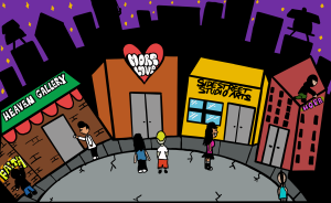
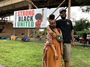
For our inaugural issue Margins we did a call for designers to submit cover ideas. That is when we were introduced to the work of Kyle Asperger, a graphic designer from La Grange, Illinois. He found a ways to visually synthesize the essence of the issue in a way that bridges several different eras–a place where art deco meets an digital world aesthetic. We decided that it might be a good idea to find out more about his inspirations, process and exactly how he approached this cover design.
Sixty: Who are you–where did you grow up and how did you get started in graphic design?
Kyle Asperger: Since the day I could pick up a pencil I have been leaving my mark on whatever I could get my hands on. A fairly common subject matter early on were flames and it worried my teachers. Once I hit high school and had more formal art classes-teachers hinted that I had a graphic style to my work. At the time I was unaware of what exactly that meant but it worked for me. When I first applied to the graphic design program at Miami University (Ohio, not Florida, I don’t tan), my work was about the same quality as that of a third grade math teachers’. Design did not click for me right off the bat.
Sixty: How would you define your style and aesthetic?
Kyle Asperger: Now that I have been immersed in the world I find that beautiful design makes me happier than most things in life…that and a great beer. I generally tend to keep my work simple, clean, tasteful and current, flirting primarily with the digital realm. Inspiration can be pulled from anywhere. People say design is a process of taking what has already been done, tweaking it so it is your own, and in my case, occasionally blending elements together to create a stronger, more unique composition.
Sixty: How did you approach the idea for the “Margins” cover?
Kyle Asperger: After inquiring about Sixty Inches From Center’s magazine and the type of work they usually frequent, I hit the books (the internet, duh). Having a general idea of what a margin consisted of was not enough for me. Going off of the literal definition of a margin, I quickly formulated an image of what I wanted. The next item on the menu: figure out a sexy way to do it.
Sixty: What does the word “Margins” mean to you in the context of art and cultural production?
Kyle Asperger: The edge or margin, if you will, is where people like me get excited. Creative and dangerous people take a concept, chisels it down to its most infantile state and flips it on its head. Edgy work is produced once you get to the margin. A project can be pushed to the edge but all it needs is a flick and it will plunge into the realm of originality. By originality, I am referring to medium, subject matter, message, anything that went into the production of a piece and how it was applied in a new, mind blowing way.
Kyle Asperger: Keep it fun and never be afraid to stand out.


